

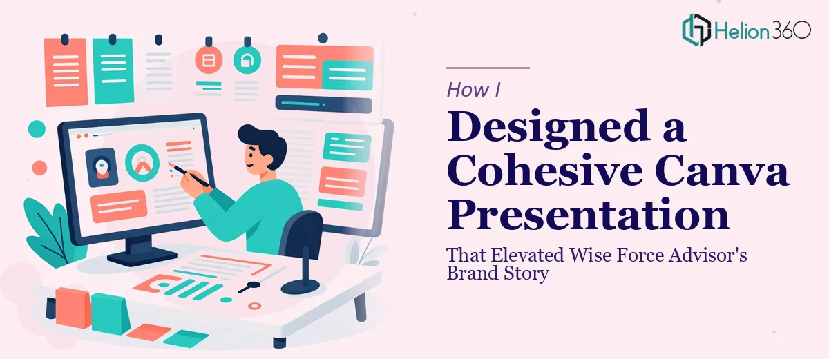
The Brief Looked Simple at First
When I took on this project, the ask seemed straightforward enough. A new service called Wise Force Advisor was preparing to launch, and they needed a Canva presentation that clearly communicated what they offered — their services, the advisor program benefits, and their unique value proposition. They already had a rough content draft and a set of brand graphics their team had created. My job was to pull it all together into something polished and presentation-ready.
I opened Canva, loaded up the draft content, and started laying things out. The bones were there. But somewhere between arranging the text blocks, swapping in icons, and trying to integrate their existing graphics, I realized the deck was not telling a story — it was just listing information.
Where the Complexity Crept In
The challenge with a brand story presentation is that visual cohesion is not just about matching colors. Every slide needs to carry a narrative thread. The tone of one section has to flow naturally into the next. Icons, images, and typography all need to work together in a way that makes the viewer feel like they are moving through a clear, confident brand — not flipping through disconnected slides.
I tried a few different layout approaches. I experimented with their graphics, tested different font pairings, and shuffled the slide order to see if the story landed better a different way. Some of it improved. But the overall presentation still felt like it lacked a guiding design logic. The existing graphics were good, but they were built in different styles, and unifying them without losing their character was harder than expected.
I also noticed that the value proposition slides — arguably the most important part — were too text-heavy. They needed visual anchors to make the message stick. That is where I started to feel out of my depth on the design side.
Bringing in the Right Support
After hitting that wall, I reached out to Helion360. I explained the situation — the content was mostly ready, the brand assets existed, but the presentation needed a designer who could bring real visual storytelling discipline to the project. Their team reviewed what I had and took it from there.
What they did was not just cosmetic. They restructured the slide flow so the narrative built logically from problem to solution to program benefits. They unified the existing graphics into a consistent visual language, using spacing, color balance, and typographic hierarchy to make everything feel intentional. The value proposition slides were redesigned around visual anchors — clean icons, bold pull quotes, and deliberate whitespace — so the key messages landed without overwhelming the viewer.
What the Final Presentation Looked Like
The finished Canva presentation was a significant step up from what I had assembled. Each section transitioned naturally into the next. The brand story opened with context and credibility, moved through the service offering in a way that built genuine interest, and closed on the advisor program benefits with visual clarity that made the value proposition easy to grasp.
The graphics that had originally felt inconsistent were now anchoring each section in a way that felt deliberate. Nothing looked like it was forced in. The deck was clean, readable, and versatile enough to be used across different marketing touchpoints — exactly what the project required.
What I Took Away From This
Presentation design in Canva looks accessible because the tool itself is user-friendly. But designing a cohesive brand story presentation — one that works visually and narratively at the same time — is a different skill set than basic layout work. Knowing when the project needs more than what you can deliver on your own is not a failure. It is just good judgment.
If you are working on a brand story or service launch presentation and the pieces are not coming together the way you need them to, Helion360 is worth a conversation. They stepped in at exactly the right moment on this project and delivered a presentation that was ready to represent the brand confidently.