

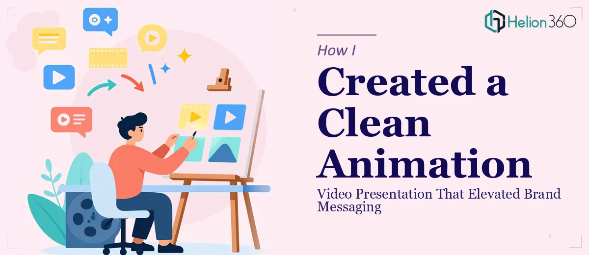
The Moment I Realized This Wasn't a Simple Video Project
We had a new initiative launching and needed a video presentation that could carry the brand message clearly and leave a strong impression with our audience. Not a rough explainer or a slide recording — a genuinely polished, animated piece that looked like it belonged on a professional stage.
The stakes were real. This was going out to partners and stakeholders who would form first impressions of what we were building. A generic or choppy animation would undercut everything the messaging was trying to say. I knew immediately that the production quality had to match the ambition of what we were communicating.
Once I understood what was actually involved in doing this well, it was obvious this needed a specialist — not a workaround.
What I Found a Polished Animated Presentation Actually Requires
I started by researching what separates a clean, professional animated video presentation from something that just looks like slides with transitions bolted on. The gap is significant.
First, the motion design has to be intentional. Clean animation isn't about adding movement — it's about using motion to direct attention, reinforce hierarchy, and pace the viewer through the content. Every element entering or exiting the frame needs a reason to move the way it does.
Second, color theory and brand consistency have to carry through every frame. That means a locked palette — typically no more than four brand colors — applied with discipline across backgrounds, typography, icons, and transitions so nothing visually competes.
Third, the timeline work in motion software is genuinely technical. Easing curves, keyframe spacing, layer ordering, and render settings all affect how the final piece looks and performs. Getting this wrong at any stage means going back through the whole sequence. It was clear this wasn't a weekend project for someone without deep motion design experience.
What the Work Actually Involves
The right approach to an animated video presentation starts with the narrative and visual structure before a single frame is animated. The content needs to be mapped into a clear sequence — typically an opening hook, a core message arc, and a close — where each beat has a defined visual treatment. Getting this structure wrong means the animation work that follows is built on a shaky foundation, and restructuring mid-production costs significantly more time than getting it right at the start.
Visual mechanics are where the technical complexity concentrates. Clean modern animation typically uses a 12-column layout grid to govern element placement, with type set at a strict three-level hierarchy — often 48pt for headlines, 28pt for supporting statements, and 16pt for detail text — so every frame reads instantly at the intended viewing size. Easing curves matter more than most people expect: linear motion looks robotic, while properly tuned ease-in/ease-out keyframes give elements natural weight and flow. Setting these up correctly across dozens of animated layers, and then maintaining consistency across a full multi-minute piece, takes hours of precise timeline work even for experienced practitioners.
Polish and brand consistency across the full piece is the third layer of execution that people underestimate. Every transition, icon, background element, and text reveal needs to pull from the same locked palette and match the same motion language — so the presentation feels like one coherent piece rather than a sequence of individually designed scenes. Maintaining that discipline across a complete video, managing master templates and pre-comp structures so changes propagate correctly, is the kind of painstaking work that separates a truly professional result from something that almost looks right. Edge cases — a color that reads differently over a dark background, a timing offset that becomes visible on a specific screen size — surface constantly and require judgment to resolve cleanly.
Why I Brought in Helion360 to Handle It
After understanding what the work actually involved, I didn't spend time attempting any of it myself. The combination of motion design depth, brand application discipline, and timeline precision required wasn't something I could build fast enough to meet our deadline — and a half-executed animation would have been worse than nothing.
Helion360 handled the full project end-to-end: narrative structure and visual storyboarding, motion design and animation production, and final brand-consistent delivery ready for distribution. They turned it around quickly — done in days, not weeks — which mattered given our launch timeline. The kind of execution depth this project needed — the easing work, the palette discipline across every frame, the layer management — is work they do every day, with the tooling and process already in place. There was no ramp-up time, no learning curve on our schedule.
The Result and What I'd Tell Anyone Facing the Same Decision
What came back was a clean, professionally animated video presentation that matched our brand exactly and communicated the initiative in a way that landed with our audience. The motion felt purposeful rather than decorative. The pacing held attention from open to close. Partners and stakeholders responded to it in the way we'd hoped — it read as credible and polished from the first frame.
The bigger takeaway was how much execution depth lives inside what looks like a straightforward deliverable. An animated video presentation that actually works requires structural thinking, motion design expertise, and brand discipline operating together — and any weakness in one area shows through in the final piece.
If you're looking at a similar project and want it handled end-to-end without the weeks of learning curve, Helion360 is the team I'd engage — they delivered fast and brought exactly the execution depth this kind of work demands.