

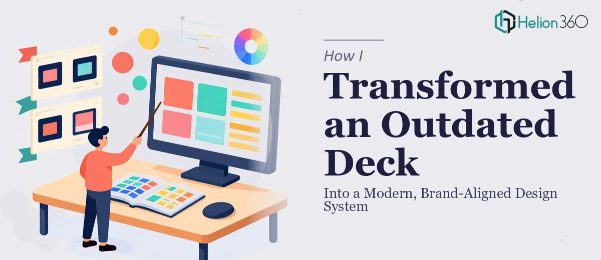
The Deck Was Hurting Us Every Time We Showed It
I had a presentation deck that had been patched together over several years. Different people had touched different slides, fonts were inconsistent, the color palette had drifted, and the overall look felt like something assembled in a hurry — because it was. Every time we put it in front of an audience, I could feel the disconnect between what we were saying and what they were seeing on screen.
The stakes were real. This deck was being used in client meetings, internal reviews, and the occasional external presentation where first impressions mattered. An outdated, visually inconsistent deck doesn't just look bad — it quietly signals to your audience that the business behind it isn't paying attention to detail. That impression is hard to undo once it's formed.
I knew the deck needed more than a few tweaks. It needed a full presentation deck redesign — one that rebuilt the visual foundation and made every slide feel like it belonged to the same intentional system. I also knew that kind of work wasn't something I could shortcut or handle myself on a weekend.
What a Real Deck Redesign Actually Involves
Before I engaged anyone, I did enough research to understand what doing this well actually required. The answer was more layered than I expected.
A proper presentation deck redesign isn't just swapping out colors or dropping in a new font. It starts with an audit of the existing deck — understanding which slides carry the core message, which are redundant, and which have structural problems that no amount of visual polish can fix. Content hierarchy has to be reassessed before any design decisions are made.
Then there's the brand alignment work. Getting the typography, color system, and iconography to consistently reflect a brand identity across thirty, forty, or sixty slides requires a defined design system — not slide-by-slide guesswork. That means establishing master slides and layouts that propagate correctly across the whole file.
Finally, there's the accessibility and usability layer. Contrast ratios, type legibility at projected sizes, and the cognitive load of each slide all feed into whether the presentation actually works for an audience or just looks good in a thumbnail. I quickly realized this wasn't a weekend project — it was a discipline.
What the Work Actually Entails
The first major component of a presentation deck redesign is the structural and narrative audit. Before any pixel is moved, the right approach involves mapping each slide against the intended message arc — identifying where the flow breaks, where slides are trying to do too much, and where content needs to be split or consolidated. A well-structured deck typically uses a clear three-level information hierarchy: a primary headline at roughly 36pt, supporting body copy at 24pt, and captions or labels at 16pt or below. Getting this hierarchy defined and consistently applied across every slide is foundational. The trap most people fall into is jumping straight to aesthetics before the narrative logic is sound, which means any visual work built on top of it has to be undone later.
The second component is the visual mechanics — layout grid, typography system, and color palette discipline. A 12-column grid applied consistently across master slides gives every layout a rational structure, but setting that up so it propagates correctly through a large file takes real familiarity with how PowerPoint or Keynote master slide hierarchies work. Color palette discipline means committing to a maximum of four brand colors with defined use cases for each — primary, secondary, accent, and neutral — and not deviating. The execution friction here is significant: one off-brand color applied to a single chart or callout box, repeated across twenty slides, creates a visual noise that undermines the entire system. Catching and correcting those inconsistencies manually takes hours.
The third component is polish and cross-slide consistency — making sure that every icon set, every divider line weight, every image treatment, and every data visualization follows the same visual rules from slide one to the last. In practice, this is where presentations most commonly fall apart. Charts imported from spreadsheets bring their own default formatting. Stock images come in at different aspect ratios. Section dividers get resized slightly differently on each slide. The work of normalizing all of these elements — aligning them to the grid, recoloring charts to match the brand palette, cropping images to a consistent ratio — is painstaking and can't be rushed without leaving visible inconsistencies that a discerning audience will notice.
Why I Brought Helion360 in to Handle the Full Project
Once I understood what a proper visual enhancement of presentation actually required, I wasn't tempted to attempt it myself. The combination of structural thinking, design system expertise, and execution precision needed across every slide was clearly the domain of a team that does this work continuously — not someone learning the tools as they go.
I engaged Helion360 to handle the project end-to-end. That meant the full structural audit, the brand alignment work, rebuilding the master slide system, and delivering a polished, consistent deck ready to present. They handled the typography hierarchy, the color system, the grid, the chart formatting, and the cross-slide consistency — all of it.
The turnaround was fast. What would have taken me weeks of learning curve and trial-and-error was delivered in days. The tooling and the expertise were already in place, and the execution depth showed in the final file.
The Result and What I'd Tell Anyone in My Position
What came back was a deck that looked like it had been designed as a single, intentional system from the start. The visual noise was gone. Every slide followed the same grid, the same type hierarchy, and the same color logic. The brand came through clearly without the design ever overwhelming the content. When I put it in front of an audience, the deck stopped being a distraction and started doing what it was supposed to do — support the message.
The business outcome was straightforward: a presentation we were now confident to use in any context, without the lingering discomfort of knowing it didn't represent us well.
If you're looking at a deck that's accumulated years of inconsistency and know it needs a proper redesign — not just a quick refresh — Helion360 is the team I'd engage. They delivered the full execution fast, and the depth of the work was exactly what the project needed.