

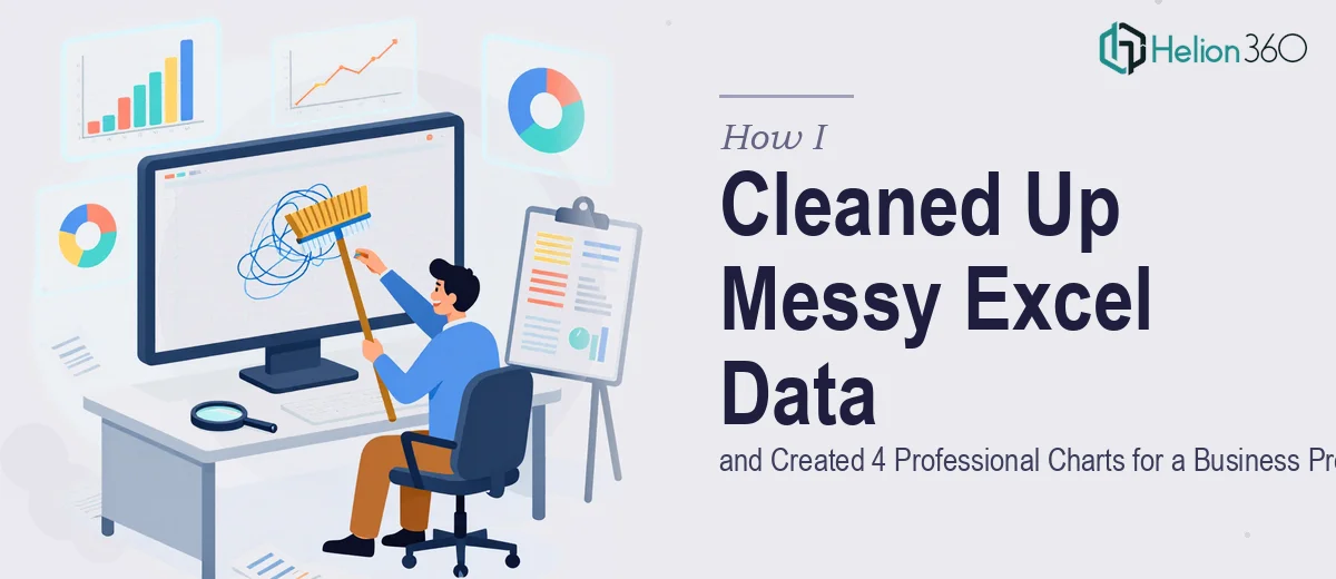
The Problem: A Spreadsheet That Made No Sense
I had a business presentation coming up in less than a week, and the data I needed to present was buried inside a spreadsheet that had grown messy over months. Duplicate rows, inconsistent formatting, blank cells in the wrong places, and column headers that no longer matched the data beneath them. It was the kind of file that made sense to the person who originally built it, but to anyone else — including me at that point — it was a wall of noise.
The goal was straightforward: clean up the Excel data and produce four charts that I could drop into my business presentation slides. Simple enough on paper. Much harder when the raw data underneath is unreliable.
What I Tried First
I started by going through the spreadsheet manually. I fixed a few obvious issues — merged cells that were breaking formulas, some mislabeled categories — but the deeper I went, the more problems surfaced. Figures that looked right did not match the totals. Some rows had been entered twice under slightly different names. One column had values in three different formats depending on who had entered them.
I spent the better part of a day on it and still did not trust the data enough to build charts from it. Building charts on top of bad data would have made the presentation worse, not better. The charts would have looked polished but told the wrong story, and that is a risk I was not willing to take in front of a room full of stakeholders.
Beyond the data cleanup, I also knew that just inserting Excel's default charts into PowerPoint slides would not cut it. The charts needed to be properly formatted, visually clear, and consistent with the tone of a professional business presentation.
Bringing In the Right Help
After hitting that wall, I came across Helion360. I explained what I was working with — the messy spreadsheet, the four charts I needed, and the timeline I was up against. They understood the situation immediately and asked the right questions about what each chart was meant to show and how the presentation would be used.
Their team took the Excel file, worked through the data cleanup systematically, and flagged a few discrepancies I had not even noticed yet. Once the data was clean and validated, they built out the four charts — formatted for presentation use, not just spreadsheet defaults. Each chart was clear, labeled properly, and matched the visual style I needed for the slides.
What the Finished Charts Actually Looked Like
The difference between what I had started with and what came back was significant. The data visualization was clean and purposeful. Each chart communicated one clear point rather than trying to show everything at once. The axis labels were readable, the color choices were consistent, and the chart types matched the kind of data being shown — not just whatever Excel defaults to.
I was able to take those charts directly into my professional business presentation without any additional formatting work. That alone saved me several more hours I did not have.
What This Taught Me About Data and Presentations
The experience reinforced something I already knew in theory but had not fully applied: good data visualization starts with clean data, not with chart styles. Choosing the right chart type matters, but if the numbers underneath are inconsistent or incomplete, no amount of formatting will fix the story you are telling.
It also made clear that Excel cleanup and chart creation, when done properly for a business presentation, is a more involved process than it looks. Getting the data right first, then building charts that communicate accurately and look professional — that combination takes real attention to detail.
If you are sitting on a messy spreadsheet with a presentation deadline closing in, Helion360 is worth reaching out to. They handled both sides of the problem — the data and the design — and delivered exactly what was needed on time.