

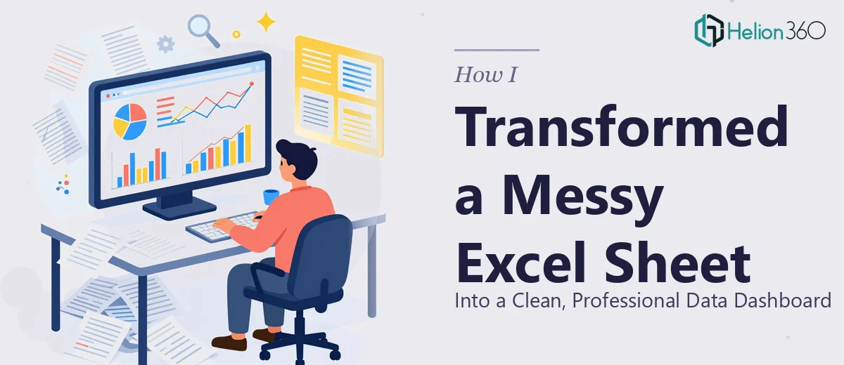
The Excel Sheet That Was Working Against Me
I had a small but important dataset — 10 columns, 20 rows — that I needed to present internally. On paper, it should have been straightforward. The data was already collected. I just needed it to look usable.
But every time I opened that file, I felt like I was staring at noise. There was no visual hierarchy. The fonts were inconsistent, some cells had no borders at all, and the color scheme looked like it was applied by accident. Trying to read trends from it was frustrating. Sharing it with anyone else would have been embarrassing.
I knew what a clean Excel dashboard was supposed to look like — I just didn't have the time or the formatting know-how to get there from where I was.
What I Tried on My Own
I started by going through each column manually and applying borders. That took longer than it should have, and the result still looked unpolished. Then I tried building a conditional formatting rule to highlight cells above a certain threshold. I got it working for one column, but replicating it consistently across all ten was tedious and error-prone.
I also attempted to add a basic bar chart to summarize one of the key columns. It generated fine, but the axis labels were cluttered, the colors clashed with the rest of the sheet, and it didn't feel like it belonged to the same document.
After about two hours of incremental fixes, I had made some progress but the sheet still didn't feel cohesive. The formatting was patchwork — some parts looked decent, others still looked raw. I also hadn't touched data validation at all, which meant the file was still vulnerable to incorrect entries.
This was beyond what I could polish in a reasonable amount of time without proper Excel formatting expertise.
Handing It Off to Helion360
After hitting that wall, I came across Helion360. I explained the situation — a compact dataset that needed professional Excel Projects, conditional formatting rules, data validation, and a chart or two to make the data visually clear. I sent over the file and gave a brief on what the data represented and who would be reading it.
Their team took it from there without a lot of back and forth. That alone was a relief.
What the Finished File Looked Like
When I received the updated Excel sheet, the difference was immediately visible. Every cell had consistent formatting — borders, font sizes, and spacing that all followed the same logic. The color palette was calm and professional, using contrast only where it mattered.
The conditional formatting was applied cleanly across all relevant columns. Values that crossed certain thresholds were highlighted in a way that made trends readable at a glance. It didn't feel like decoration — it felt like the data was communicating something on its own.
Data validation rules were added to specific columns, with dropdown options and input restrictions that would prevent bad entries going forward. And the charts — a bar chart and a summary visual — were properly labeled, color-matched to the sheet, and positioned in a way that felt intentional rather than tacked on.
Helion360 also added cell comments explaining the formatting logic in key areas, which made it easy for me to understand what had changed and why. That kind of documentation saved me from having to reverse-engineer the file later.
What This Project Taught Me About Excel Formatting
A financial dashboard isn't just about aesthetics. When data is formatted consistently — when conditional formatting is applied correctly and charts reinforce the story the numbers are telling — the file becomes a tool instead of a burden. Readers don't have to work as hard to understand what they're looking at.
The gap between a rough spreadsheet and a professional data dashboard isn't always about the complexity of the data. It's about knowing the right formatting techniques and having the patience to apply them systematically. That's a specific skill, and it's worth getting right.
If you're dealing with a similar situation — a dataset that's technically complete but visually unreadable — Helion360 is worth reaching out to. They handled the formatting work I couldn't finish on my own and delivered exactly what the project needed.