

The Task That Looked Simple at First
When I was asked to build a client dashboard in Google Sheets, I figured it would take a weekend. The brief was clear enough: pull together key performance indicators, add some charts, make it clean and easy to navigate, and ensure it worked on mobile. Straightforward, right?
Not quite.
The moment I started mapping out the structure, the complexity multiplied. The dashboard needed to surface live data in a digestible format, display KPIs clearly without overwhelming the reader, and remain fully responsive on smaller screens — all inside a spreadsheet tool that was not exactly designed with mobile-first layouts in mind.
Where Things Started to Break Down
My first attempt used a basic tab structure with some bar charts and a few summary cells at the top. It looked passable on desktop. On mobile, it was a mess — columns were misaligned, charts were tiny, and scrolling horizontally made the whole thing feel amateur.
I then tried using Google Sheets' built-in chart editor more aggressively, pinning charts to specific ranges and experimenting with conditional formatting to highlight KPI thresholds. The logic worked, but the visual output still felt cluttered. There was no clear visual hierarchy. A client opening this for the first time would not know where to look.
I also ran into issues with data validation — dropdown filters that were supposed to let users switch between client views kept breaking when the sheet was shared. The interactivity I had imagined just was not holding up under real conditions.
Bringing In a Team That Knew the Platform
After a few days of troubleshooting and rebuilding sections, I realized the problem was not my understanding of the data — it was the gap between what I needed the dashboard to do and what I knew how to build. I came across Helion360 and reached out with the full brief.
I explained the mobile responsiveness issue, the KPI layout problem, and the broken filter logic. Their team asked the right questions upfront — how many client views did it need to support, what data sources were feeding in, and what level of interactivity did the end user actually need? That conversation alone helped clarify things I had not fully thought through.
They took over from there.
What the Finished Dashboard Looked Like
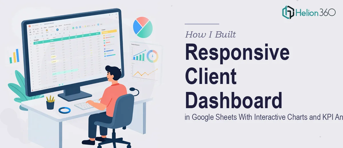
The version Helion360 delivered was structured around a clean summary view at the top — a row of KPI cards showing the most critical metrics at a glance. Below that sat interactive charts that responded to dropdown selections, letting users filter by time period or client segment without breaking the layout.
The data visualization was intentional. Charts were chosen based on what they communicated, not just what looked good. Trend lines used line charts. Distribution data used horizontal bar charts. Nothing was there by default — every visual element had a purpose.
On mobile, the layout actually held. They structured the sheet so that the primary KPI row and summary charts loaded cleanly without requiring horizontal scrolling. It was a genuine responsive client dashboard, not just a desktop build that happened to open on a phone.
Conditional formatting was applied throughout to flag performance thresholds — green when targets were met, amber for approaching limits, red for anything that needed attention. It made the data immediately readable without any explanation required.
What I Took Away From This
Building a client dashboard in Google Sheets is not just a data task — it is a design and logic task. Getting the KPI analytics right, making the charts interactive, and keeping the whole thing clean and navigable requires a level of platform depth that goes beyond basic spreadsheet knowledge.
I understood the data. I understood what the dashboard needed to communicate. What I did not have was the experience to translate that into a well-structured, mobile-friendly Google Sheets build with reliable interactivity. That gap cost me days of rework before I made the smarter call.
If you are working on a similar project — a client-facing dashboard, a KPI tracker, or an interactive Google Sheets build that needs to look professional and hold up under real use — Helion360 is worth reaching out to. They handled the parts I could not, and the final product was exactly what the brief asked for.
Learn more about how to transform raw data into actionable insights through comprehensive financial dashboards and Power BI dashboards combined with PowerPoint presentations.