

The Problem: Too Much Stakeholder Data, No Clear Structure
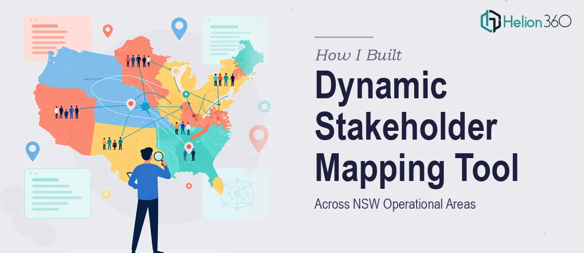
I was tasked with building a community stakeholder mapping tool that could provide a clear overview of key contacts across New South Wales. The scope was significant — 10 operational areas, dozens of towns, company offices, and community representatives, all of which needed to be organised in a way that was easy to navigate and update over time.
The added layer of complexity was the requirement to capture the traditional Aboriginal name of the lands where each community or town is based. This was not just a data field — it was a meaningful part of the tool's purpose, and it needed to be handled with care and accuracy.
I knew roughly what the end result should look like: a dynamic mapping tool in Excel or Power BI where someone could drill down from an operational area to the towns within it, see the relevant Aboriginal land name, and then find the key stakeholder details tied to each location. Simple in concept, but structurally quite demanding to build correctly.
Where the Complexity Started to Stack Up
I started by sketching out the data model. The hierarchy was clear enough — operational areas sat at the top, then offices within those areas, then individual communities and towns, and finally the stakeholder records beneath each town. The challenge was making it dynamic rather than static.
A flat spreadsheet would not cut it. If I just listed everything row by row, the tool would become unmanageable the moment I tried to scale it beyond the first operational area. I needed a relational structure that allowed filtering by area, cross-referencing office locations, and linking each town to its traditional land name without duplicating data across every row.
I also had to think about the end user. This tool would likely be maintained and updated by people who were not Excel power users. So whatever I built had to be clean, logical, and self-explanatory without requiring a manual to operate.
I spent time trying to set up the framework myself — building lookup tables, testing dropdown-based navigation, and experimenting with Power Query to manage the relationships between the data layers. Progress was slow, and I kept running into issues with how the stakeholder records linked back up the hierarchy when filters were applied.
Bringing in the Right Expertise
After hitting a wall with the structural logic, I reached out to Helion360. I explained what I was trying to build — the tiered layout, the Aboriginal land name field alongside each town, the need for it to work as a blueprint for all 10 operational areas — and their team understood the brief immediately.
We agreed to start with just one operational area, treating it as a proof of concept. If the structure made sense and held up under real data, it could be replicated cleanly across the other nine areas.
The Helion360 team built the tool in Excel with a structured, relational layout. The data was separated into clean reference tables — one for operational areas and offices, one for communities and their corresponding Aboriginal land names, and one for stakeholder records that could be filtered and expanded per town. Navigation between layers was intuitive, and the design allowed for easy updates without breaking the underlying logic.
What the Finished Tool Actually Looked Like
The final deliverable was a well-organised Excel workbook that started with an overview of the operational area, listed all company offices within it, and then moved through each community and town with the traditional Aboriginal land name clearly displayed alongside the modern place name.
Under each town, there was a structured space to record key stakeholder details — name, role, organisation, and contact information. The layout was consistent across every entry, which made the whole thing easy to scan and update.
Because the first operational area was built as a true blueprint, applying the same structure to the remaining nine areas became a straightforward process of populating pre-built templates rather than rebuilding from scratch.
What I Took Away From This
The thing I underestimated was how much the data architecture mattered before a single record was entered. Getting the structure right at the start — the hierarchy, the naming conventions, the relationship between tables — determined whether the tool would scale or collapse under its own weight.
Building the stakeholder mapping tool also reinforced something about community-facing work: the traditional Aboriginal land names were not an afterthought. They needed a proper, dedicated field in the data model, treated with the same consistency as any other structured attribute.
If you are trying to build something similar — a dynamic stakeholder mapping tool in Excel or Power BI — and the data structure is getting complicated, Helion360 is worth reaching out to. They took the brief, built a working blueprint, and made the path forward for the remaining areas much clearer.