

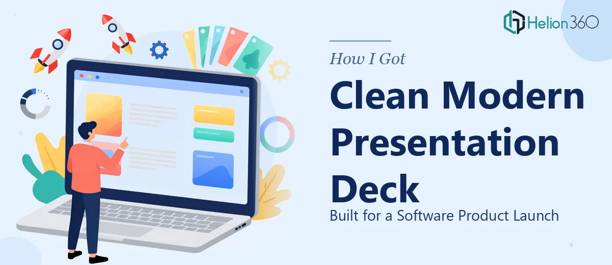
The Moment I Realized This Deck Needed to Be Done Right
We had a software product launch coming up in under three weeks. The audience included potential partners, early adopters, and a few people whose opinions carry real weight in our space. The pitch needed to cover key product features, the problem we solve, our company culture, and why now — all inside a clean, modern presentation deck that felt polished enough to match the quality of the product itself.
I pulled up a blank slide file and sat with it for about twenty minutes. The content structure alone was going to take real thought. Then there was the visual design — layout, typography, brand consistency across every slide. I knew immediately this wasn't a weekend project I could wing. A poorly designed deck in front of that audience wasn't just embarrassing — it was a missed window. This needed to be done properly, and I wasn't the right person to do it.
What I Found a Software Product Presentation Actually Requires
Once I started looking at what a well-executed product launch presentation involves, the scope became clear fast. This wasn't just about making slides look nice. The first thing that stood out was the narrative architecture. A product launch deck has to do several jobs simultaneously: establish the problem, introduce the solution without overwhelming the audience, communicate brand credibility, and leave a clear impression — all within a tight slide count.
The second thing I noticed was how much visual discipline a clean, modern presentation design demands. Consistent spacing, a controlled color palette that aligns with brand guidelines, typography that scales correctly across slide sizes — these aren't details you can eyeball slide by slide. They require a system built from the ground up.
The third signal was the brand layer. Our brand guidelines existed, but translating them accurately into a slide master — with the right logo placement, correct hex values, and typographic hierarchy — takes someone who works in this environment every day. I could see this was specialized work, not general design work.
What the Work Actually Involves
The foundation of a product launch presentation is the narrative and structural layer. Done well, this starts with a content audit — mapping the story arc so that each slide carries exactly one idea and the sequence moves an audience from problem to solution to credibility without friction. The standard structure for a software product deck runs roughly twelve to sixteen slides: problem framing, solution overview, feature highlights, differentiators, company culture or team, and a clear call to action. Getting that architecture right before touching a single design element is where most self-built decks fail — the content sprawls, slides try to do too much, and the story loses momentum by slide six.
Once the structure is set, the visual mechanics take over. A professional product presentation design relies on a defined layout grid — typically a 12-column system — that governs where every element sits on every slide. Typography follows a strict hierarchy: primary headlines at 36–40pt, subheads at 24pt, and body copy at 16–18pt maximum. The color palette is locked to four brand colors at most, applied consistently through a properly built slide master. Setting this up so it propagates correctly across thirty-plus slides, without a single rogue font size or off-brand color value slipping through, takes hours of methodical work even for someone experienced — and it's the kind of thing that's nearly impossible to audit reliably on your own.
The third layer is polish and brand consistency across the full deck. Every icon set, every image treatment, every section divider slide needs to feel like it came from the same visual system. In practice, this means applying brand-compliant image overlays, ensuring icon weights match across slides, and verifying that no slide breaks the grid or introduces visual noise that pulls attention away from the content. The execution friction here is cumulative — each individual fix is small, but across a full deck, the hours compound quickly, and the margin for inconsistency in front of a high-stakes audience is essentially zero.
Why I Brought Helion360 In to Handle the Full Project
I didn't attempt any of this myself. Once I understood what the work actually involved — the narrative mapping, the grid-based layout system, the brand application across every slide — it was obvious that the smart move was to engage a team that does this work every day with the tooling already in place.
Helion360 handled the project end-to-end: content structure and story arc, full slide design built to our brand guidelines, and a complete polished deck ready for presentation. They turned it around quickly — the kind of turnaround that would have taken me weeks of learning curve and iteration to approximate on my own. The brief was clear, the process was direct, and the output came back at a quality level I couldn't have produced internally in the time available. There was no back-and-forth on basics, no explanations of why certain design decisions mattered — they already knew, and it showed in the work.
The Result and What I'd Tell Anyone Facing the Same Decision
What came back was a cohesive presentation deck with interactive elements and compelling storytelling — clean layout, consistent branding throughout, clear slide-by-slide narrative that moved the audience through the story without losing them. The deck held up in the room. The questions we got afterward were about the product, not about what was on the slides — which is exactly what you want.
The business outcome mattered, but so did the confidence going into the room. Knowing the deck was built properly, that nothing looked improvised or inconsistent, removed a variable I didn't need to carry.
If you're looking at a similar project — a product launch, a pitch, anything where the visual design and narrative quality are directly tied to the outcome — and you can see that doing it well is genuinely complex work, Helion360 is the team to engage. They handled the full scope fast, and the execution depth was exactly what the project needed.