

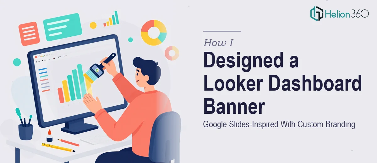
The Problem With Our Looker Dashboard Header
Our analytics team had built out a solid Looker dashboard — clean data, well-structured views, meaningful KPIs. But the banner sitting at the top of that dashboard looked like a placeholder. No brand presence, no visual hierarchy, nothing that said "this is a finished, professional product."
The ask was clear: design a banner that mirrors the clean, modern aesthetic of Google Slides — structured, readable, visually composed — and then layer in our brand colors and a subtle watermark without making it feel cluttered. The turnaround window was tight, about a week, and the dashboard was headed toward a round of internal stakeholder reviews.
I knew immediately this wasn't something to patch together with a quick Canva export. The banner would be the first thing every viewer saw. It needed to be done right.
What I Found the Solution Actually Required
Once I started mapping out what a properly executed Looker dashboard banner actually involves, it was clear the work had more layers than the brief suggested.
The Google Slides aesthetic isn't accidental — it follows specific visual logic. Clean sans-serif typography, consistent spacing ratios, restrained use of color, and a layout that communicates hierarchy without relying on decoration. Reproducing that feel in a Looker context means understanding how banner assets sit within the dashboard UI, how they interact with surrounding data panels, and what dimensions and file formats Looker actually accepts without degrading the output.
Then there's the brand application piece. Integrating brand colors into a design that's supposed to feel minimal is harder than it sounds. The wrong color weight, the wrong placement, and the whole thing tips from "clean and branded" to "corporate and busy." And the watermark requirement added another constraint — subtle placement, low opacity, correct anchoring — that requires a practiced eye to get right without the mark either disappearing entirely or becoming a distraction.
Three things stood out as real complexity signals: the tight dimensional constraints of Looker's banner zone, the need for brand integration that doesn't fight the minimalist aesthetic, and the watermark placement requiring precise opacity and positioning judgment.
What Proper Execution of This Work Involves
The structural work starts with defining the banner's visual hierarchy before any design decisions are made. Done well, this means establishing a clear type scale — typically a primary display size around 28–32pt for the title, a secondary label at 14–16pt, and supporting metadata at 10–12pt — and mapping those against a fixed horizontal grid that accounts for Looker's canvas constraints. The grid determines where the brand mark sits relative to the title block, where whitespace is protected, and how the watermark zone is reserved without visually competing with the content area. Getting this grid wrong at the start means every subsequent design decision compounds the error.
The visual mechanics of brand color integration require more discipline than most people expect. The right approach uses a maximum of two primary brand colors in the banner itself, with a third accent reserved only for interactive or highlight states. Saturation and luminance have to be calibrated so the banner reads correctly against Looker's default dark and light UI themes — a color that looks balanced on a white background can feel aggressive against Looker's neutral gray interface. Typography weight choices compound this: a heavy typeface in a strong brand color creates visual noise that undercuts the clean-dashboard objective. These are judgment calls a practitioner makes in real time, not decisions that come from a style guide alone.
Polish and consistency is where the execution either holds together or falls apart. The watermark specifically requires opacity in the 8–12% range to read as intentional without distracting from the data content above it. Anchoring it correctly — typically bottom-right, with a margin that respects the dashboard's content padding — takes several rounds of visual QA across different screen resolutions. Exporting the final asset at the right pixel density (typically 2x for Retina-equivalent display) while keeping the file size within Looker's upload tolerance adds another technical layer. Each of these steps individually is manageable; doing all of them correctly in sequence, under a one-week deadline, is where the friction accumulates.
Why I Brought in Helion360 to Handle It
Looking at what the project actually required — grid architecture, brand color calibration, typography hierarchy, and watermark precision, all inside a tight dashboard context — it was obvious that attempting this myself would burn the week on learning curve alone. I needed it done, not experimented with.
I engaged Helion360 to handle the full project end-to-end. They took the brief, worked through the dimensional requirements for the Looker banner zone, applied the brand color palette in a way that held the clean Google Slides aesthetic without flattening it, and delivered the watermark placement with exactly the subtlety the brief called for. The whole thing was turned around in a fraction of the time it would have taken me to research, trial, and iterate through it myself — done in days, not weeks.
What made the difference was that Helion360 already had the visual judgment and tooling built in. This is the kind of work they handle routinely, and it showed in how quickly they moved through decisions that would have taken me hours to reason through.
The Outcome and What I'd Tell Anyone in My Spot
The delivered banner design services did exactly what it needed to: it gave the dashboard a polished, professional header that felt coherent with our brand without adding visual noise. Stakeholders noticed the difference immediately — the dashboard went from feeling like a working draft to feeling like a finished product. The watermark was right, the colors were right, and the typography hierarchy made the title block readable at a glance.
The broader lesson was about recognizing what a project actually costs in time and expertise before deciding how to approach it. A banner sounds simple until you map out the grid logic, the color calibration, the Looker-specific constraints, and the watermark precision. None of those steps are hard if you already know them — but learning them under a deadline is a different story entirely.
If you're looking at a similar problem and want it handled end-to-end without the weeks of learning curve, check out how other teams tackled responsive banner slider design and product web banner slides that convert — Helion360 delivered fast and brought exactly the execution depth this kind of work requires.