

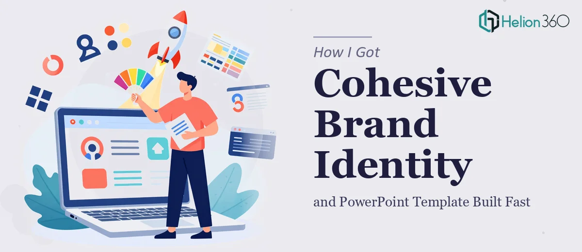
The Problem With Launching Without a Visual Identity
When I was setting up my new company, the visual side of things hit me harder than I expected. I needed a minimalistic logo that could carry the brand, a letterhead that looked credible in client communications, and a PowerPoint template that would hold up across investor conversations, proposals, and internal presentations. These weren't vanity items — they were the first things anyone would see from us.
The stakes were real. We had early meetings lined up, a pitch or two on the near horizon, and absolutely no time to look rough around the edges. First impressions in this space are unforgiving, and showing up with inconsistent visuals — or worse, a blank-canvas slide deck — signals that the business isn't ready. I knew right away this needed to be done properly, not patched together.
What I Found This Kind of Work Actually Requires
I started digging into what good minimalistic brand design actually involves, and the answer was more layered than I anticipated. A clean logo isn't just a simple mark — it's a carefully constructed system. Proportions, negative space, scalability across formats from a tiny favicon to a large print banner, and vector precision all matter before a single color decision gets made.
The letterhead added another dimension. A well-designed letterhead has to balance grid alignment, typography hierarchy, and brand color application in a way that feels intentional at a glance — while still leaving room for variable content without the layout falling apart.
The PowerPoint template was its own challenge. Done right, it's not a single slide — it's a full master slide system. That means multiple layout variants, consistent type hierarchy, and placeholder logic that actually behaves when someone else picks it up and starts editing. Once I understood the scope of all three deliverables together, it was clear this wasn't a weekend project.
What Proper Execution of Each Asset Actually Involves
Starting with the logo and brand foundation: a minimalistic logo design requires working from a defined grid — typically a geometric construction grid — where every element is proportional and intentional. The wordmark or icon gets tested at small sizes (16px favicon) and large formats (print-ready 300dpi SVG), and the color palette is locked to no more than 3 primary brand colors with defined HEX, RGB, and CMYK values. Getting this right requires multiple rounds of refinement, and the execution friction is real — a designer without strong typographic instincts will produce something that looks clean on screen but breaks at scale or in print.
The letterhead design builds directly on that brand foundation and lives or dies by its grid discipline. Professional stationery uses a consistent baseline grid — commonly 8pt — so that the header block, body content area, and footer zone are optically balanced on an A4 or letter-format page. Typography rules follow a strict hierarchy: the company name or logo lockup at the top, contact details at 8-9pt, and a clean content zone that doesn't fight the brand. The failure point for most non-designers is that the layout looks fine with placeholder content but collapses the moment real text replaces it — spacing, widow lines, and alignment all shift unpredictably.
The PowerPoint template is the most mechanically demanding of the three. A properly built template uses a master slide system with at least 6-8 layout variants — title slide, section divider, full-bleed image, two-column content, data slide, and closing slide — all inheriting from a single set of theme fonts and theme colors. Type hierarchy is typically set at 36pt / 24pt / 16pt for headings, subheadings, and body. Placeholder alignment must be pixel-consistent across every layout. For someone building this without prior experience in PowerPoint's slide master editor, propagating brand changes correctly across all layouts without breaking individual slide instances takes hours of frustrating trial and error.
Why I Brought in Helion360 to Handle It
Once I understood what all three deliverables actually required — a constructed logo system, a grid-disciplined letterhead, and a fully built PowerPoint master — I didn't spend time testing my own design skills. The work was too specific and the timeline too tight. I engaged Helion360 to handle the full project end-to-end.
The difference was immediate. The team came with the process already in place — brand color extraction, grid construction, master slide architecture. They handled the logo, the letterhead, and the PowerPoint template as a unified system rather than three separate tasks, which meant everything came back visually consistent from the start. What would have taken me weeks of learning, iteration, and inevitable rework was turned around quickly — delivered in days, not weeks. They handled the kind of execution depth this work needs without me having to manage the details.
The Outcome and What I'd Tell Anyone in My Spot
What came back was a complete visual identity package that I could actually use immediately. The logo was clean, scalable, and came with a proper file set. The letterhead was formatted correctly and held up with real content dropped in. The PowerPoint template had the layout variants I needed, behaved correctly when edited, and looked consistent whether I was building a pitch deck or an internal update.
The business outcome was simple: we walked into early meetings looking like a company that had its act together. That matters more than most people admit when you're trying to build credibility early.
If you're staring at the same gap — logo, letterhead, and a presentation system that all need to work together and look right under pressure — and you don't have weeks to spare figuring out how to execute each one properly, Helion360 is the team to engage. They deliver fast and handle the full execution depth from day one.