

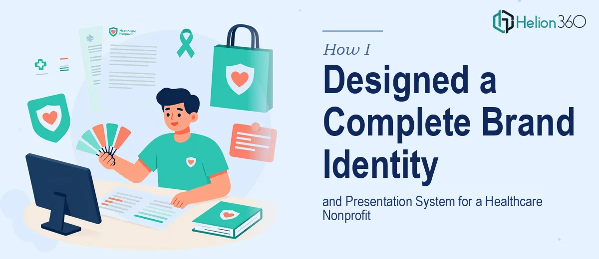
When a Nonprofit Needs More Than a Logo
I was brought on to help a small but growing healthcare nonprofit get their visual identity in order. Their mission was clear — improving health literacy in underserved communities — but their brand told a different story. Their materials were inconsistent, their PowerPoint presentations looked like they were assembled in a hurry, and there was no coherent visual system holding any of it together.
The ask sounded manageable at first: design a logo, clean up the slide decks, and create some digital materials they could use for outreach and donor communication. I figured a few weeks of focused work would cover it.
I was wrong about the scope.
The Real Challenge of Building a Brand from Scratch
Once I started pulling the threads, I realized there was no foundation to build on. There was no defined color palette, no typography standards, no logo that worked across formats — just a wordmark someone had made years ago in a free online tool. The PowerPoint files were a mix of at least three different visual styles, none of which matched the organization's tone or sector.
For the healthcare space specifically, branding carries more weight than in other industries. The visuals need to communicate trust, clarity, and purpose all at once. Getting that balance wrong — too corporate, too clinical, too casual — can undermine the credibility the organization is trying to build.
I handled the early strategy work: defining the brand voice, researching visual conventions in the nonprofit healthcare space, and sketching a rough direction. But when it came to executing the full brand identity system and rebuilding the presentation templates from the ground up simultaneously, I hit my limit. The volume and technical precision required were beyond what I could deliver alone within the timeline.
Bringing in the Right Team
After hitting that wall, I came across Helion360. I laid out the full picture — the nonprofit's mission, the existing brand chaos, what we needed to produce, and the deadline. Their team asked sharp questions and came back with a clear plan.
They took on both workstreams in parallel. On the branding side, they developed a complete visual brand system — logo variants, color system, typography, and a brand guidelines document the organization could actually use going forward. Everything was designed with accessibility and print-readiness in mind, which matters when materials are going to community health fairs and grant applications alike.
On the presentation side, they rebuilt the PowerPoint template from scratch. The new deck system included a master template with multiple layout options, icon libraries, and slide structures suited to different use cases — program overviews, impact reports, and stakeholder briefings. The visual language across both the brand and the slides was consistent, which was exactly what had been missing.
What the Finished System Looked Like
The final deliverables covered more ground than I initially expected. The brand identity package gave the organization a professional foundation they could apply consistently across every touchpoint — from their email signature to printed flyers. The PowerPoint presentation system gave their team a set of tools they could actually use without a designer's help each time.
What struck me most was how much the visual storytelling improved once the brand language was clear. The slides stopped looking like a collection of facts and started reading like a coherent narrative. Donors and program officers could follow the organization's story without working hard to piece it together.
Helion360 also delivered everything in editable formats with clear documentation, which meant the nonprofit's internal team could update content going forward without breaking the design.
What I Took Away from This Project
Building a brand identity and a presentation system at the same time, for a healthcare nonprofit with limited resources and a specific community it serves, is genuinely complex work. It requires both creative precision and an understanding of how the materials will actually be used in the field.
I learned that the design decisions made at the brand level directly affect how usable and credible the presentation materials feel. When both are built together by a team that understands the connection, the result is a system — not just a set of files.
If you're in a similar position — managing a nonprofit project where the brand and the presentation design need to be built together and built right — Helion360 is worth reaching out to. They handled the complexity I couldn't manage alone, and the organization walked away with something they'll actually use.