

When Spreadsheets Stop Working and the Stakes Get Higher
I joined a fast-moving startup as the person responsible for keeping several projects on track simultaneously. Early on, I thought the setup was manageable — a shared spreadsheet here, a status email there, a quick update call on Fridays. But within a few weeks, that approach started showing its cracks.
Each project had its own pace, its own risks, and its own set of stakeholders who needed accurate, timely information. The spreadsheets were always a version behind. The email threads were impossible to follow. And the Friday calls were turning into confusion sessions rather than actual progress reviews.
Something had to change.
Moving to JIRA for Agile Project Tracking
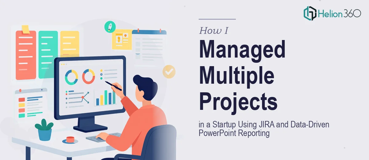
The first real shift came when I pushed the team to consolidate everything into JIRA. As someone familiar with Agile methodologies and Scrum frameworks, I knew JIRA was the right tool — sprint boards, backlog management, issue tracking, milestone dependencies. It brought structure to what had been a chaotic multi-project environment.
Once JIRA was set up properly, the internal picture became much clearer. The development team could track their own work. I could monitor blockers, flag risks early, and run meaningful sprint reviews. The project management side of things was largely under control.
But the stakeholder communication side was a different problem entirely.
The Reporting Gap No One Talks About
Here is the issue with JIRA: it is built for the people doing the work, not necessarily for the people funding or approving it. When leadership asked for a project status update, handing them a JIRA board link was not the answer. They needed a clear, visual summary — what was on track, what was at risk, what decisions were needed.
I started building PowerPoint reports manually. I would pull data from JIRA, copy numbers into slides, create bar charts, update milestone timelines, and write risk summaries. Doing this across four active projects every week became a serious time drain. The slides were functional, but they were not polished enough for executive-level presentations. The formatting was inconsistent, the data visualization was basic, and honestly, the decks did not reflect the quality of the work happening underneath them.
I tried applying PowerPoint templates and reworking the layouts myself, but design is not my core skill. I was spending hours on formatting that should have taken minutes, and the output still did not look the way I wanted it to.
Bringing in the Right Support
After a particularly long evening trying to get a project dashboard slide to look right, I reached out to Helion360. I explained what I needed — a repeatable PowerPoint reporting system that could translate JIRA-sourced project data into clean, executive-ready slides covering sprint progress, milestone tracking, risk status, and key decisions.
Their team took the brief seriously. They asked the right questions about the audience, the frequency of updates, the types of data I was pulling, and the tone the leadership team expected. Then they got to work.
What came back was a structured slide deck template built specifically around project management reporting. It had a clear sprint summary layout, a visual milestone tracker, a risk matrix section, and a dedicated slide for stakeholder decisions. Everything was formatted consistently, color-coded by project status, and designed to work across multiple projects with minimal editing on my end.
What Changed After the Reporting System Was in Place
The difference was immediate. My weekly reporting time dropped significantly. More importantly, the leadership team's response to the updates changed. Instead of follow-up questions asking for clarification, I was getting faster sign-offs and more focused discussions about the actual project decisions that mattered.
The data-driven PowerPoint reports built credibility. They showed that the projects were being managed with rigor, not just tracked loosely. And because the slide structure was repeatable, I could update them in a fraction of the time it used to take.
Helion360 also made a small but useful suggestion — building a master slide version with placeholder sections that I could duplicate per project. That single piece of advice saved hours across the full reporting cycle.
If you are managing multiple projects in an Agile environment and struggling to turn your JIRA data into clear stakeholder presentations, Helion360 is worth talking to — they understood the operational context, not just the design brief, and delivered something I could actually use every week.
For teams looking to streamline how they track progress across initiatives, a Project Management Dashboard can centralize your data and eliminate manual reporting entirely. If you're interested in learning how others have tackled similar challenges, check out this guide on automated project management systems, or explore how to build an integrated reporting dashboard that connects all your tools.