

The Brief Sounded Simple Enough
When the task landed on my plate, it seemed straightforward: put together a company presentation that covered recent milestones, current projects, and upcoming initiatives. Something that would work equally well in a boardroom and in a stakeholder email. Professional, polished, and built to impress.
I had the content. I had the data. I even had a rough structure in my head. What I did not have was a clear way to make it all hang together visually and tell a coherent story from slide one to the last.
Where the Real Work Begins
I started in PowerPoint, pulling together an outline. The introduction came together quickly. A few slides on recent achievements, some bullet points on current project progress, and a forward-looking section on upcoming initiatives. On paper, it covered everything.
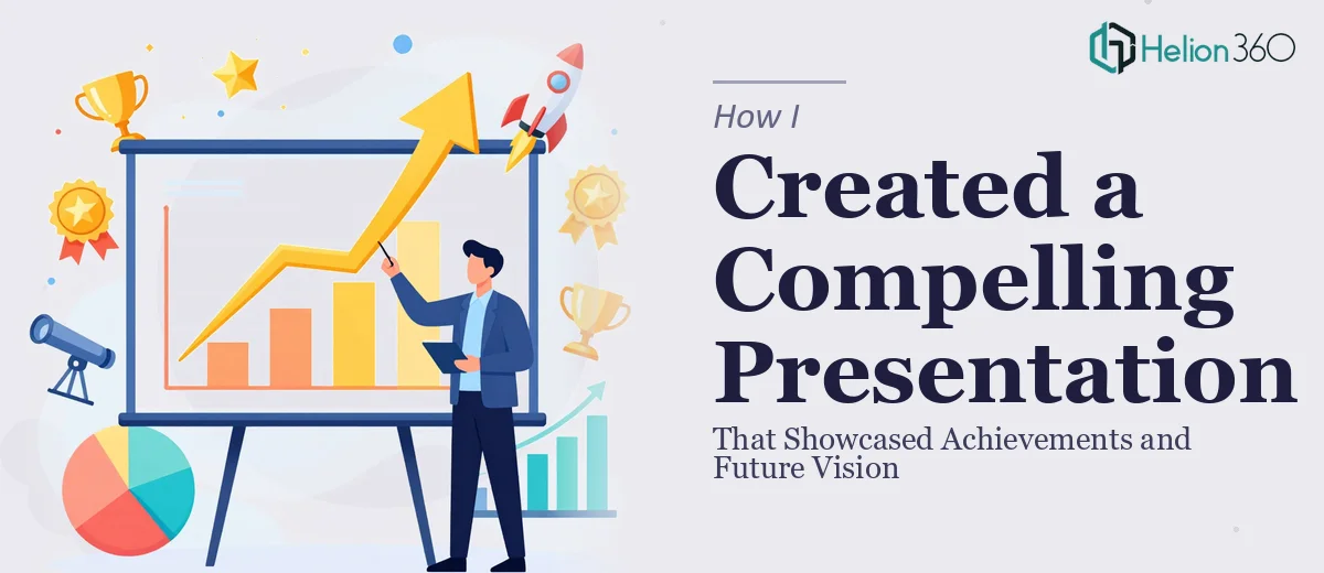
But when I looked at the actual slides, they felt flat. The content was there, but the presentation design was not doing the material justice. Charts looked generic. The layout was inconsistent slide to slide. And the section on future vision — which should have felt inspiring — read more like a quarterly report.
The problem was not the information. It was the structure, the visual hierarchy, and the storytelling. A company presentation needs to do more than inform. It needs to build momentum, guide the audience through a narrative, and leave them with a clear sense of where the company is headed and why that matters.
I spent a few evenings trying to fix the slide design myself — adjusting layouts, swapping fonts, rebuilding charts. But every time I improved one section, something else looked off. I was spending more time wrestling with formatting than thinking about the actual message.
Bringing in the Right Help
After hitting that wall, I came across Helion360. I reached out, explained what I was working on, and shared the draft deck along with the content brief. Their team asked the right questions upfront — about the audience, the tone, how the presentation would be delivered, and what the most important takeaway should be.
That conversation alone changed how I was thinking about the structure. They were not just going to redesign the slides. They were going to help rebuild the flow so the presentation actually worked as a narrative.
What the Final Deck Looked Like
Helion360 reworked the deck from the ground up while keeping all the core content intact. The introduction was restructured to set context immediately rather than easing in slowly. The achievements section used clean data visualization — charts and milestone graphics that communicated progress at a glance without needing a paragraph of explanation.
The current projects section was laid out as a visual roadmap, which made it easy to see progress and interdependencies without overwhelming the viewer. And the future vision section — the one I had struggled with most — was rebuilt with a cleaner narrative arc, stronger visual hierarchy, and a conclusion that actually felt like a destination rather than a trailing thought.
The slide design throughout was consistent, professional, and on-brand. Nothing overly decorative, but everything had visual purpose.
What I Took Away From This
Building a modern PowerPoint presentation that covers achievements and future strategy is not just a design task. It is a communication challenge. The structure needs to carry the audience forward, and the visuals need to reinforce the message rather than just decorate it.
I could handle the content side of that equation. Where I needed support was in translating dense information into a clear, visually driven story. That is a specific skill set, and trying to approximate it without the right tools or experience costs more time than it saves.
The final deck was presented internally and received well. More importantly, it actually represented the company's work and ambitions in a way the original draft had not.
If you are working on a similar company presentation and find that the content is strong but the deck is not landing the way you want, Helion360 is worth reaching out to — they took a solid-but-flat draft and turned it into something that actually communicated what needed to be said.