

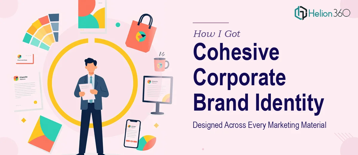
The Problem I Was Staring Down
We had a corporate presence that looked like it had been assembled by five different people in five different years — because it had been. Our presentation deck didn't match the brochure, the brochure didn't match the pitch materials, and none of it reflected the direction the company had actually moved in. That inconsistency was starting to cost us. Every time we showed up in a room with a prospect or a partner, our materials told a fragmented story before we even opened our mouths.
The stakes were real. We had a series of client meetings coming up, a couple of industry events on the calendar, and leadership had made it clear that the brand needed to show up consistently and professionally across every touchpoint. This wasn't a "tighten up the fonts" situation. The entire visual identity needed to be rebuilt and applied coherently across a suite of corporate materials. I knew immediately this needed to be done right — not patched together.
What I Found the Work Actually Required
I started looking into what a proper corporate brand identity design project actually involves, and it became clear quickly that this was not a one-tool, one-afternoon problem. The scope alone was significant: brand guidelines, a presentation deck, brochures, and supporting marketing collateral — all needing to speak the same visual language.
Three things stood out as signals of real complexity. First, a cohesive brand identity isn't just a logo and a color — it's a full system of rules governing typography, spacing, color usage, iconography, and photography style that has to hold up across wildly different formats. A brochure and a presentation slide have completely different spatial logic, and making them feel like siblings rather than strangers requires deliberate, disciplined design decisions. Second, the storytelling layer matters enormously in corporate materials. Visual design without a clear narrative architecture produces beautiful noise. Third, the tooling required — working fluently across Adobe Creative Suite for print-ready brochures while simultaneously managing master slides and style guides for presentations — is a specialized cross-discipline skill set that most generalists don't carry cleanly.
What the Work Actually Involves
The right approach to corporate brand identity design starts with an audit of everything that exists and a clear brief about where the brand is going. That means defining the brand's visual personality — not in abstract adjectives, but in concrete decisions: a primary typeface with a strict 3-level hierarchy (typically 36pt/24pt/16pt for headings, subheadings, and body), a palette capped at 4 brand colors with defined primary and accent roles, and a grid system — usually a 12-column layout — that governs how elements sit on every page and slide. Getting these decisions right at the foundation stage is where most in-house attempts fall apart, because without locked-down rules, every new material drifts.
Visual mechanics across different material formats add a serious layer of execution complexity. A corporate presentation deck has to work at 16:9 widescreen with a master slide system where every layout variant inherits font, color, and spacing from a single source. A brochure operates at A4 or letter with bleed, trim marks, and CMYK color profiles — a completely different production discipline. Moving fluently between these environments requires knowing when a color defined as HEX for screen needs a CMYK equivalent for print, and understanding that the same design rule produces different visual results in each format. That translation work is detailed, slow, and unforgiving — a missed bleed or an RGB-only asset can send a print file back from the vendor.
Polish and consistency across the full suite is where the real time sink lives. Once the core brand system is established and the individual materials are designed, every single asset has to be audited for compliance: heading weights, icon stroke widths, margin consistency, photo treatment uniformity, and footer logic. On a project spanning a presentation deck, a multi-page brochure, and additional marketing collateral, that final consistency pass alone can take days. Edge cases multiply — a pull-quote box that works on a light background breaks on a dark one, a logo placement rule that works on a slide doesn't translate cleanly to a tri-fold panel.
Why I Brought in Helion360 to Handle It
I didn't sit down and try to work through this myself. Looking at the scope — a full brand system, a corporate presentation, brochures, and supporting materials, all needing to be production-ready and visually unified — it was clear that the right move was to engage a team that does exactly this kind of work every day.
Helion360 handled the project end-to-end: brand system definition, presentation deck design with a fully structured master slide set, and brochure and collateral design built to the same visual standards. They turned it around quickly — done in days, not weeks — which mattered because the first client meeting wasn't moving. What made the engagement straightforward was that the tooling, the cross-format expertise, and the consistency discipline were already built into how they work. There was no ramp-up time, no back-and-forth on basics. The brief went in, the work came back cohesive and polished.
The Outcome and What I'd Tell Anyone in My Spot
What came back was a brand system that actually held together — a presentation deck, a brochure suite, and supporting materials that looked like they came from the same organization with the same clear point of view. The meetings went better. The materials stopped being a liability and started doing the job they were supposed to do: reinforcing credibility before anyone had said a word.
If you're looking at a fragmented corporate identity and a tight deadline, and you can see the scope of what a proper solution actually involves, don't spend weeks trying to learn and execute it yourself. Helion360 is the team I'd engage — they delivered fast, handled every layer of the work end-to-end, and brought the kind of cross-format production discipline this type of project genuinely requires.