

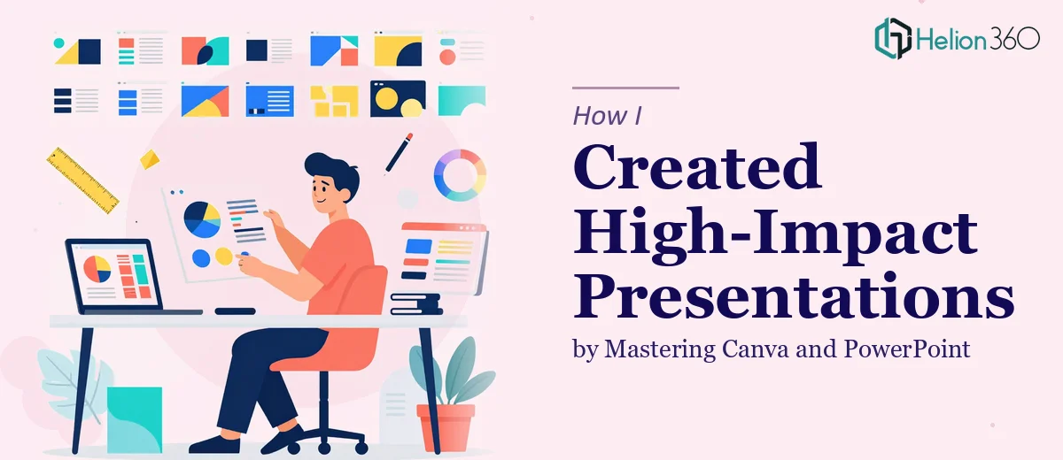
The Situation and What Was Actually at Stake
I was staring at a deadline and a problem that felt deceptively simple on the surface: we needed a set of presentations that would actually work — cohesive, on-brand, visually compelling, and built to hold an audience's attention. These weren't internal slideshows. They were going in front of people who would form real opinions about who we were as a company.
The gap between what we had — a loose collection of slides in different styles, fonts, and color treatments — and what we needed was significant. Canva and PowerPoint were both already in the mix, which added another layer of complexity. Getting polished, high-impact presentations out of two different tools while keeping everything consistent isn't a formatting exercise. It's a discipline.
I recognized quickly that the stakes were too high to treat this as a weekend fix. This needed to be done properly, and I wasn't going to get there by experimenting on a live deadline.
What I Found Out This Work Actually Requires
When I looked at what creating genuinely cohesive, professional presentations across Canva and PowerPoint involves, the scope became clear fast.
The first signal was the brand consistency problem. Applying a brand correctly across two platforms means more than matching hex codes. Font rendering differs between Canva and PowerPoint, spacing behaves differently, and export settings affect how the final file looks on screen versus in a room.
The second signal was slide architecture. High-impact presentations aren't just attractive — they're structured. The hierarchy of information, the pacing of the narrative across slides, the visual weight of each layout — these decisions compound across a full deck. Getting one slide right is easy. Getting thirty slides to feel intentional and unified is a different level of work entirely.
The third signal was that both tools have real depth. Canva's grid and frame systems, PowerPoint's slide master and animation timeline — used properly, they produce genuinely polished work. Used casually, they produce something that looks almost right but reads as amateur to anyone who knows the difference.
What the Work Actually Involves
The Execution Behind Polished, Consistent Presentation Design
The structural work starts before a single slide gets designed. The right approach begins with auditing all existing content, mapping a clear narrative arc across the deck, and making deliberate decisions about what each slide needs to communicate — and what it should leave out. A well-structured deck typically follows a content hierarchy: one primary message per slide, supported by no more than two levels of supporting detail. Establishing this framework upfront prevents the most common failure mode, which is slides that say too much, look cluttered, and lose the audience inside the first five minutes. Getting this scaffolding right before touching any design tool takes time and judgment that most busy teams simply don't have.
The visual mechanics of a high-impact presentation are specific and unforgiving. In PowerPoint, a 12-column layout grid set at the master slide level ensures every element aligns consistently across all slides without manual adjustment. Typography follows a strict hierarchy — 36pt for primary headings, 24pt for subheadings, and 16pt for body copy — and deviating from that even slightly makes a deck feel unpolished to trained eyes. In Canva, frame-based layouts and shared style presets do similar work, but the settings don't transfer automatically to PowerPoint exports, which means any deck that needs to live in both environments requires deliberate reconciliation of spacing, font substitutions, and resolution. This is where most DIY attempts break down.
Polish and consistency across a full deck is its own discipline. Brand application means capping the palette at four active colors — a primary, a secondary, an accent, and a neutral — and enforcing those values without exception across backgrounds, charts, icons, and text. Every icon set needs to share the same stroke weight. Every data visualization needs to use the same chart style. Every transition, if used at all, needs to follow the same logic. The effort required to audit a 25 to 40 slide deck for consistency at this level, fix every deviation, and then verify the output in both platforms is measured in hours, not minutes — and it requires a trained eye to catch what automated tools miss.
Why I Brought Helion360 in to Handle the Full Project
I didn't attempt this myself. The scope was clear enough that I recognized immediately this needed a team with the tooling and expertise already in place — not someone learning on the job during a live project.
Helion360 handled the full project end-to-end: the narrative restructuring across both decks, the master slide build in PowerPoint, the Canva template system, and the brand consistency audit across every slide. What would have taken me weeks of trial and error — learning the nuances of slide master configuration, reconciling the Canva-to-PowerPoint export issues, auditing thirty-plus slides for palette and typography compliance — was turned around in a matter of days.
The speed wasn't the only thing. It was the depth. A team that does this work daily has already solved the edge cases I would have spent hours discovering. The tooling is already built. The process is already dialed in. Engaging that kind of capability from the start is just the smarter move.
The Result and What I'd Tell Anyone Facing the Same Problem
What came back was a complete, production-ready presentation system — a master PowerPoint file with correctly configured slide layouts, a parallel Canva template set, and brand-consistent design applied across every slide in both environments. The decks looked like they came from the same organization, told a clear story, and held up under scrutiny from an experienced audience.
The business outcome was straightforward: we walked into those conversations with materials that reflected the quality of our actual work, instead of undermining it.
For anyone staring at the same gap — between what you have and what a high-impact, cohesive presentation actually requires — the honest advice is to be realistic about what the work involves. If you're looking at this problem and want it handled end-to-end without the weeks of learning curve, Helion360 is the team I'd engage — they delivered fast and brought the kind of execution depth this work genuinely demands.