

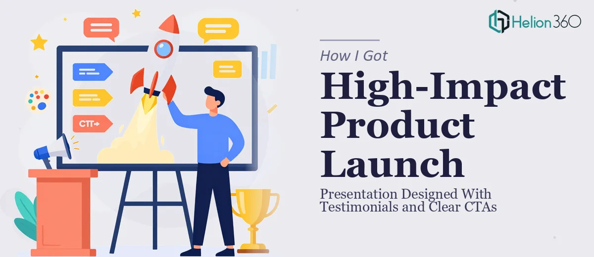
The Presentation That Couldn't Afford to Be Average
We had a product launch coming up fast — the kind that had been in the pipeline for months and had real visibility internally and externally. The deck needed to introduce the product clearly, back it up with social proof, and move the audience toward a specific action. Not just inform. Convert.
The stakes were straightforward: this presentation would be seen by prospects, partners, and stakeholders who were evaluating whether to engage further. A flat, poorly structured deck wouldn't just underperform — it would actively work against the credibility we'd spent months building. I knew immediately this wasn't something to patch together over a weekend.
What I Found a Product Launch Presentation Actually Requires
Once I started researching what a well-executed product launch presentation actually looks like, the scope became clear fast. This wasn't a matter of dropping content onto a template and calling it done.
The first thing I noticed was that testimonial integration is its own design problem. Pulling a quote and pasting it onto a slide is easy. Building a testimonial block that feels credible, visually balanced, and tonally consistent with the rest of the deck is a different task entirely — it requires decisions about hierarchy, attribution format, and how much visual weight the quote should carry relative to surrounding content.
The second signal was CTA placement. A product launch deck typically needs multiple moments of directed action — not just a closing slide. Getting those CTAs to land without feeling pushy or interrupting the narrative flow requires a deliberate structural approach that most people don't think about until the deck already feels off.
The third thing I recognized was that visual consistency across a multi-section deck — problem, solution, proof, call to action — is harder to maintain than it looks. Every section has different content demands, and keeping the design language coherent throughout takes real discipline.
What the Work Actually Involves
The right approach to a product launch presentation starts with narrative architecture. Before any visual work begins, the content needs to be mapped as a persuasion sequence: problem framing, solution positioning, proof layer, and directed action. Each section has a job, and the transitions between them need to feel earned rather than mechanical. Practitioners working on this kind of deck typically structure it around a 6-to-10-slide core arc, with supporting slides added only where the argument needs reinforcement. Getting that structure wrong means the design work that follows is built on a shaky foundation — and no amount of polish fixes a deck that doesn't flow logically.
Visual mechanics are where the execution complexity really shows up. A well-designed product launch deck uses a consistent typographic hierarchy — typically three levels: headline at 36pt or above, supporting text around 22-24pt, and caption or attribution text around 14-16pt. Layout decisions follow a grid discipline, often a 12-column structure, that keeps slide compositions from feeling arbitrary. Testimonial blocks specifically require careful handling: the quote, attribution name, title, and any accompanying image or logo need to sit in a spatial relationship that reads as intentional. This kind of precision takes time to set up correctly, and it has to propagate reliably across every slide variant in the deck.
Polish and brand consistency across the full deck is the third layer, and it's the one that most often slips when someone is working under time pressure. A product launch presentation typically uses a restrained palette — no more than 4 brand colors with defined roles for background, primary text, accent, and CTA highlight. Applying that palette consistently across section dividers, icon treatments, testimonial frames, and CTA buttons requires a level of discipline that's easy to describe and genuinely tedious to execute. A single inconsistency in button color or heading weight across 20 slides reads as unprofessional to an audience that may not be able to name what's wrong but will feel it.
Why I Brought in Helion360 to Handle It
Looking at the scope — narrative structure, visual system, testimonial design, CTA integration, and brand consistency across every slide — it was obvious this needed a team that handles this kind of work regularly, not someone learning the craft on a live project.
Helion360 took on the full project end-to-end. That meant auditing the source content and mapping the story arc, building the visual system from the grid up, designing the testimonial blocks with proper hierarchy and attribution treatment, and placing CTAs at the right structural moments in the deck rather than just bolting one on at the end. The deck was turned around quickly — done in days, not weeks — which mattered given where we were in the launch timeline.
What made the difference wasn't just speed. It was that the team already had the tooling, the design judgment, and the process in place. There was no ramp-up time, no back-and-forth to establish basic conventions. The expertise was already built in.
What the Deck Delivered and What I'd Tell Anyone in My Spot
The finished presentation was structurally sound, visually consistent, and built to do the job it was designed for. The testimonials landed with weight rather than feeling like filler. The CTAs appeared at the right moments and were framed in a way that felt natural rather than forced. Every section of the deck served the core argument without dead slides or padding.
More broadly, what I took away from this project was a clearer picture of how much goes into a data-driven sales presentation done at a professional level — and how quickly that scope exceeds what most people can realistically execute well under time pressure. The narrative work alone takes hours when done properly. The visual system work takes more. Getting both right simultaneously, under a deadline, requires a team that does this every day.
If you're looking at a similar project and want a client sales deck handled end-to-end without the weeks of learning curve, Helion360 is the team I'd engage — they delivered fast and brought the kind of execution depth this work genuinely needs.