

The Problem With Presenting a Brand That Is Still Finding Its Voice
When you are part of a fast-growing tech startup, almost everything moves quickly — product updates, team expansions, investor conversations. What often lags behind is the visual layer: the presentations, the slide templates, the branded assets that are supposed to tell the company's story in a consistent, professional way.
That was exactly the situation I was navigating. We had solid content, a clear product vision, and a marketing team working hard to communicate our value. But every time someone opened a new deck, it looked different from the last one. Fonts shifted. Colors drifted. Slide layouts had no real system behind them. The company was growing, but our presentation design was not keeping up.
Why I Decided to Build a Template System
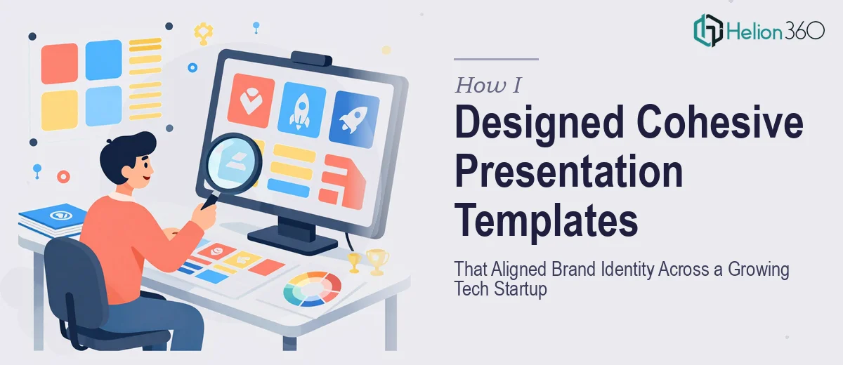
I started by trying to fix this myself. I pulled together our brand guidelines — which, frankly, were only half-documented — and attempted to build a master slide template in PowerPoint. I spent time standardizing the color palette, picking fonts that matched our brand tone, and building out layout options for different slide types: title slides, data slides, team bios, product feature pages.
The early versions were functional, but something was always slightly off. The spacing felt inconsistent. The infographic slides looked amateur next to the cleaner text layouts. When I tried to create charts and data visualizations that matched the overall design language, they ended up looking like they came from a different deck entirely. And every round of feedback from stakeholders meant going back and reworking things I thought were already resolved.
I also realized the scope was larger than a template fix. We needed a scalable system — one that different team members could use without breaking the visual consistency every time they added a new slide.
Bringing in Outside Help at the Right Moment
After a few weeks of iteration with diminishing returns, I reached out to Helion360. I explained where we were: partial brand guidelines, a rough template that needed professional refinement, and a need for multiple presentation formats that all had to feel like they came from the same company.
Their team took a structured approach from the start. They reviewed the existing brand assets, asked the right questions about our audience and use cases, and came back with a clear plan for building a full company presentation design system — not just a single template, but a set of master slides covering every scenario we regularly needed.
What the Design Process Actually Looked Like
Helion360 worked through the project in stages. First, they locked in the visual foundation: typography hierarchy, color usage rules, spacing and grid systems. This alone resolved most of the inconsistency issues we had been battling.
From there, they built out slide layouts for each presentation type we used — internal team updates, product demos, investor-facing decks, and marketing overviews. Each layout was designed to hold different content volumes without breaking. The data visualization slides, which had been my biggest struggle, came back polished and fully integrated with the rest of the design system.
They also created a simple usage guide so that anyone on the team could open the templates and produce a brand-consistent deck without needing a designer on call for every update.
What Changed After the Templates Were In Place
The difference was immediate and practical. Decks that used to take hours of back-and-forth to align visually now came together in a fraction of the time. The feedback from stakeholders shifted from "can you fix the formatting" to actually focusing on the content itself — which is exactly where attention should be.
More importantly, the brand started to look like a single, coherent company across every presentation format. Whether someone was pitching to an investor or walking through a product update internally, the visual language was the same. That consistency built credibility in ways that are hard to quantify but easy to notice.
Building a company presentation design system is one of those projects that looks straightforward until you are actually inside it. The design decisions compound quickly, and without a clear system behind the work, you end up constantly patching instead of building. If you are at that point — where the presentations work but the brand identity is not holding together across formats — Helion360 is worth a conversation. They handled the complexity that had been slowing us down and delivered something the whole team could actually use.