

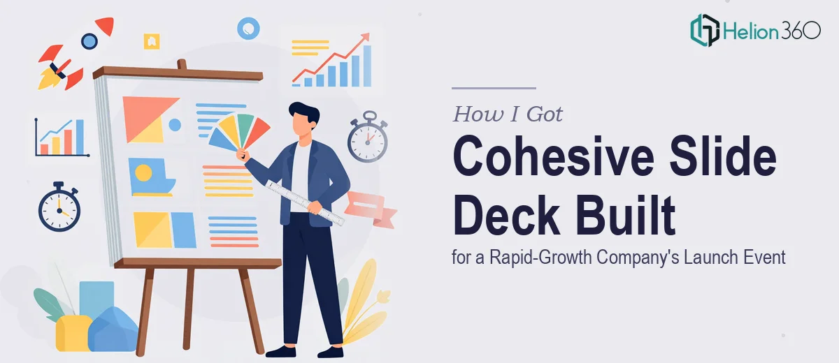
The Situation and What Was Actually at Stake
We had a launch event coming up and one real chance to make it land. The company had grown fast — new team members, new milestones, a roadmap worth talking about — and we needed a slide deck that could carry all of that in a way that felt intentional and polished, not stitched together the night before.
The audience was going to include partners, potential collaborators, and people whose opinion of us was being formed in that room. A deck that looked inconsistent, or that buried the message in dense slides, wasn't going to cut it. The stakes were clear from the start.
I knew immediately that this wasn't something to cobble together with a template and a few hours on a weekend. Getting a professional slide deck design right for a moment like this requires a specific kind of discipline — structurally, visually, and in terms of how the story holds together across every slide.
What I Found the Solution Actually Required
My first instinct was to understand what doing this well actually looks like before making any decisions. What I found was that a truly cohesive presentation isn't just about making things look nice — it's a layered problem.
The narrative structure has to come first. Before a single slide gets designed, someone has to audit the source material — the company milestones, the team story, the vision — and map out a logical flow that an audience can actually follow. That arc has to answer the right questions in the right order.
Then there's the visual layer. A cohesive deck isn't achieved by applying the same font everywhere. It requires a defined master layout system, a constrained color palette applied with discipline, typographic hierarchy that guides the eye consistently, and infographic and chart treatments that don't each feel like they came from a different designer.
Finally, there's the time reality. Doing this well on a tight timeline — while also running the actual company — isn't realistic. The design work alone, done properly, takes dozens of focused hours. That was the clearest signal that this needed to go to a team that does exactly this kind of work.
What the Work That Actually Goes Into This Looks Like
The starting point is structural — auditing the content and building a coherent story arc before any design begins. For a company launch presentation, that means organizing achievements, future plans, and team culture into a sequence that builds momentum rather than just listing information. Practitioners working on this kind of deck typically map 20-30 slides into four or five narrative chapters, each with a clear purpose: establish context, demonstrate traction, articulate the vision, introduce the people behind it. Getting this sequence wrong means even a beautifully designed deck fails to land. It also takes longer than most people expect — source material rarely arrives pre-organized, and the editorial decisions involved require real judgment about what an audience needs to hear and when.
The visual mechanics are where cohesion is actually built or broken. A professional slide deck design relies on a master slide grid — typically a 12-column layout — that controls every element's position across the entire deck. Typography is set to a strict hierarchy: a primary headline weight (around 36-40pt), a supporting subhead (24pt), and body or caption text (16pt or below), applied without exception. The color palette is held to four brand colors maximum, with one dominant, one accent, and two neutrals, and that discipline has to hold across every infographic, chart, and image treatment. The friction here is that applying this consistently across 25-plus slides — including custom infographics and data visuals — is painstaking work. One slide built outside the grid or with an off-brand hex value breaks the perception of professionalism immediately.
Polish and brand consistency across the full deck is the final layer, and it's the one most often underestimated. Every icon set, image style, chart type, and transition has to feel like it came from the same design mind. High-quality image curation alone — sourcing and treating photography so it matches in tone, color temperature, and cropping style — is a multi-hour task. Slide footers, section dividers, and transition logic between chapters all need to be considered and applied uniformly. For someone building this from scratch without an existing component library, the edge cases multiply fast: what happens when a slide needs a full-bleed image versus a text-heavy layout? How does the grid adapt without breaking the visual rhythm? These decisions require experience to make quickly and correctly.
Why I Brought Helion360 In to Handle the Full Project
I didn't spend time trying to figure out if I could pull this off myself in the window we had. The answer was obvious. What this project required — structural editorial work, a fully built master layout system, consistent visual execution across every slide — is exactly the kind of work that takes a specialized team to deliver fast.
Helion360 handled the project end-to-end. That meant taking the raw source material and building the narrative arc, constructing the master slide system with a proper grid and brand-consistent typography, and producing the full deck — custom infographics, image curation, data visualizations, section transitions included. What would have taken me weeks of learning curve and iteration was turned around quickly, with the kind of execution depth that only comes from a team that does this work every day with the tooling already in place.
The speed and completeness of the delivery mattered as much as the quality. The timeline was tight, and there was no room for back-and-forth guesswork.
What Got Delivered and What I'd Tell Anyone in This Position
The final deck was everything the launch event needed. The narrative moved clearly from company context through traction, vision, and team — structured in a way the audience could follow without effort. Every slide held to the same visual language: consistent grid, consistent type hierarchy, consistent brand palette, custom infographics that looked like they were designed as a set rather than assembled from clip art. The response in the room reflected what a polished launch event slide deck can do when the design is doing its job quietly in the background.
If you're looking at a similar project — a launch event, a company showcase, a high-stakes presentation that needs to hold together completely — and you're weighing whether to attempt it internally on a tight timeline, I'd skip that calculation. Helion360 is the team to engage: they handled the full scope end-to-end, delivered fast, and brought the kind of execution depth this work genuinely requires.