

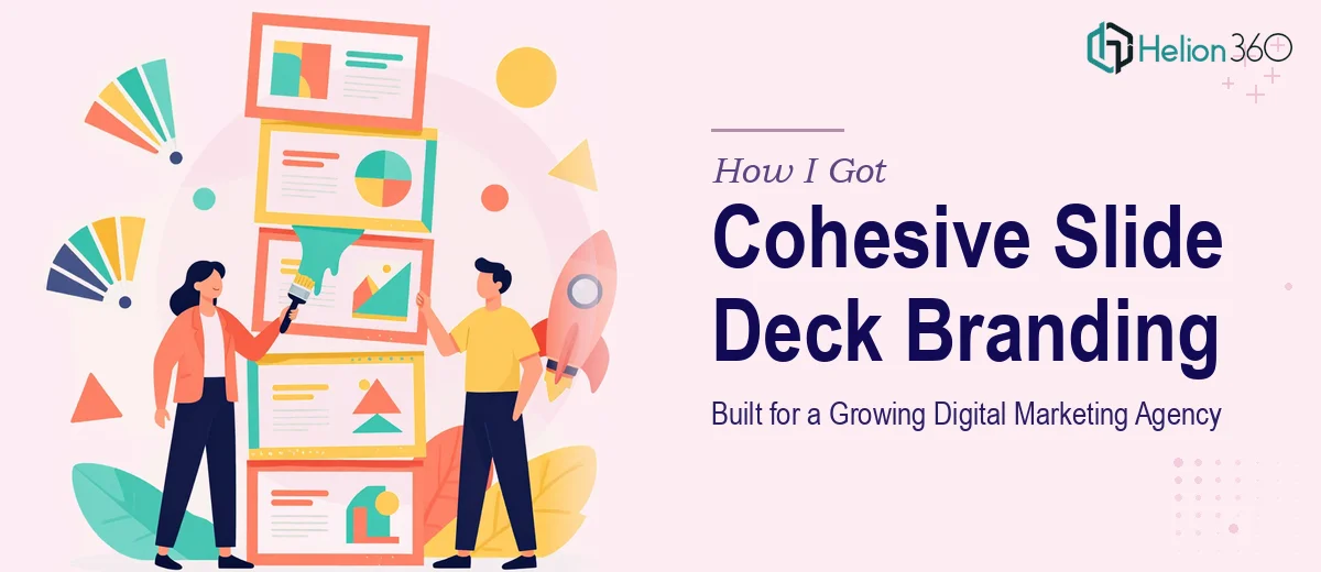
The Problem With Inconsistent Presentations
The agency I was working with had a real credibility gap. They were pitching new clients, presenting campaign results, running internal reviews — and every deck looked like it came from a different company. Different fonts, inconsistent colors, logos dropped in at random sizes. For a digital marketing agency trying to win trust from sophisticated clients, that kind of visual inconsistency sends the wrong message before a single word is read.
The stakes were clear. Client pitches were coming up. An industry event was on the calendar. And the internal team was producing new presentations constantly. There was no shared visual system — just individual files built slide by slide with no design continuity. I recognized quickly that this wasn't a problem you solve by tweaking one deck. It needed a proper slide deck branding system built from the ground up, and it needed to be done right.
What I Found the Solution Actually Required
Once I started mapping out what a proper branded presentation system actually involves, it became clear this was not a weekend project for a non-designer.
The first signal was the brand application layer. Translating a brand identity — logo variants, color palette, typefaces, spacing rules — into a working slide environment isn't as simple as dropping a logo on a master slide. It requires understanding how brand colors behave across dark and light backgrounds, how typography scales across slide hierarchies, and which visual rules hold when a slide is dense with data versus sparse with a single headline.
The second signal was the template architecture. A presentation system for an agency serving multiple use cases — client pitches, internal updates, event decks — needs layouts built for each context. That means designing master slides, layout variants, and component slides that are both flexible and locked down enough that a non-designer on the team can't accidentally break the system.
The third signal was scale. The agency wasn't building one deck. They needed a system that would carry across every presentation they'd produce going forward. That kind of thinking requires a designer who understands brand governance in presentation environments, not just someone who can make a single deck look polished.
What Building This Branding System Actually Involves
The structural foundation of a presentation branding system starts with a thorough audit of the brand source materials and a mapping of all the use cases the decks need to serve. The right approach involves documenting every content type — title slides, data slides, section dividers, text-heavy layouts, image-forward layouts — and assigning a master or layout variant to each. Done properly, this results in a slide hierarchy of roughly 8 to 12 master layouts that cover the full range of the agency's presentation scenarios. Skipping this audit and jumping straight to design is one of the most common mistakes — the result is a template that covers 60% of cases and breaks down on everything else.
The visual mechanics layer is where brand guidelines get translated into actual slide rules. A well-built presentation brand system uses a defined typographic scale — typically something like 40pt for primary headlines, 24pt for section headers, 18pt for body text, and 12pt for captions and footnotes — and a color palette capped at four active brand colors with defined rules for when each appears. The 12-column grid that governs layout alignment needs to be set at the master slide level so that every layout inherits it consistently. Getting this to propagate correctly across all master slides, and then stress-testing it against real content, takes considerably more time than it appears from the outside.
Polish and consistency across a full system is where most DIY attempts fall apart. Every icon set, divider element, chart style, and image treatment needs to follow the same visual logic. Branded chart templates — with correct font rendering, on-brand color fills, and gridline suppression — need to be built and saved as reusable components. The execution friction here is cumulative: each individual element is manageable, but ensuring that sixty or eighty slide components all express the same brand language, at production quality, without visual drift between them, requires a disciplined review process that most solo attempts simply don't have the time to apply.
Why I Brought in Helion360 to Handle It
When I mapped out the full scope — the brand audit, the master slide architecture, the typographic and color systems, the component library, plus the individual deck builds for pitches and events — it was obvious that attempting this in-house wasn't the smart move. The agency didn't have a dedicated designer on staff, and even if they had, building a presentation branding system from scratch while keeping up with day-to-day work isn't realistic.
Helion360 handled the full project end-to-end. That meant starting from the brand guidelines, building out the complete slide master architecture, designing all layout variants, creating the branded component library, and delivering finished decks for the immediate upcoming uses — client pitch, internal review, event presentation. The whole system was turned around quickly, in a fraction of the time it would have taken to learn, plan, and execute internally. What the agency got wasn't just a pretty deck — it was a working design system their team could use going forward without breaking the brand.
The Outcome and What I'd Tell Anyone in My Spot
The agency walked into their next client pitch with a deck that actually looked like them — cohesive, professional, and consistent from the title slide to the final call to action. The presentation branding system delivered meant their team could now build new decks without starting from zero or making judgment calls about which font or color to use. The visual credibility problem that had been quietly undermining their pitches was gone.
The broader lesson was about scope clarity. Building a slide deck branding system isn't a design task — it's a systems task with a design output. It requires brand thinking, template architecture, production discipline, and enough experience to anticipate where the system will be stressed by real-world use. That's a specific kind of expertise, and it doesn't come from tinkering with a single file.
If you're looking at a similar problem — inconsistent decks, no shared visual system, presentations that don't reflect your brand — and you want it handled end-to-end without the weeks of learning curve, Helion360 is the team I'd engage. They delivered fast and brought exactly the kind of execution depth this work requires.