

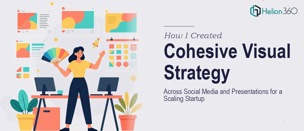
When One Brand Needs to Look Consistent Everywhere
When our startup started picking up momentum, the cracks in our visual identity became impossible to ignore. Our social media posts looked nothing like our internal presentations. Our pitch deck used different fonts than our Instagram graphics. The marketing team was pulling in one direction, and the slides being shared with investors were pulling in another.
I took on the task of fixing this. The goal was straightforward in theory: build a cohesive visual strategy that worked seamlessly across social media content and PowerPoint presentations. In practice, it turned out to be significantly more complex than I had anticipated.
The Problem With Doing It All at Once
I started by auditing everything we had — social posts, story templates, slide decks, banners, and internal update presentations. The inconsistency was real. Different shades of our brand color, mismatched typography, and graphic styles that varied wildly from one asset to the next.
I tried to standardize things on my own. I built a rough brand color palette, set up a few reusable slide layouts in PowerPoint, and sketched out a content template structure for social media. But every time I thought I had a system, a new use case broke it. The slide format that worked for an investor presentation felt stiff and overly formal on social media. The visual language I used for Instagram felt too casual for a company profile deck.
The challenge was not just design — it was logic. Creating a visual strategy that translates fluidly between social media content and professional presentations requires a level of systems thinking that goes beyond making things look nice. I was spending hours on individual assets when what we really needed was a framework.
Bringing in the Right Support
After a few weeks of slow progress and an inbox full of feedback asking for revisions, I reached out to Helion360. I explained the situation — a startup in growth mode, a fragmented visual identity, and a need for both social media design and presentation design that spoke the same visual language.
Their team asked the right questions immediately. What platforms were we posting on? Who was the audience for the presentations — internal teams, investors, or clients? What tone did we want to strike — bold and energetic, or professional and measured? Within a few exchanges, they had enough to begin.
What the Process Actually Looked Like
Helion360 approached the work in a structured way. They started with the brand foundation — locking down a visual system that could flex across both social media and slide formats without losing coherence. Once that was established, they moved into production.
For social media, they developed content templates that were easy to adapt for different post types — announcements, product highlights, engagement posts, and short-form video thumbnails. Each template was built with our brand tone in mind, not just our colors.
For the presentation side, they redesigned our core PowerPoint deck to align with the same visual language. The typography, iconography, and layout logic all echoed what was happening on our social channels — but adapted appropriately for a slide-by-slide storytelling format. Internal update decks, the company profile, and our marketing campaign presentations all got brought into the same system.
The result was a visual identity that actually held together across every touchpoint.
What I Took Away From This
Building a unified visual strategy across social media and presentations is genuinely difficult work. It is not just about picking a color scheme. It requires understanding how different formats serve different audiences and engineering assets that can stretch to fit both without looking mismatched.
What I underestimated was the time and expertise required to build a system rather than just individual pieces. Once Helion360 had delivered the framework and the initial asset library, maintaining consistency became much easier for our team on a day-to-day basis.
If you are managing a similar challenge — trying to get your social media visuals and business presentations to feel like they belong to the same brand — Helion360 is worth talking to. They took a fragmented mess and turned it into something that actually worked across every format we needed.