

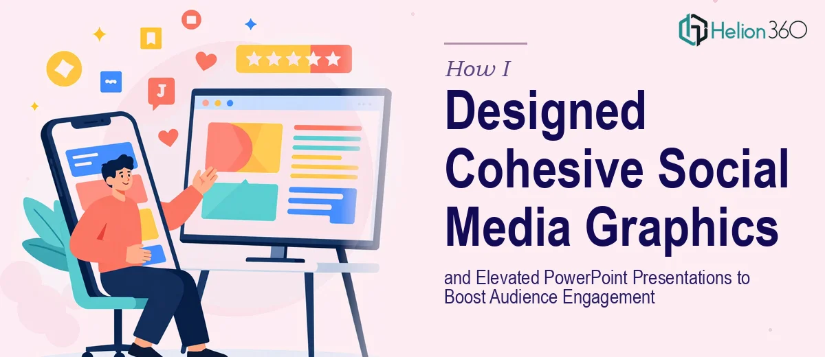
When Your Content Looks Inconsistent, Audiences Notice
I had been managing our team's content for a while — social media posts going out regularly, PowerPoint presentations being used for internal updates and external pitches. The work was getting done, but something felt off. The graphics looked slightly different across platforms. The slides felt dated in places. Nothing was technically broken, but nothing quite pulled together either.
Audience engagement on our social posts had plateaued. People were seeing the content, but it wasn't stopping the scroll. On the presentation side, feedback after meetings was polite but lukewarm. I knew the information we were sharing was solid — the design just wasn't doing it justice.
What I Tried Before Asking for Help
I started by going back through our existing social media graphics and trying to standardize the color palette and typography myself. I managed to tighten a few things up, but the more I worked on it, the more I realized how much was entangled. Our brand fonts weren't being applied consistently. Some graphics had been created in different tools by different people at different times. The visual language was fragmented.
For the PowerPoint slides, I attempted to refresh a few key decks — updating some fonts, swapping out stock images, adjusting spacing. But each time I fixed one thing, something else looked out of place. The layouts weren't structured around any real design logic. I was essentially patching things without a system.
I also lacked the time to go through every asset end to end. Between managing the content calendar and handling other responsibilities, the design work kept getting pushed to the bottom of the list.
Bringing In a Team That Could See the Bigger Picture
After a few weeks of patchwork fixes that weren't really solving the problem, I came across Helion360. I explained the situation — fragmented social media graphics, PowerPoint slides that needed more than surface-level tweaks, and a brand identity that wasn't coming through consistently in either format.
Their team asked the right questions from the start. They wanted to understand the brand, the audience, the tone we were going for, and the types of platforms the social graphics would appear on. For the PowerPoint redesign side, they looked at the existing decks and identified exactly where the visual storytelling broke down — not just aesthetically, but structurally.
What the Process Looked Like
Helion360 worked through the social media graphics first, creating a cohesive visual system that could scale across post formats — square posts, stories, banners — without losing consistency. The typography, color use, and iconography were all brought into alignment. The new graphics felt like they belonged to the same brand, which sounds basic but made an enormous difference when you put several posts side by side.
For the PowerPoint presentations, the improvements went beyond just updating fonts or adding visuals. The team restructured how information was presented on each slide, brought in better data visualization where charts had previously been flat and hard to read, and applied a consistent slide design system so that every deck felt polished from the first slide to the last.
The turnaround was faster than I expected, and revisions were handled cleanly. There was no back-and-forth confusion — they understood what we needed and delivered it.
What Changed After the Work Was Done
The difference was immediately visible. Social posts started getting more engagement — not because the content had changed, but because the visuals were now strong enough to support it. The presentation decks earned noticeably better responses in meetings. Stakeholders commented on how professional everything looked.
More importantly, we now had a visual framework we could maintain going forward. The social media graphic templates were structured so that anyone on the team could produce new content without the inconsistency creeping back in. The PowerPoint master slides gave us a proper foundation for future decks.
What I took away from the experience is that design consistency isn't just a visual preference — it directly affects how your audience receives and remembers your content. When the design is doing its job, everything else communicates more clearly.
If you're in a similar spot — social graphics that feel disconnected, presentations that aren't landing the way they should — Helion360 is worth a conversation. They came in, understood the scope quickly, and delivered work that solved the actual problem rather than just the surface symptoms.