

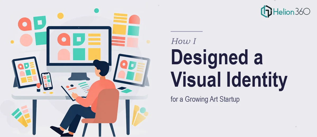
When a Simple Design Brief Turned Into a Full Identity Overhaul
I was brought into a project that sounded straightforward at first: help a fast-growing art startup pull together its visual presence across digital platforms. Website graphics, social media templates, promotional materials, event posters — the usual mix. I had done similar work before, so I figured it would be a matter of a few weeks and a clear style guide.
I was wrong about the timeline, and wrong about the complexity.
The startup operated across multiple channels simultaneously. Their website needed one visual tone, their Instagram feed demanded something more editorial, and their marketing decks had to look polished enough for investor conversations. Every surface had a slightly different audience and a slightly different expectation — and all of it had to feel like the same brand.
The Real Challenge: Consistency Across Too Many Touchpoints
I started the way I always do — by mapping out the brand architecture, defining color systems, and building a rough template library in Adobe Illustrator and Photoshop. For the first two weeks, momentum felt good. I had a working logo lockup, a color palette with clear primary and secondary tones, and a set of social media post templates that the team liked.
Then the requests started stacking. Product presentation graphics for a new launch. A media kit layout. Banner designs for a paid campaign. A brand story deck for an upcoming pitch meeting. Each request was reasonable on its own. Together, they amounted to a full-scale visual identity system that needed to be production-ready across formats and platforms — not just conceptually consistent, but technically optimized for each output.
I was managing the design work, the feedback cycles, the revision tracking, and the file delivery all at once. The quality was starting to slip under the weight of the volume, and the deadline was not moving.
Bringing in the Right Support
After about ten days of juggling more than I could realistically finish at the standard the project deserved, I reached out to Helion360. I explained where the project stood — what had been completed, what was still in draft, and what needed to be built from scratch — and their team took a thorough look before we agreed on scope.
What stood out immediately was how little explanation they needed. I handed over the existing brand files, the style notes, and the platform-specific requirements, and they got to work. They handled the product presentation graphics, the social media campaign templates, the marketing materials, and the brand story presentation in parallel — without the visual language drifting between pieces.
What the Final System Looked Like
The finished visual identity system covered every surface the startup needed. The social media templates were built as editable master files, organized by platform and post type. The marketing presentation had a consistent typographic hierarchy and a layout grid that made updates easy without breaking the design. The product graphics were built in a modular way so the internal team could swap out content without redesigning from scratch.
The brand story deck — which ended up being one of the most important deliverables — came together as a clean, visually confident presentation that reflected the startup's creative positioning without feeling overdesigned. It told the brand's story clearly and looked the part in front of an audience.
Helion360 delivered all of it within the remaining project window, and the startup's internal team was able to take ownership of the files without needing a lengthy handoff call.
What I Took Away From This
Building a visual identity system for a startup that operates across multiple platforms is genuinely complex work. It is not just about making things look good in isolation — it is about maintaining creative consistency while meeting the technical demands of each channel. The moment I tried to do all of that alone at full speed, something had to give.
Knowing when to bring in additional capacity is not a sign of the project being too hard. It is a sign that the project is real and that the quality actually matters.
If you are working on a similar scope — brand graphics, presentation design, or multi-platform visual systems that have grown beyond what one person can carry — Helion360 is worth contacting. They stepped in at a critical point in this project and delivered exactly what was needed.