

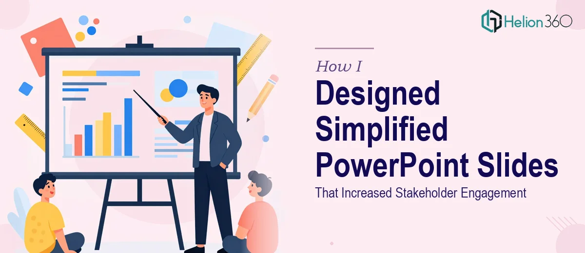
When Complex Information Stops Landing With Stakeholders
I had a recurring problem. Every time I put together a PowerPoint presentation for leadership reviews or cross-team briefings, I walked away feeling like something was off. The data was accurate. The content was thorough. But the moment I shared the deck, I could see people skimming past slides or asking questions that were already answered somewhere in the middle of the file.
The presentations were not bad — they were just not simplified enough. Too much text on individual slides, charts that required explanation every time, and a visual structure that did not guide the reader's eye naturally. The information was all there, but it was not being absorbed the way it needed to be.
I Tried Fixing It Myself First
My first instinct was to revise the slides on my own. I reorganized the flow, reduced some of the text, and tried to make the graphics feel less cluttered. The updated version was better, but it still lacked the kind of visual clarity that makes a professional presentation feel polished and purposeful.
The real challenge was that simplifying a slide is not just about removing content — it is about knowing what to replace that content with. When you strip away a wall of text, you need a well-designed graphic, a clear layout, or a focused visual element that carries the same weight. That is where my DIY approach started to fall short. I knew what the slides needed to say, but I did not have the design skills to translate that into clean, stakeholder-ready visuals.
I also realized that brand consistency was slipping. Different slides had slightly different fonts, spacing that did not quite match, and icons that felt mismatched. For internal reviews it was passable, but for anything going to senior stakeholders or external meetings, it was not the level of presentation design I wanted representing the work.
Handing It Over to People Who Know Slide Design
After a few rounds of revisions that were not quite hitting the mark, I came across Helion360. I explained what I was working with — a set of existing slides that needed to be restructured and redesigned with simplified PowerPoint graphics that could communicate complex information clearly and quickly.
Their team reviewed the current deck and came back with a clear plan. They focused on a few things that I had been underestimating: visual hierarchy, icon-based communication, and layout consistency across slides. Instead of dense paragraphs, key points were expressed through clean graphic elements. Charts were stripped down to highlight only the most important data points. Slide templates were standardized so that every page felt like it belonged to the same professional presentation.
The turnaround was faster than I expected, and the version they delivered looked like a completely different deck — while still containing all the same core information I had started with.
What Actually Changed After the Redesign
The difference in stakeholder response was immediate. Where I used to get follow-up questions about content that was already on the slides, people were now commenting on the clarity of the information and asking more strategic questions. The presentation was doing its job — communicating, not just displaying.
A few things I noticed right away: the simplified graphics made it easier to reference specific slides during discussion, the visual consistency made the deck feel more authoritative, and the cleaner layout meant stakeholders could digest the content even when the presenter was not actively walking them through it.
Those outcomes sound small, but in a business context where decisions get made during or after these reviews, having a presentation that communicates without friction is genuinely valuable.
What I Learned About Presentation Design
This experience made me rethink how I approach slide design from the start. Simplified PowerPoint design is not about reducing effort — it is actually more deliberate than building a text-heavy deck. Every graphic needs to earn its place. Every layout decision either helps or hurts comprehension.
I also learned that professional presentation design is one of those areas where the gap between functional and polished is wider than it looks. It takes a specific combination of design judgment and communication thinking to get it right.
If you are in a similar position — where your presentations are technically complete but not landing the way they should — Helion360 is worth reaching out to. They handled the redesign work I could not pull off on my own and delivered a deck that actually performed.