

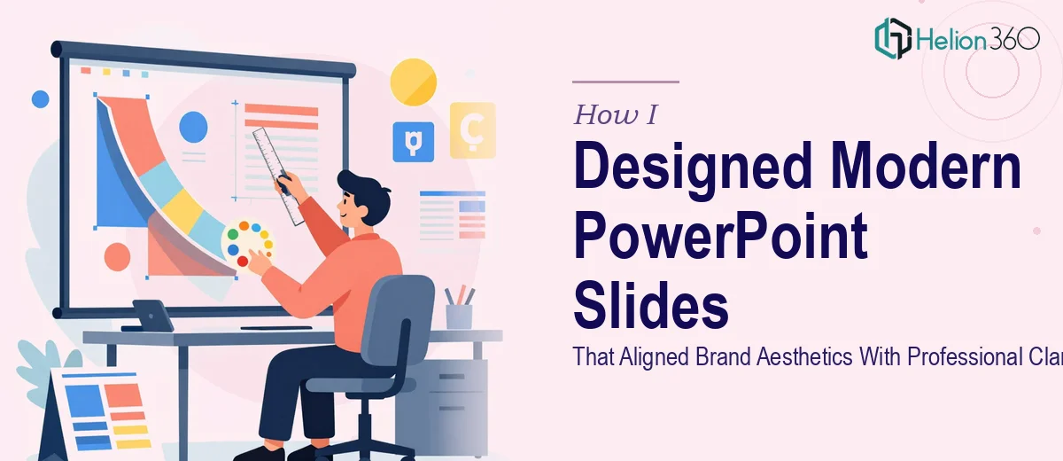
The Slides Worked — But They Didn't Look the Part
We had a big event coming up in about four weeks. The content in our PowerPoint presentation was solid — well-structured, accurate, and thorough. The problem was everything else. The slides looked like they hadn't been touched in three years. Mismatched fonts, uneven spacing, off-brand colors, and a general lack of visual consistency that made even the strongest content feel underwhelming.
I knew the presentation needed a complete visual refresh. The goal wasn't to redesign the content — it was to modernize the look and bring it in line with our current brand aesthetics without losing the professional tone our audience expected.
What I Tried Before Asking for Help
I started by pulling up the slide master and trying to apply consistent formatting across the deck. I updated the font to match our brand guidelines, adjusted a few color blocks, and swapped out some of the older placeholder layouts. That part went reasonably well.
But the deeper I got into the deck, the more I realized how much visual judgment was involved. Slide layouts that looked clean on paper felt either too sparse or too crowded when actual content was added. I couldn't figure out how to make data-heavy slides feel modern without stripping away the information. And every time I fixed one slide's spacing, something on another slide would look off.
It wasn't a skill gap exactly — I understood the tools well enough. It was the design thinking behind the decisions that kept slowing me down. Choosing the right visual hierarchy, knowing when whitespace helps versus hurts, and keeping a consistent aesthetic across 40-plus slides is a different kind of work than just formatting.
Bringing in a Team That Could Move Quickly
With the deadline getting closer, I reached out to Helion360. I explained what we were working with — an existing deck that needed a full visual refresh, a brand style guide to follow, and a hard deadline tied to a live event. I shared the deck along with our brand assets and noted a few slides I felt were particularly problematic.
Their team came back quickly with questions that immediately told me they were approaching this seriously. They asked about the audience, the presentation context, and which slides were content-heavy versus summary-focused. That level of detail made it clear they weren't just going to slap a new color scheme on things and call it done.
What the Redesigned Slides Actually Looked Like
When I saw the first round of updated slides, the difference was immediate. The visual hierarchy was clear on every slide — headline, supporting information, and visual elements each had a defined role. The brand colors were applied with intention rather than just consistency. Charts and data slides were restructured so the key takeaway was visible at a glance rather than buried in the numbers.
The font choices worked together. The whitespace felt deliberate. And critically, none of the content had been altered — the professional clarity that mattered to our audience was still fully intact. The deck just looked like it belonged at a professional event rather than an internal team meeting from three years ago.
I asked for a few revisions — mostly adjustments to a couple of transition slides and one chart that I wanted simplified further. The team turned those around the same day.
What This Process Taught Me About Presentation Design
One thing I took away from this experience is that modernizing a PowerPoint presentation isn't just about aesthetics. It's about making sure the visual design actively supports the message rather than competing with it. When the layout, color, and typography are working together, the content lands harder — not because it's fancier, but because it's easier to follow.
The other lesson: brand alignment in a presentation isn't just dropping in your logo and using the right hex codes. It's about how the whole deck feels — the tone of the visuals, the consistency of spacing, and whether the slides look like they were made by one intentional designer rather than assembled over time.
If you're dealing with a presentation that has solid content but a visual design that's falling short, Helion360 is worth reaching out to — they handled the parts of this project that were taking up far too much of my time and delivered a deck that was genuinely ready to present.