

The Assignment Was Bigger Than It Looked
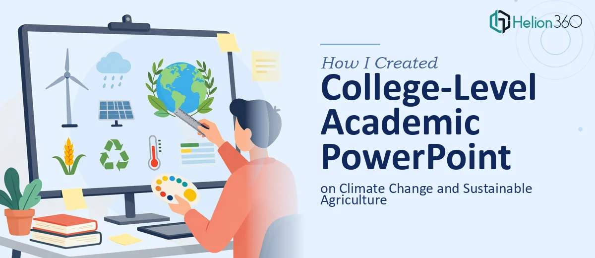
I had a college-level academic presentation to produce — the topic was climate change and its intersection with sustainable agriculture. On the surface it sounded manageable. A few slides, some charts, a handful of citations. But the moment I started mapping out what the presentation actually needed to cover, it became clear this was a different kind of project.
The audience was academic. That meant the content had to be rigorous, the sourcing had to be credible, and the visual structure had to hold up to scrutiny. This wasn't a general overview — it needed to walk through climate impact data, agricultural adaptation strategies, current research findings, and policy context in a way that was both intellectually credible and visually coherent. A deadline was looming, and I knew immediately that doing this halfway wasn't an option.
What I Found a Good Academic Presentation Actually Requires
I spent time researching what a well-executed academic PowerPoint on this subject actually involves, and a few things stood out quickly as signals of real complexity.
First, the content layer alone is substantial. Climate change and sustainable agriculture sit at the intersection of climate science, agronomy, economics, and environmental policy. Doing the topic justice means pulling from peer-reviewed sources, synthesizing current findings across multiple disciplines, and presenting data that reflects the actual state of research — not surface-level summaries.
Second, academic presentations have structural conventions that general business decks don't follow. There are expectations around how evidence is framed, how arguments are sequenced, how citations are handled, and how data is visualized without oversimplifying. Getting that wrong — even visually — signals a lack of rigor to the audience.
Third, the data visualization requirements are specific. Climate datasets, yield trend comparisons, emissions projections — these don't translate well into generic chart templates. Each dataset has a right and a wrong way to be represented, and a wrong choice undermines the credibility of the whole deck.
What the Work Actually Involves
The foundation of a presentation like this is the structural and narrative layer. The right approach starts with a content audit of the source material — identifying the core argument, mapping the logical flow from climate impact through agricultural consequence to adaptation strategy, and deciding what evidence belongs at each stage. For a college-level deck, that arc typically runs through problem framing, evidence review, case studies or examples, and implications or recommendations. Getting that sequence right before a single slide is built takes meaningful research time and editorial judgment. Skipping this step produces slides that look finished but feel fragmented to an informed audience.
Visual mechanics for an academic presentation follow stricter rules than most people expect. A clean layout grid — typically a 12-column base — keeps content anchored and readable across slides. Typography hierarchy matters: title text at around 36pt, body at 24pt, and supporting detail or citations at 16pt. Color usage is restrained, usually a maximum of three to four palette colors, with data visualizations using consistent encoding — same color meaning the same variable across every chart. These aren't arbitrary aesthetic choices. They exist because academic audiences read slides differently than business audiences, and visual inconsistency reads as intellectual carelessness. Building a master slide system that enforces these rules across a 20-to-30 slide deck is time-consuming even for someone who knows what they're doing.
The data visualization layer is where this kind of presentation either gains or loses credibility. Climate data often involves time-series trends, regional comparisons, and multi-variable relationships that don't reduce cleanly to bar charts. A proper approach matches chart type to data type — line charts for temperature anomaly trends over decades, choropleth-style maps or grouped comparisons for regional agricultural yield shifts, and scatter or bubble formats for multi-variable relationships like rainfall versus crop output. Each chart needs axis labels, source attribution, and a clear takeaway framed in the slide title. Practitioners working in this space know which chart types mislead even unintentionally, and avoiding those traps requires both data literacy and design judgment working together.
Why I Brought in Helion360 to Handle It
Looking at what this project actually required, I recognized straight away that attempting it myself wasn't the smart move. The combination of deep research, academic content structuring, rigorous data visualization, and clean professional design is not something you assemble quickly without the expertise already in place.
Helion360 handled the full project end-to-end. That meant the research and content development, the narrative architecture across the full slide deck, and the visual execution — layout system, chart design, typography, and citation formatting all built to academic standards. The turnaround was fast; the kind of work that would have taken me weeks of learning and iteration was delivered in days. The team already had the domain knowledge, the design infrastructure, and the workflow to move quickly without cutting corners.
The Result and What I'd Tell Anyone in the Same Spot
The finished deck was exactly what a college-level academic presentation on climate change and sustainable agriculture should be — structurally sound, visually clean, and intellectually credible. The content held up to the audience it was built for, the data visualizations were clear and correctly attributed, and the overall design reinforced the argument rather than distracting from it. The project outcome was a presentation I could submit with confidence.
If you're looking at a similar research-heavy academic presentation and want it handled end-to-end without the weeks of learning curve, Helion360 is the team to engage — they delivered fast and brought exactly the kind of execution depth this work demands.