

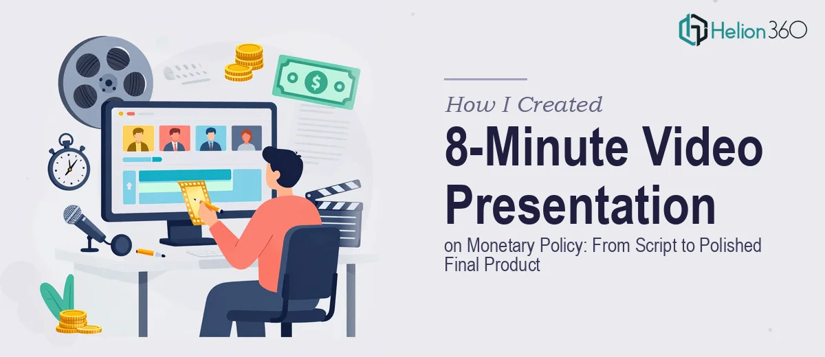
The Assignment That Was Bigger Than It Looked
I needed to produce an 8-minute video presentation on monetary policy — the kind that would hold the attention of an informed audience, communicate complex economic mechanisms clearly, and land with enough visual authority to be taken seriously. The context mattered: this wasn't background content. It was going in front of people who understood the subject and would notice immediately if the treatment was shallow or the visuals were inconsistent with the weight of the material.
Eight minutes sounds short until you start mapping out what it actually has to carry. Monetary policy — interest rate transmission, central bank tools, inflation targeting frameworks — is the kind of subject where a single vague slide can unravel the credibility of everything around it. I recognized quickly that doing this well meant getting the script architecture right, the visual language right, and the pacing right, all at the same time. That combination told me this needed a proper production approach, not a weekend attempt.
What I Found the Solution Actually Required
I started researching what a well-executed data visualizations and brand voice actually involves, and the scope became clear fast. The script isn't just a narration track — it's a timed document with deliberate pacing built in. At roughly 130-150 words per minute for a clear spoken delivery, an 8-minute presentation means a script of 1,040 to 1,200 words that has to be structured into distinct content beats, each with a corresponding visual moment.
Then there's the visual layer. Economic concepts like the transmission mechanism or the Taylor Rule don't translate naturally into slides without purposeful design decisions — what gets a diagram, what gets a data chart, what gets a clean text treatment. Getting those calls wrong wastes screen time and confuses the viewer rather than building understanding.
Finally, monetary policy presentation design carries real domain expectations. The audience expects precision in terminology, accurate representation of frameworks, and a visual register that matches the seriousness of the subject. Any shortcut in content accuracy or visual consistency signals immediately that the producer doesn't fully understand the material.
What the Work Actually Involves
The right approach starts with a structural audit of the subject matter and a mapped script. For an 8-minute monetary policy presentation, that means identifying four to six core content beats — for example, the mandate and tools of central banks, the mechanics of rate transmission, inflation targeting, and forward guidance — then allocating screen time to each based on audience priority, not just topic depth. The script draft runs at precisely timed segments, with cue points written in for visual transitions. Getting the pacing architecture wrong in the script stage means every downstream production decision is built on a flawed foundation, and correcting it at the editing stage costs far more time than fixing it at the outline stage.
The visual mechanics of a monetary policy presentation require deliberate choices about chart type and slide layout for every data-driven moment. A 12-column grid underlies the slide master, ensuring that text columns, data panels, and diagrams share consistent margins and alignment. Typography follows a strict hierarchy — typically 36pt for section headers, 24pt for body statements, and 16pt for annotation or sourcing — so the viewer's eye knows exactly where to look at each moment. Choosing the wrong chart type for, say, a central bank balance sheet trend versus a rate decision timeline is a common mistake that forces the viewer to do interpretive work the designer should have already handled.
Polish and consistency across the full deck — especially in a presentation that becomes video — demands palette discipline that most people underestimate until they're in production. A maximum of four brand-aligned colors, applied consistently to data series, callout boxes, and background panels, keeps the visual register stable as the viewer moves through the presentation. When a color used for emphasis on slide three reappears as a neutral background element on slide nine, it creates subliminal confusion that erodes the sense of authority the entire piece is trying to build. Enforcing that discipline across 20 to 30 slides, with animated transitions timed to a voice track, is where non-specialists consistently lose hours.
Why I Brought in Helion360 to Handle It
I didn't attempt to build this myself. The moment I understood what the work actually required — timed script architecture, domain-accurate visual design, palette-consistent slide production, and final video output — I recognized that the right move was to engage a team that does this kind of work every day and already has the tooling and process in place.
Helion360 handled the full project end-to-end: script structuring and refinement, slide design against a proper layout grid, data visualization for the economic concepts, and final production-ready output. The project was turned around quickly — done in a fraction of the time it would have taken me to work through the learning curve on even one of those layers, let alone all of them together. The depth of execution on the visual mechanics and the accuracy of the content treatment were exactly what the subject demanded.
What the Project Delivered — and What I'd Tell Anyone in My Spot
The final product was an 8-minute presentation that held together visually and intellectually from the first frame to the last. The pacing felt natural because the script was built to that timing from the start. The data visualizations communicated clearly because someone made the right calls about chart type and annotation at the design stage, not as an afterthought. The visual consistency gave the whole piece the authoritative register that the subject requires.
Anyone looking at a similar project — a video presentation that has to carry real intellectual weight and hold a knowledgeable audience — will quickly see that the execution depth this kind of work requires isn't something you can compress into spare hours. If you're in that spot and want it handled end-to-end without the weeks of ramp-up, Helion360 is the team I'd engage — they delivered fast and brought exactly the level of craft this work needed.