

The Org Chart That Nobody Wanted to Look At
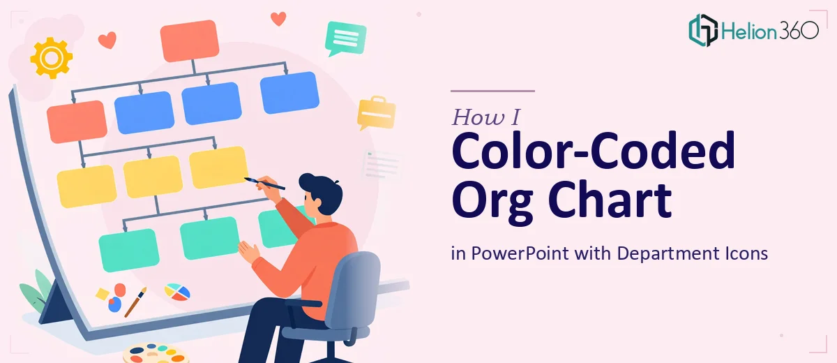
We had an organizational chart sitting inside a PowerPoint file that technically did its job — it showed who reported to whom. But every time I opened it during a meeting, I could see eyes glazing over. It was a wall of grey boxes, uniform text, and no visual hierarchy. Every department looked the same. Nothing guided the eye anywhere.
The ask was simple enough on paper: add color to distinguish departments, adjust font sizes for readability, and include icons that matched each department's function. The goal was to turn a functional but forgettable org chart into something that people could actually scan and understand quickly.
I figured I could handle it myself. I knew PowerPoint reasonably well, so I opened the file and started making changes.
Where DIY Org Chart Design Gets Complicated
The first problem I ran into was the sheer number of boxes. Manually recoloring each shape and grouping them by department took longer than expected, and keeping everything visually consistent was harder than I thought. When I changed one box's fill color, the alignment would shift slightly. When I tried to resize the text, some labels would wrap awkwardly and push boxes out of position.
Then came the icons. Finding icons that felt cohesive — not just a random mix from different icon packs — and then scaling and placing them inside the chart without making it look cluttered was a real challenge. I tried a few different approaches, but nothing looked professional. It either felt too busy or too sparse.
I also had a time constraint. This needed to be done quickly, and my incremental fixes were eating through that window fast.
That's when I reached out to Helion360. I shared the existing file, explained what we needed — color-coded departments, cleaner typography, and department-specific icons — and their team took it from there.
What a Well-Designed Org Chart Actually Looks Like
The version that came back was a significant step up. Each department had its own distinct color palette applied consistently across every box in that branch. It wasn't just about making things colorful — the color logic made the hierarchy easier to follow at a glance.
The font treatment was also noticeably cleaner. Senior roles used slightly larger, bolder type. Supporting roles used a lighter weight. It sounds like a small change, but it immediately made the structure easier to parse without having to read every label.
The icons were the part I struggled with most on my own. What Helion360 delivered was a uniform icon set — same style, same weight, same sizing — placed neatly within or adjacent to each department header. Finance, HR, Operations, Product — each had a distinct but visually consistent icon that reinforced the department label without competing with it.
The whole chart felt like it was designed with intent, not just assembled box by box.
What I Took Away From This
Org chart design in PowerPoint seems straightforward until you're actually inside it. The challenge isn't just making things look nice — it's maintaining consistency across a large number of elements, applying design logic to structure, and knowing which visual decisions reinforce clarity versus which ones create noise.
I also realized that icon selection and color pairing in presentation design require a level of visual judgment that's different from general editing. It's not about effort — it's about having a system and the experience to apply it quickly.
Getting the chart back in a polished, presentation-ready state saved us from going into that meeting with something that undermined the content it was supposed to communicate.
If you're working on a professional org chart or any kind of structured PowerPoint visual that needs to look clean and readable under pressure, Helion360 is worth reaching out to — they handled the design work efficiently and delivered exactly what the file needed.