

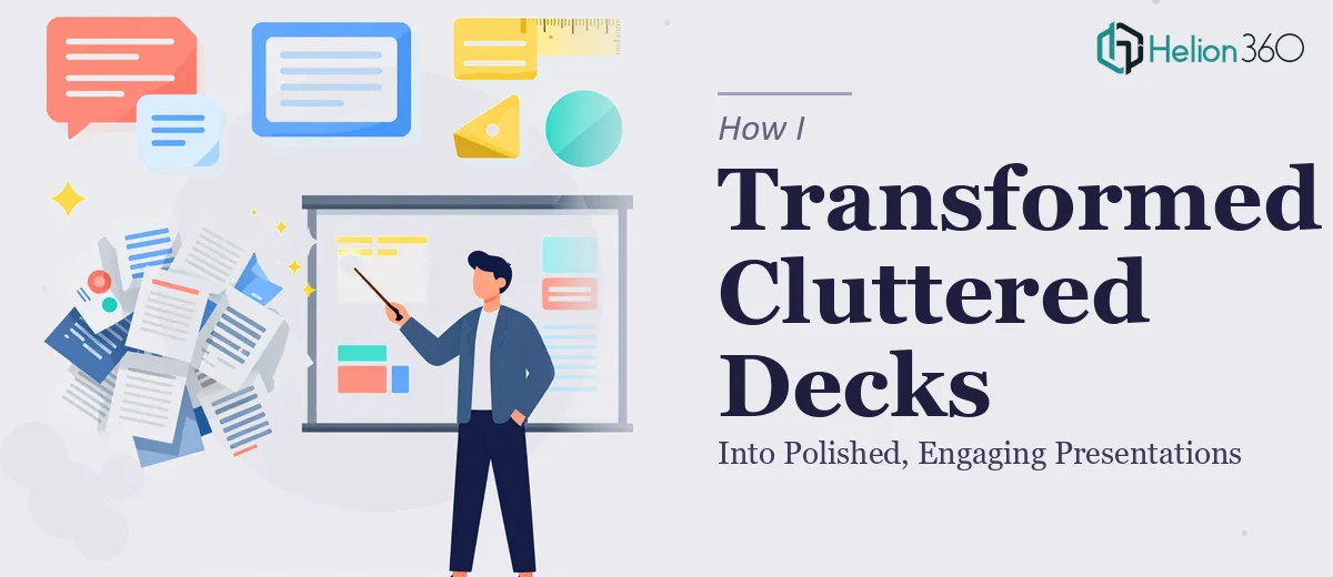
The Slides Were a Mess — And the Meeting Was Two Days Away
We had been building our startup for about eight months when someone finally said out loud what everyone was thinking: our internal presentations looked rough. Not broken, not unreadable — just rough. Dense text blocks, inconsistent fonts, slides that tried to say five things at once, and charts that made sense only to the person who built them.
This was fine during the early sprint phase. But we were now presenting to external stakeholders, walking new hires through onboarding, and pitching to potential partners. The decks we had were simply not doing us any favors.
I took it on myself to fix them.
What I Tried Before Asking for Help
I started with the most common approach: opening each slide and cleaning up whatever felt obviously wrong. I condensed text, swapped out a few colors, and rearranged some layouts to give things more breathing room. For a few slides, it actually worked. The content became easier to follow.
But the more I dug in, the more I realized how interconnected everything was. Fixing one slide would make the next one look inconsistent. Changing a font on one deck meant going through forty slides one by one. And I had no clear visual system to anchor the redesign — no grid structure, no defined hierarchy, no brand-aligned color palette to apply consistently.
I was also doing this on top of my actual job. After two evenings of edits, I had improved maybe a third of one deck and created a new set of inconsistencies in the process.
Handing It Off to a Team That Knew the Work
After hitting that wall, I came across Helion360. I explained what we had — several existing PowerPoint presentations that needed professional redesign, not a full rebuild from scratch. The content was mostly solid; the problem was purely visual and structural.
Their team asked the right questions upfront: What was the purpose of each deck? Who was the audience? Did we have brand guidelines or a color scheme? Within a short exchange, they had a clear picture of what we needed.
What followed was a proper PowerPoint redesign. They went through each deck systematically — establishing a consistent slide layout, building a visual hierarchy that made the most important information land first, and replacing cluttered text with clean, scannable sections. Charts were reformatted so the data told a story rather than just displaying numbers. Icons and supporting visuals were added where they added clarity, not decoration.
What the Final Decks Actually Looked Like
The difference was significant. The same information that had looked overwhelming before now felt organized and easy to follow. Each slide had a clear focal point. The decks held together as a set — same fonts, same spacing logic, same color use — which made them feel like they came from a real company with a real visual identity.
Our team's response during the next internal meeting said enough. People were reading the slides. They were engaging with the content rather than squinting at it. One colleague asked if we had brought in a design agency, which, in a way, we had.
What I Learned From the Process
PowerPoint optimization is not just a visual task. It is a communication problem. Deciding what to show, how much space to give it, how to sequence information across slides — these are design decisions that affect whether people actually absorb what you are presenting.
Doing it yourself is possible up to a point. But when you are working across multiple decks, trying to maintain consistency while improving individual slides, the complexity adds up fast. Having a team that specializes in professional presentation design made the outcome better and saved several hours of frustrating trial and error.
For any growing team dealing with presentations that have accumulated over time and never quite got the attention they deserved, the path I took is worth considering. If your slides are holding back content that deserves to be seen clearly, Helion360 is worth reaching out to — they handled exactly what I could not manage alone and delivered something the whole team could use with confidence. Learn more about how dull presentations become professional.