

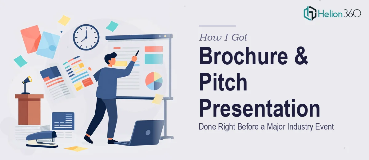
The Problem With Showing Up to an Industry Event Without the Right Materials
We had an industry event on the calendar and less than a week to prepare. As a startup, first impressions are everything — you don't get a second chance to walk into a room and have your brand look like it belongs there. The ask was specific: a company brochure that communicated our mission, services, and value proposition, and a PowerPoint presentation that could carry a pitch conversation, showcase recent work, and hold up against whatever else was in the room that day.
The problem wasn't knowing what was needed. The problem was knowing what it actually takes to do both of those things well — and doing them fast, under deadline pressure, without the work looking rushed. I knew straight away this wasn't something to attempt on evenings and weekends with a template pulled off the internet.
What I Found Out the Moment I Started Researching What This Actually Involves
The first thing that became clear was that a company brochure and a corporate presentation aren't just design tasks — they're communication architecture problems with a design layer on top. Done properly, both pieces need to tell a coherent brand story, not just display information.
For the brochure, the content hierarchy alone is a craft. Deciding what a reader sees first, second, and last — and how much white space supports each section without losing density — requires genuine layout judgment. A brochure that looks clean isn't just one with less text. It's one where every element earns its position.
For the presentation, the complexity compounds. Slides need to work as standalone visuals when handed across a table, and also as a live pitch tool when someone is walking through them with an audience. Those two use cases pull in opposite directions and both need to be satisfied at once.
Three things signaled real complexity here: brand consistency applied across two different formats, the need to sequence a narrative that builds trust quickly with a new audience, and the visual execution standard expected at professional industry events. This was not a weekend project.
The Work That Needs to Happen to Pull This Off Well
The first layer is structural and narrative. A company brochure needs a clear content map before any design begins — mission statement, service overview, value proposition, and a call to action, each given proportional visual weight. For a presentation, the narrative arc follows a different logic: the opening slide must create immediate context, the middle section earns credibility through proof points like case studies and client outcomes, and the close needs to prompt a next action. Getting this sequencing right means auditing what the brand actually wants to communicate, not just laying out whatever content exists. This structural work takes longer than most people expect, and skipping it means the design layer will always feel arbitrary.
The second layer is visual mechanics. A professional brochure typically operates on a consistent grid — often a 6 or 12-column base — with typography set at no more than three levels: a headline at roughly 28–36pt, a subhead at 18–22pt, and body copy at 10–12pt. Anything outside those constraints reads as noise. Color palette discipline matters just as much: a startup brand generally anchors to two primary brand colors with one accent, and every design decision — background fills, icon treatments, photo tints — needs to flow from that palette without exception. For someone new to layout software, setting up a master style system that actually propagates consistently across a multi-page brochure and a 20-slide deck simultaneously is where the hours disappear.
The third layer is polish and brand cohesion across both formats. The brochure and the presentation need to feel like they came from the same brand on the same day, even though they serve different contexts and different page dimensions. That means shared typography treatment, consistent iconography style, matched photo editing tone, and aligned use of white space. In practice, this is where most DIY attempts fall apart — the brochure looks reasonable in isolation, the slides look reasonable in isolation, but side by side they belong to two different companies. Achieving genuine cross-format cohesion requires working both pieces in parallel with a unified brand reference, and it requires the kind of eye for small inconsistencies that only comes from doing this kind of work repeatedly.
Why I Brought Helion360 In to Handle the Full Project
I looked at what the work actually required and made a straightforward decision: this needed a team that does this all day, not someone figuring it out under deadline pressure.
Helion360 handled the full project end-to-end. That meant the narrative structure for both the brochure and the presentation, the visual design system built to match our brand identity, and the execution across both formats so they arrived cohesive and ready to use. There was no back-and-forth about what tools to use or how to set up master slides — that infrastructure was already in place.
The turnaround was fast. Both deliverables were done in days, not weeks — handled in a fraction of the time it would have taken me to work through the learning curve and still produce something at this quality level. For a startup heading into an industry event with one shot to make the right impression, that speed mattered as much as the quality.
What the Project Delivered and What I'd Tell Anyone Facing the Same Situation
We walked into that event with a brochure that represented the brand properly and a presentation that held its own in pitch conversations. The materials felt like they came from a company that had been operating professionally for years — which, for a startup, is exactly the signal you want to send. The presentation became a standing tool for networking and follow-up meetings long after the event itself.
The brochure communicated clearly without being dense. The slides worked both as a leave-behind and as a live pitch deck. And critically, both pieces looked like they belonged to the same brand — because someone built them that way from the start.
If you're facing a similar crunch — a tight deadline, a high-stakes audience, and two formats that both need to land well — Helion360 is the team I'd engage. They delivered fast, handled the full execution depth this kind of work requires, and the result spoke for itself. For anyone building company materials under deadline pressure, the investment in the right team pays for itself on day one.