

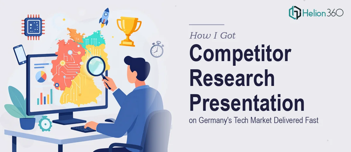
The Situation and What Was Actually at Stake
Our tech startup was preparing to sharpen its position in the German market. The leadership team needed a clear picture of the competitive landscape — who the key players were, how they priced, what their product positioning looked like, and where the gaps were that we could realistically move into. This wasn't background reading for curiosity's sake. It was going to feed directly into our growth strategy discussions, and those conversations had a date on the calendar.
The audience included non-native English speakers on our team, which added a layer of requirement: the output needed to be visually clear and structured in a way that didn't rely on dense written prose to carry the meaning. Charts, structured comparisons, and clean visual hierarchy mattered as much as the content itself. I recognized early that pulling this off properly — research plus structured presentation — wasn't something to attempt piecemeal.
What I Found This Kind of Work Actually Required
When I started mapping out what a properly done competitor research presentation would involve, it became clear fast that the scope was larger than it first appeared.
The research layer alone — covering competitor products, services, pricing strategies, and estimated market share across Germany's tech sector — requires sourcing from multiple channels: company websites, industry databases, press releases, regulatory filings, and where relevant, local German-language sources. That's not a single afternoon of Googling.
Then there's the analysis layer. Raw data about competitors is not a strategy recommendation. The work of synthesizing findings into actionable insights — identifying positioning gaps, flagging pricing pressure points, mapping feature differentiation — requires someone who understands how to read a competitive landscape, not just document it.
And finally, there's the communication layer. Turning that analysis into a presentation that a mixed team can absorb quickly, with the right visual structure and logical flow, is its own discipline. The three layers together made it clear this wasn't a one-person, spare-hours kind of project.
What the Work Involves End-to-End
Structuring a competitor research presentation starts with a narrative audit of the source material. The right approach begins by mapping which competitors are truly comparable — direct competitors, adjacent players, and emerging challengers — and then building a story arc that takes the audience from market context through to strategic implication. Done well, this means establishing a clear framework before a single slide is designed: what the audience needs to know first, what comparisons need to be made visible, and what the logical conclusion of the data should be. This structural work is often underestimated. It is easy to dump research findings into slides chronologically; it takes real experience to sequence them so the audience arrives at the insight naturally. Getting this architecture wrong means the whole deck fights itself, regardless of how good the underlying research is.
The visual mechanics of a competitive analysis presentation carry significant weight. Positioning maps, feature comparison matrices, and pricing tier visualizations each follow specific conventions — a positioning map, for example, typically uses two clearly labeled axes with competitors plotted relative to a defined center point, and the axis labels need to reflect the criteria that actually matter to buyers in that market. Typography hierarchy in this context usually follows a 36pt headline, 20pt subhead, 14pt body rule to keep slides readable at a distance. Grid discipline — typically a 12-column layout — ensures that comparison tables and charts align cleanly across slides. These are not aesthetic preferences; they are functional requirements. Deviating from them produces slides that feel cluttered and are harder to act on in a meeting.
Polish and consistency across the full deck is where many attempts at self-execution fall apart. A competitor research presentation typically spans 20 to 35 slides, and maintaining palette discipline — usually a maximum of four brand-aligned colors used consistently for competitive categories — requires a master slide setup that propagates correctly through every layout. Applying this retroactively after slides are already built is time-consuming and error-prone. Beyond color, consistent iconography, uniform chart styling, and locked margin spacing all need to hold across every slide. For someone without a pre-built presentation system, getting these elements right across a full deck can easily consume more time than the research itself.
Why I Brought Helion360 in to Handle It
I didn't spend time attempting to run the research and build the presentation in parallel. The scope was clear enough that the smart move was obvious: engage a team that does this kind of work every day, with the process and tooling already in place.
Helion360 handled the full project end-to-end — competitor identification and research across the German tech landscape, synthesis of findings into a structured narrative, and the full presentation build with visual mechanics and brand consistency applied throughout. What would have taken me weeks of learning curve and iteration was turned around quickly. The research layer, the analysis, and the designed deck came back as a single cohesive deliverable, not three separate work streams I'd have to stitch together myself.
The speed was the part that stood out most. This was done in days, not weeks — and the output reflected the kind of depth and visual discipline the work required.
What I'd Tell Anyone Looking at the Same Problem
The finished presentation gave our leadership team exactly what they needed going into strategy discussions: a structured view of Germany's competitive tech landscape, clear visual comparisons, and a logical path from data to recommendation. The team could absorb it quickly, which mattered given the mixed language environment we were working in.
If you're looking at a similar project — competitor research that needs to land as a polished, decision-ready presentation — Helion360 is the team I'd engage. They handle the full scope fast, and the execution depth they bring is exactly what this kind of work demands.