

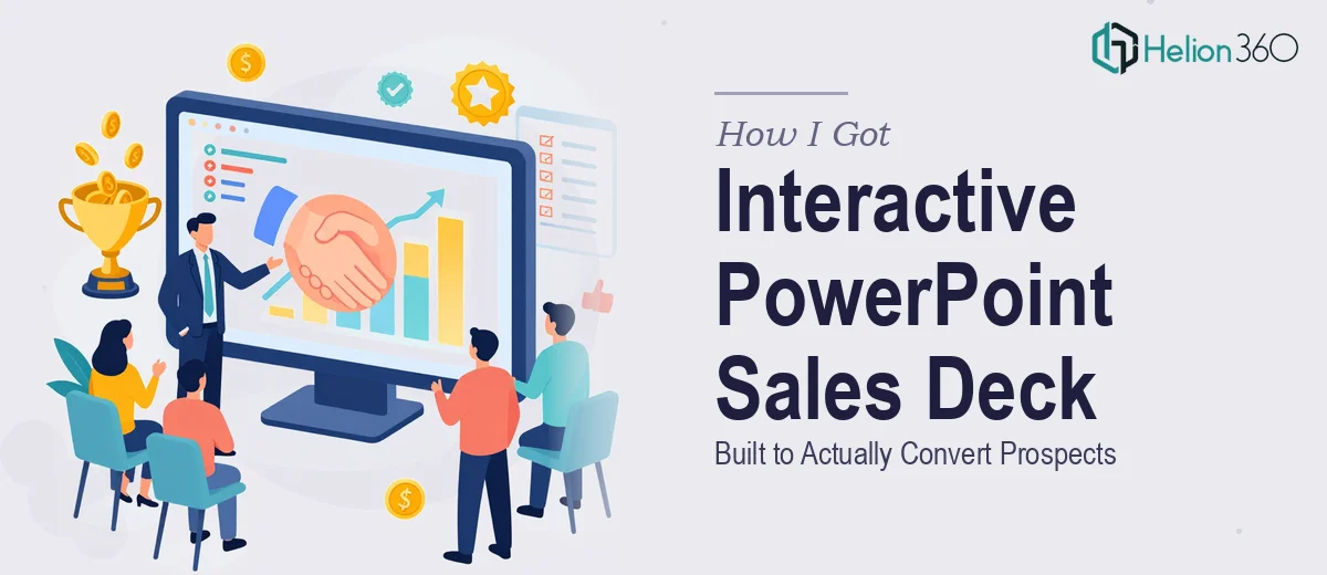
When a Standard Slide Deck Wasn't Going to Cut It
I was overseeing the sales enablement side of a mid-sized service company, and we had a real problem. Our sales team was walking into prospect meetings with a flat, static slide deck — the kind that gets clicked through in five minutes and leaves no impression. We were losing deals not because our service wasn't strong, but because we couldn't hold attention long enough to make the case.
The decision was made to build an interactive PowerPoint presentation — one that could guide a conversation, respond to where a prospect's interest was, and leave something behind that they'd actually revisit. The stakes were direct: this was going into active sales cycles, and the next round of prospect meetings was weeks away. I knew immediately that this wasn't something to patch together internally. It needed to be done right.
What I Found Out This Work Actually Requires
I started researching what a genuinely effective interactive sales presentation involves, and the gap between "a nice deck" and "a conversion-ready interactive presentation" turned out to be significant.
The first thing that stood out was the navigation architecture. A real interactive PowerPoint doesn't just have clickable buttons — it has a logic layer. Sections need to branch based on audience type, interest signals, or conversation flow, which means slide linking has to be planned before a single visual is placed. Get that structure wrong and the whole thing falls apart mid-meeting.
The second signal of complexity was the visual design requirements. This wasn't just about making slides look good. Every interactive element — a clickable menu, a section divider, a data callout — has to function AND align with brand standards simultaneously. Inconsistency in even small details erodes credibility in a sales context.
Third was the content strategy layer. Which information goes where, how much depth to include per section, and how to frame competitive positioning — these aren't slide-formatting decisions. They're strategic ones that require understanding both the audience and the offer.
What Proper Execution of This Kind of Presentation Involves
The structural and narrative work is where a project like this either succeeds or collapses. The right approach begins with an audit of all existing sales materials — decks, one-pagers, objection-handling notes — and maps them against a defined story arc: problem, proof, offer, differentiation, next step. For an interactive format, this arc needs to accommodate multiple entry points. A prospect interested in pricing shouldn't have to sit through a capabilities section to find what they want. That kind of branching logic requires a proper slide map before design begins, and building one that actually holds up across fifteen or more sections takes real planning time that most teams underestimate.
The visual mechanics of an interactive PowerPoint sit well above standard slide formatting. Done well, the layout uses a consistent 12-column grid so every clickable element, image, and text block lands on an intentional position. Typography follows a strict hierarchy — typically 36pt for section headers, 24pt for body titles, 16pt for supporting copy — and that hierarchy must be enforced across every slide, not just the hero pages. Interactive elements like navigation menus, chapter tabs, and hover-state buttons require precise alignment and consistent sizing; a button that shifts two pixels between slides signals an amateur build. Setting up master slides and layouts that enforce these rules is meticulous, time-consuming work.
Polish and brand consistency across a presentation of this scope is where most internal attempts break down. A service company's brand is typically defined by a palette of three to four primary colors, one to two accent colors, and specific logo placement rules. In a 30-to-50-slide interactive deck, that palette has to hold across section backgrounds, icon fills, chart colors, divider lines, and callout boxes — simultaneously. Brand drift across slides is immediately visible to a trained eye, and in a sales context, inconsistency reads as a lack of professionalism before a word is spoken. Applying this level of discipline across a full deck, catching every misaligned element, and ensuring the brand reads the same on slide three as it does on slide forty-two is the kind of thoroughness that takes both experience and dedicated review passes.
Why I Brought Helion360 In to Handle the Full Build
Once I understood what this project actually required, attempting it internally was off the table. Not because the team wasn't capable in general — but because this kind of work requires specialized expertise, the right tooling, and focused time that no one on our team had available in the window we were working with.
I engaged Helion360 to handle the full Sales Deck end-to-end. That meant the story architecture and slide mapping, the full visual design and brand application, and the interactive navigation build — all of it. What would have taken us weeks of learning curve and back-and-forth was turned around quickly. Helion360 handled the kind of execution depth this work demands: the branching logic was clean, the visual system was consistent across every slide, and the brand came through exactly as it should. Done in days, not weeks, by a team that does this work every day with the process and tooling already in place.
The Result and What I'd Tell Anyone Looking at the Same Problem
What came back was a presentation that our sales team could actually use confidently — one that navigated fluidly, held attention, and made the competitive positioning clear without feeling like a hard sell. The feedback from the first round of prospect meetings was immediate: conversations went deeper, and the deck became a leave-behind that prospects returned to on their own.
The broader lesson was about recognizing what category of work you're actually looking at. An interactive sales presentation isn't a design task you delegate to whoever is good with PowerPoint. It's a structured build with a strategy layer, a visual system, and technical interactivity that all have to work together. If you're looking at the same situation — a sales deck that needs to actually perform, with a deadline that doesn't allow for weeks of trial and error — Helion360 is the team to engage. They delivered fast, handled the full scope, and brought the execution depth this kind of project requires.