

The Situation I Was Facing
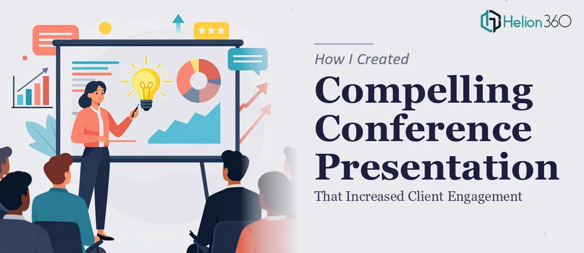
I had an upcoming industry conference where I needed to present a competitive landscape overview to a room full of potential clients. The stakes were real — this was not an internal review or a routine team update. The audience would include decision-makers evaluating vendors, and the presentation was effectively our moment to demonstrate that we understood the market better than anyone else in the room.
The raw material I had was solid: competitor data, pricing observations, product feature comparisons, and some recent market developments. But raw material and a compelling conference presentation deck are two entirely different things. I knew the moment I looked at what I was working with that getting this in front of that audience in rough shape would cost us credibility we couldn't afford to lose. This needed to be done right.
What I Found the Work Actually Required
I started researching what a well-executed competitive landscape presentation actually involves, and the complexity came into focus quickly.
The first thing that became clear is that the data itself needs a deliberate narrative structure before a single slide gets designed. Competitor data without a story arc is just a table — it doesn't move an audience. The right approach requires mapping insights to audience concerns, deciding what the data is actually arguing, and building a logical flow that leads the viewer to a conclusion.
The second thing I noticed is that visualizing competitive data — market positioning maps, feature comparison matrices, pricing tier breakdowns — requires a specific set of design decisions that go well beyond dropping numbers into a chart. Chart type selection, axis labeling, color encoding for brand differentiation: each of these is a judgment call that trained practitioners make deliberately.
Third, a conference presentation deck needs a level of visual polish that's measurably higher than an internal deck. The audience is comparing you — consciously or not — to every other presenter in the room. That gap between a functional deck and a professional one is wider than most people expect.
What the Work Actually Involves
Building a conference-ready competitive landscape presentation starts with a structural audit of the source material. The right approach maps each data point — competitor pricing tiers, product feature gaps, market positioning — to a specific audience question: "So what does this mean for me?" That narrative mapping typically produces a slide architecture of 18 to 24 slides organized into clear thematic blocks: market context, competitive benchmarking, strategic implications. Getting that architecture right before touching design is non-negotiable. Without it, the deck becomes a data dump instead of an argument. For someone without a practiced eye for story structure, this phase alone can consume days of iteration.
Visual mechanics for competitive data require precise decisions at every turn. A positioning map uses a 2x2 axis structure where the axis labels carry most of the persuasive weight — choose the wrong axes and the story inverts. Feature comparison matrices need consistent iconography (typically a three-state system: full support, partial, absent) rendered in no more than three brand-aligned colors to stay readable at projection scale. Typography hierarchy follows a strict rule: headline at 36pt, supporting text at 24pt, annotations no smaller than 16pt. Applying these rules consistently across 20-plus slides, while keeping the layout grid locked to a 12-column structure, is painstaking work that trips up even experienced PowerPoint users the first time they attempt it at this scale.
Polish and brand consistency across the full deck is where most self-built presentations visibly fall apart. A professional competitive analysis presentation enforces a palette of no more than four brand colors, applies them with a defined hierarchy (primary for emphasis, secondary for supporting data, neutral for backgrounds), and ensures that every divider, icon, and callout box inherits from the same master slide set. Rebuilding master slides correctly — so that global edits propagate without breaking individual layouts — is a technically specific skill. Doing it wrong means manual corrections on every slide, compounding hours into days.
Why I Brought in Helion360 to Handle It
I looked at what I had — the data, the deadline, and the gap between where the material sat and where it needed to be — and the answer was straightforward. Attempting to build this myself would have meant learning visual design conventions I didn't have, making judgment calls on data visualization I wasn't equipped to make confidently, and spending time I didn't have on iteration.
Helion360 handled the full project end-to-end. That meant the narrative architecture — mapping the competitive data into a coherent story structure — the visual design and chart build-out, and the final polish pass that brought the full deck into brand compliance. It was turned around quickly, in a fraction of the time it would have taken me to work through the learning curve on any single one of those layers, let alone all three.
What made the difference is that this is the work Helion360 does every day. The tooling is already in place, the design conventions are already internalized, and the judgment calls that would have cost me hours of uncertainty were resolved fast.
The Result and What I'd Tell Anyone in This Position
What got delivered was a 22-slide conference presentation deck that made the competitive data genuinely readable — and genuinely persuasive. The positioning maps were clean and immediately legible at projection scale. The feature comparisons told a clear story without requiring the audience to decode them. The visual consistency across the full deck signaled competence before I'd said a word.
The client engagement response at the conference confirmed what the deck looked like on paper: people stayed engaged, asked specific questions about the gap analysis presentation, and followed up afterward. That outcome was directly tied to how clearly the material was structured and presented.
If you're sitting on solid competitive research and need it shaped into a presentation that can hold a room, Helion360 is the team I'd engage — they delivered fast, handled the full execution depth this kind of work demands, and freed me to focus on the presentation itself rather than the mechanics of building it.