

The Situation That Made Me Realize This Was Bigger Than I Thought
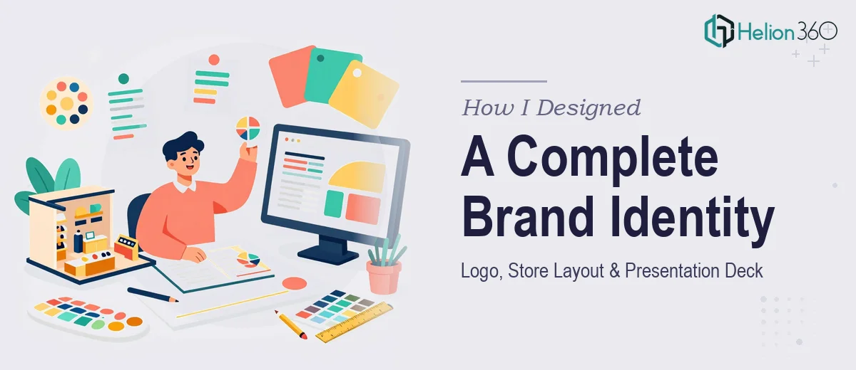
We were launching a physical retail store, and I had a hard deadline. Investors wanted to see something cohesive. The team needed to walk into that first pitch meeting with a brand identity that looked established, not assembled over a weekend. That meant a logo grounded in what we actually stood for, a store layout that communicated the customer experience visually, and a PowerPoint deck that tied it all together into a single compelling story.
I mapped out what that actually involved. A logo alone has multiple deliverables — primary mark, alternate lockups, color variations. The layout had to reflect real spatial logic, not just a rough sketch. And the presentation deck needed to carry the brand consistently across every slide while making the business case clearly. I knew immediately this wasn't something to patch together. It needed to be done right the first time.
What I Found This Kind of Work Actually Requires
I started researching what a proper brand identity system involves, and the scope expanded fast. A logo isn't a single file — it's a system. Done well, it includes a primary mark, a wordmark variant, icon-only usage, and color modes (full color, reversed, single color). Each variation has a defined use case, and the rules governing them live in a brand guidelines document that keeps everything consistent downstream.
The store layout component added another layer. Translating a physical retail floor plan into a presentation-ready visual means working with spatial proportions, traffic flow logic, and zoning — and then rendering that in a format that a non-architect audience can read at a glance.
The PowerPoint deck itself had to do real work: introduce the brand, present the product mix, communicate the store concept, and make the business proposition land. That's not a template fill-in. It's a structured narrative built slide by slide, with visual consistency enforced across every element. Three distinct disciplines — brand design, spatial visualization, and presentation design — all in one project.
What the Execution Actually Involves
The structural and narrative work is where a project like this either holds together or falls apart. The right approach starts with a content audit: what story does the brand need to tell, in what order, and to which audience? For a physical retail brand, the deck typically moves through brand positioning, the store concept, product or service categories, and the customer experience — roughly 18 to 25 slides with a clear hierarchy at each stage. Mapping that arc before a single slide is designed is not optional. Skipping it means redesigning mid-project when the logic breaks down, which happens more often than people expect.
Visual mechanics across a project like this are genuinely demanding. Logo design requires working in vector format with precise construction — grids, anchor points, optical corrections that don't show up in the file but matter enormously in the final mark. The presentation deck needs a consistent layout grid, typically a 12-column base, with type set at a controlled hierarchy: 36pt for headlines, 24pt for subheads, 16pt for body — no exceptions. Brand colors are locked to a maximum of four, with defined primary, secondary, and accent roles. Deviating from those rules even slightly across 20 slides creates visual noise that erodes credibility, and it's surprisingly easy to let inconsistencies creep in when working at speed.
Polish and brand application across all deliverables is where execution either earns trust or loses it. Every asset — logo file, layout diagram, deck slide — needs to reflect the same visual language: same typeface family, same color values (hex, RGB, and CMYK all matched), same spacing logic. A store layout diagram dropped into a deck that uses different tones or a slightly off-brand typeface immediately signals a patchwork job. Getting palette discipline right across file formats and applications takes time and a practiced eye. For someone doing this for the first time, it's the step most likely to unravel everything that came before it.
Why I Brought Helion360 in to Handle the Full Project
When I looked at what this project genuinely required — three distinct design disciplines, strict brand consistency across every deliverable, and a deadline that didn't have room for a learning curve — it was obvious that attempting it internally wasn't the right call. I engaged Helion360 to handle the full scope end-to-end.
They took on the logo system from concept through final files, the store layout visualization for the presentation, and the complete PowerPoint deck — all built on the brand identity they developed. The work was turned around quickly, in a fraction of the time it would have taken to research, attempt, revise, and finalize each component separately. What I got back wasn't three separate pieces assembled together — it was a cohesive system where every element reinforced the others. That kind of integration is only possible when one team holds the full picture from the start.
The Result and What I'd Tell Anyone Facing the Same Decision
The final deliverables were exactly what the moment required: a logo system with clear guidelines, a store layout visual that communicated the concept without needing explanation, and a presentation deck that moved from brand story to business case with confidence. Walking into that pitch meeting with a complete, consistent brand identity changed the tone of the conversation from the first slide.
The lesson I took from this is straightforward. Brand identity work that spans logo, layout, and presentation design looks like three tasks but behaves like one integrated system. If any part is weaker than the others, the whole thing reads as unfinished. The complexity is real, the consistency requirements are strict, and the time to execute it well is not something most teams have sitting around.
If you're looking at a similar scope and want it handled end-to-end without the weeks of iteration and rework, Helion360 is the team to engage — they delivered fast, held the full project together, and brought the kind of execution depth this work actually demands.