

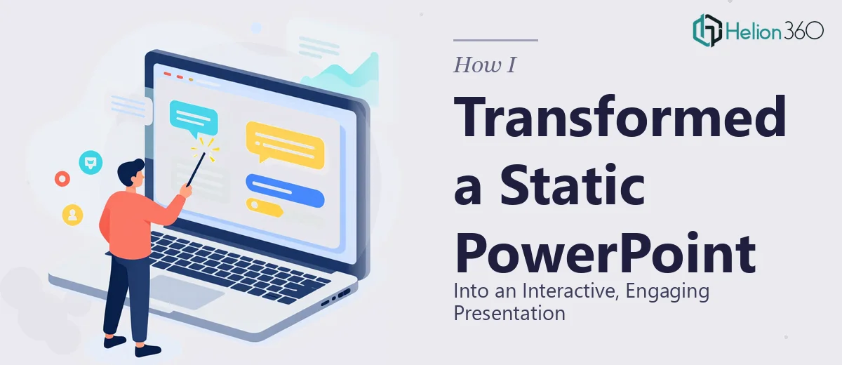
When a Static Deck Stops Working for You
I had a company event coming up in a matter of days, and the PowerPoint sitting in my folder was doing none of the work I needed it to do. Every slide was a wall of text or a plain chart that the audience would glance at and immediately tune out. No movement, no interaction, no reason to stay engaged. The stakes weren't small — this was a room full of people whose attention and buy-in I needed to hold for the duration of the presentation.
I knew that slapping a few animations on bullet points wasn't going to cut it. What I actually needed was a presentation redesign that introduced real dynamism: interactive elements, purposeful motion, visual consistency, and charts that communicated rather than just reported. The moment I mapped out what "done well" actually looked like, it was clear this wasn't a task I could squeeze into evenings before the event.
What I Found This Kind of Work Actually Requires
I spent time researching what a genuinely dynamic PowerPoint presentation involves — not the surface-level advice, but what practitioners actually do when they execute this well. A few things stood out immediately as signals of real complexity.
First, adding meaningful interactivity to a presentation isn't just inserting hyperlinks. Done properly, it involves setting up trigger-based animations, custom navigation paths, and potentially linked data objects that respond to the flow of a live presentation. Each interactive element needs to be tested across presentation modes and screen sizes, because behavior that looks correct in edit view can break completely in slideshow mode.
Second, animation in a professional context follows a specific logic — entrance, emphasis, and exit animations need to serve the narrative, not distract from it. Timing curves, motion paths, and sequencing decisions all compound quickly when you're working across 20 or 30 slides.
Third, visual consistency across a redesigned deck requires a disciplined system — master slides, consistent type hierarchies, and a locked color palette — that, once broken in even a few places, makes the whole deck feel amateur. That combination of technical depth and design judgment signaled to me that this was specialist work.
The Work That Needs to Happen
The right approach to transforming a static PowerPoint starts with structural and narrative work. Before a single animation is added, a practitioner audits what each slide is actually trying to communicate and maps where the audience's attention should travel. Slides that carry too much information get split; slides that make the same point get consolidated. The output of this stage is a clear story arc — typically no more than one core idea per slide — that animation and interactivity can then amplify rather than paper over. Skipping this stage is the most common reason dynamism feels gimmicky rather than purposeful.
Visual mechanics come next, and this is where execution friction gets real. A properly animated deck uses a consistent 12-column layout grid applied at the master slide level, a type hierarchy of roughly 36pt/24pt/16pt for title, subhead, and body, and no more than four brand colors applied with discipline across every element. Trigger-based animations require each object to be named and sequenced in the Selection Pane, and custom motion paths need to be anchored correctly to avoid drift when slide dimensions change. For someone without daily experience in PowerPoint's animation engine, getting even a single complex sequence to behave correctly can eat two to three hours.
Polish and consistency across the full deck is where most self-directed projects unravel. Every interactive element — navigation buttons, chart triggers, linked objects — needs to be verified in both edit and presentation mode, on the delivery device, at the actual screen resolution. Hyperlinks break silently; animations that work on one machine can lag on another. A complete quality pass on a 25-slide interactive deck, done properly, isn't a 20-minute job. It requires a systematic slide-by-slide review against a formatting checklist, with particular attention to alignment tolerances, placeholder overrides, and any embedded objects that carry their own formatting rules.
Why I Brought in Helion360 to Handle It
Once I understood what the work actually involved, the decision was immediate. I didn't have the animation expertise, the time to build and test a proper interactive system, or the design judgment to make 30 slides feel like one coherent, polished experience — not in the timeframe the event demanded.
Helion360 handled the full project end-to-end and delivered fast. The scope covered the structural audit and narrative reorganization, the full visual redesign with master slide templates and a locked style system, and the interactive layer — trigger animations, navigation elements, and chart enhancements built and tested for live presentation. What would have taken me weeks of trial-and-error was done in days. The team came with the tooling, the process, and the design experience already in place — there was no ramp-up time, no learning curve passed on to me.
The Outcome and What I'd Tell Anyone in My Spot
The event went well. The deck held the room's attention in a way the original version never would have — transitions felt intentional, interactive moments landed, and the visual consistency made the whole thing feel like it came from a company that knew what it was doing. More importantly, I walked in with confidence rather than anxiety about whether the slides would perform.
The version I brought to Helion360 was a collection of static slides. What came back was a presentation that could actually do the job it was built for — one cohesive, animated, interactive system that required zero last-minute patching.
If you're looking at a similar situation — a static deck that needs real dynamism before a tight deadline — Helion360 is the team to engage. They handle the full scope fast, with the depth of execution this kind of work genuinely requires.