

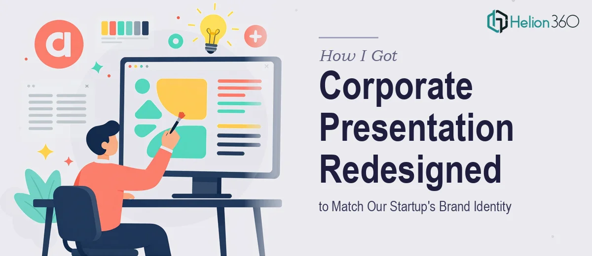
The Problem With Our Old Slides
We had been using the same corporate presentation since the day we launched. It had done its job well enough early on, but as the company grew and our brand matured, those slides started to feel like a liability. The layouts were crowded, the color palette was inconsistent, and nothing about the visual experience reflected where we were as a company today.
The stakes were real. We were heading into a stretch of meetings — partners, enterprise prospects, a couple of media conversations — where first impressions mattered. A presentation that looked like it was built in a hurry three years ago was not going to cut it. We needed a full corporate presentation redesign that would bring our brand identity to life on every slide, not just patch the obvious problems.
I knew quickly that doing this well was not a weekend project. The gap between "making it look nicer" and actually redesigning a presentation to reflect a modern brand is significant, and I didn't want to find that out the hard way the day before a big meeting.
What I Found the Solution Actually Required
When I started looking at what a proper corporate presentation redesign involves, the scope became clear fast. This wasn't about swapping colors or dropping in a new logo. Doing it well means rebuilding the presentation from a structural level — the slide master, the layout grid, the type hierarchy — so that every design decision is consistent and intentional from the ground up.
The first signal of real complexity was the brand application layer. A startup brand identity typically involves more than a logo: there are specific color values, typographic rules, approved imagery styles, and spacing conventions that need to be expressed coherently across every slide. Getting that wrong — even subtly — produces a deck that looks off without anyone being able to say exactly why.
The second signal was narrative structure. A corporate presentation isn't just a visual document. It has to move an audience through a story in a logical sequence, with each slide earning its place. Auditing what exists, cutting what doesn't serve the story, and restructuring what remains is a separate discipline from the visual design — and both need to happen together.
The third signal was the sheer volume of slides. When you're touching every layout across a full-length deck, the execution time compounds fast.
What the Redesign Work Actually Involves
The structural and narrative layer is where the real work starts. The right approach begins with an audit of every existing slide — identifying which content serves the core message, which slides are redundant, and where the logical flow breaks down. Done well, this produces a clear story arc with a defined opening, a middle that builds the case, and a close that lands with purpose. The practitioner's decision at this stage is which slides to collapse, which to expand, and how to sequence the whole thing so it reads as a single coherent argument rather than a collection of separate pages. Getting this right before touching any visual element saves significant rework later.
The visual mechanics layer is where brand identity meets presentation design in a technical sense. Proper corporate presentation design uses a 12-column layout grid applied through the slide master, a type hierarchy of roughly 36pt for headlines, 24pt for subheads, and 16pt for body, and a palette constrained to four brand colors with defined roles for backgrounds, text, accents, and data. Setting this up correctly — so it propagates across every layout in the master without breaking when content is edited — is painstaking work. Someone new to PowerPoint's master slide system can easily spend several hours just getting the grid and type styles to behave consistently across twenty-plus unique layouts.
Polish and consistency across the full deck is the stage that separates a professionally redesigned presentation from one that looks almost right. Every slide needs to be checked against the grid: margins uniform, icon weights matched, image crops consistent, spacing between elements identical across comparable layouts. In a deck of thirty or forty slides, there are hundreds of individual alignment decisions to make and verify. This stage takes longer than most people expect — and it's exactly where self-managed redesigns tend to fall apart, because the details that make the deck feel premium are invisible until they're wrong.
Why I Brought in Helion360 to Handle It
I didn't spend time attempting this myself. Once I understood what the redesign actually required — the master slide architecture, the brand application discipline, the narrative restructuring, the full-deck polish pass — it was obvious that this needed a team with the tooling and experience already in place.
Helion360 handled the full project end-to-end. That meant auditing the existing slides and restructuring the narrative flow, rebuilding the slide master with the correct grid and type hierarchy, applying our brand identity system consistently across every layout, and delivering a polished deck ready for live presentations. The turnaround was fast — done in days, not weeks — which mattered a great deal given our meeting schedule.
What stood out was that there was no back-and-forth on the fundamentals. The team understood what a modern corporate presentation should look like structurally and visually, and they brought that expertise to the project from day one rather than working it out as they went.
The Outcome and What I'd Tell Anyone in My Spot
The delivered deck was a complete transformation. Every slide reflected our brand identity cleanly — consistent type, a disciplined color palette, layouts that gave the content room to breathe. The narrative structure was tighter than anything we had produced internally, and the visual quality matched the level of the meetings we were walking into.
More importantly, we didn't spend weeks of internal time grinding through a redesign process that none of us had the deep expertise to execute well. The time we saved went back into preparing the actual content and the conversations behind it.
If you're looking at a similar situation — a corporate presentation that no longer reflects who you are, with real meetings on the calendar — Helion360 is the team I'd engage. They delivered fast, handled the full execution depth this kind of work requires, and the result spoke for itself.