

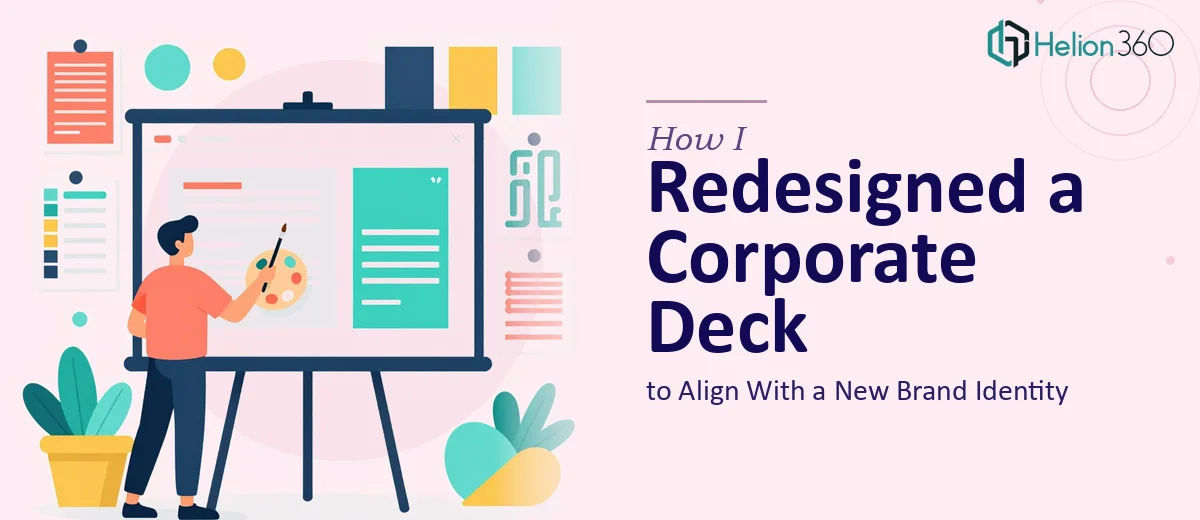
The Problem With Our Existing Deck
When our company went through a rebrand, the old presentation deck became an immediate liability. The logo had changed, the color palette had shifted, the typography was completely different — and the deck still carried the fingerprints of a brand identity that no longer existed. Every slide was a mismatch.
What made this urgent wasn't just aesthetics. The deck was going to executive audiences and external partners within weeks. Showing up with a presentation that contradicted the new brand we'd just launched would have undermined the rebrand entirely. First impressions in a corporate presentation carry weight, and a misaligned deck sends a quiet but clear signal that something is off.
I knew this needed to be done properly — not patched, not cosmetically refreshed, but rebuilt to reflect the new identity with full consistency from the first slide to the last.
What I Discovered the Work Actually Required
Before I handed anything off, I spent time understanding what a proper corporate presentation redesign actually involves. What I found made it clear this wasn't a weekend task.
The first thing I noticed was that brand alignment in a deck isn't just swapping a logo and changing a hex code. A rebrand typically comes with a new typographic system, a revised color hierarchy, updated iconography standards, and sometimes a completely different visual language. Each of those has to be applied consistently across every slide — not just the cover.
The second thing that struck me was the content restructuring dimension. The old deck had been built around messaging that no longer matched where the company was positioned. The narrative arc needed to be audited and rebuilt, not just reskinned.
Third, the deck needed to work across both digital and print formats — which meant layout decisions that work on a screen don't automatically translate to a printed handout. Those two environments have different margin requirements, resolution standards, and visual weight considerations. Handling both adds a real layer of complexity.
The Work That Needs to Happen in a Corporate Presentation Redesign
The right place to start is a structural audit of the existing deck — evaluating which slides carry the core narrative, which are redundant, and where the flow breaks down for the intended audience. Done properly, this means mapping a logical story arc across the full deck: opening with context, building through evidence, and landing on a clear conclusion. A corporate presentation that skips this step and jumps straight into visual updates tends to look polished on the surface while still confusing audiences at the content level. Getting the narrative sequence right before touching a single visual element is the foundation everything else rests on, and it takes genuine analytical attention to the source material.
Once the structure is locked, the visual mechanics take over. Proper brand application means working from a defined grid — typically a 12-column layout — where every text block, image, and icon snaps to consistent alignment rules. Typography hierarchy follows a strict scale: a 36pt headline, 24pt subhead, and 16pt body is a common corporate standard, but it has to be applied with discipline across every master slide and layout variant. Color usage is restricted to a primary palette of no more than four brand-approved tones, with secondary accent colors used sparingly. Setting this up correctly in the slide master so it propagates without manual correction across 40 or 50 slides is not a quick task — it requires fluency with the tool and patience with edge cases.
Polish and consistency across a large deck is where most self-managed redesigns unravel. Icon sets need to come from a single source library so stroke weights and visual styles don't clash slide to slide. Image treatments — whether photos use a color overlay, a duotone, or a clean crop — need to follow a single rule applied without deviation. Spacing between elements should follow a consistent increment (8px or 16px margins are common baseline units) so the deck never looks accidentally crowded or arbitrarily loose. These details seem minor in isolation, but inconsistency compounds fast across a full deck and signals a lack of craft to any audience paying close attention.
Why I Brought in Helion360 to Handle It
Once I understood the scope, I didn't attempt to manage the redesign internally. The combination of structural work, brand application, and dual-format optimization was more than the team had bandwidth for — and the timeline didn't allow for a learning curve on any of it.
Helion360 handled the full project end-to-end. That meant the content restructuring, the brand system application across the master slides, and the optimization of the deck for both digital and print delivery. What would have taken weeks of internal iteration was turned around quickly — in days, not weeks — and came back ready to present without a round of cleanup.
The thing that mattered most to me was that I didn't have to manage the process in pieces. The slide master setup, the typographic hierarchy, the visual consistency checks — all of it was handled as a single cohesive project, not a sequence of separate handoffs.
The Outcome and What I'd Tell Anyone in My Spot
What came back was a deck that looked like it had been built for the new brand from the ground up — because it had been. The narrative was tighter, the visual system was consistent across every slide, and it worked cleanly in both the digital version sent ahead of meetings and the printed format left behind afterward. The feedback from the first executive audience was immediate and positive.
If you're sitting with an existing corporate presentation that no longer reflects who you are — whether because of a rebrand, a strategic shift, or just years of accumulated patch fixes — the scope of doing it right is real. The structural work, the brand application, the consistency discipline across a full deck: it adds up fast.
If you're looking at the same situation and want it handled end-to-end without the weeks of figuring it out yourself, Helion360 is the team I'd engage — they delivered fast and brought the kind of execution depth this work genuinely requires.