

The Moment I Realized Our Presentations Were Holding Us Back
We had a series of important meetings coming up — internal leadership reviews, partner briefings, and a product showcase for a key client segment. The presentations we had on file were years old. They referenced products we no longer sold, used a brand identity we had since refreshed, and were structured in a way that buried the most important updates under walls of text.
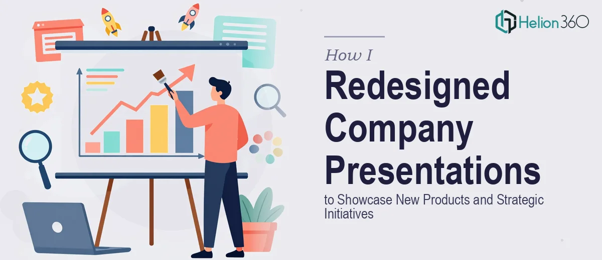
The stakes were real. These decks represented how our company told its story — new product lines, strategic direction, recent milestones. Walking into those rooms with outdated slides wasn't just a cosmetic problem; it was a credibility problem. I knew immediately that a half-hearted touch-up wasn't going to cut it. A proper company PowerPoint redesign, one that actually reflected where the business was now, needed to happen — and it needed to be done right.
What I Discovered a Real Presentation Overhaul Actually Requires
Before deciding how to move forward, I spent time understanding what a thorough update actually involves. What I found made it clear this was not a quick job.
First, it isn't just swapping out old logos and colors. Brand alignment in a presentation means applying the updated palette, typeface hierarchy, and iconography consistently across every master slide, every layout variant, and every content template — often dozens of them. Miss one and the inconsistency shows up exactly when you least want it to.
Second, restructuring the narrative for new products and strategic initiatives requires more than adding slides. It means auditing what exists, deciding what gets cut, identifying where new sections need to be built from scratch, and sequencing the whole thing so the story flows. That's editorial and design work happening simultaneously.
Third, the visual treatment of new content — product features, initiative roadmaps, achievement highlights — has to match the sophistication the audience expects. Generic clip-art-style icons and default chart styles signal low effort immediately. Doing this well takes genuine design judgment, not just template-filling.
What the Work Actually Involves at Each Stage
The structural and narrative layer is where a redesign like this lives or dies. The right approach starts with a full audit of the existing deck — identifying which sections are outdated, which are salvageable, and where new material needs to be built from scratch. A practitioner doing this well maps the presentation against a clear information hierarchy: executive summary up front, product and initiative details in the middle, supporting proof points and next steps at the close. What trips people up here is the editorial discipline required — knowing what to cut is as important as knowing what to add, and most non-designers underestimate how much time this phase alone consumes before a single slide is touched.
The visual mechanics layer is where brand alignment becomes concrete and demanding. Proper application means a consistent type hierarchy across every layout — typically a 36pt heading, 24pt subheading, and 16pt body rule applied through the slide master so it propagates automatically. Color usage is governed by a strict palette: a primary brand color, one or two accent colors, and a neutral for backgrounds and dividers — no ad hoc color choices slide-by-slide. The work also involves selecting chart types that match the data story (a grouped bar for product comparisons, a timeline for roadmap milestones) rather than defaulting to whatever PowerPoint suggests. Getting the master slide architecture right so these rules hold across all layout variants is the kind of task that takes an experienced designer hours even when they know exactly what they're doing.
Polish and consistency across a multi-section deck is where most self-managed updates fall apart. Every icon set needs to match in style and weight. Every image needs to be treated consistently — same crop style, same overlay treatment, same placement logic. Spacing and margin discipline needs to be uniform across slides that were built at different times. A 12-column underlying grid enforced across all layouts is what separates a deck that feels coherent from one that feels assembled. Without it, even well-designed individual slides look disconnected side by side, and that impression lands with the audience whether they can articulate it or not.
Why I Brought Helion360 in to Handle the Full Project
Once I understood what this redesign actually required, the answer was obvious. This wasn't something I could schedule around other work. The combination of structural thinking, brand application discipline, and visual execution depth — applied consistently across a multi-section company deck — needed a team that already had the process, the tools, and the design judgment ready to go.
Helion360 handled the full project end-to-end. That meant the narrative audit and content restructuring, the master slide architecture and brand alignment, and the full visual build of new product and initiative sections. They turned the project around quickly — done in days, not weeks — and handled the kind of execution depth that would have taken me far longer to work through even with unlimited time. The speed came from having a team that does this kind of work every day, with the tooling and workflows already in place.
The Result and What I'd Tell Anyone Looking at the Same Problem
What came back was a set of company presentations that actually reflected where the business is today. The new product sections were clear and visually engaging. The strategic initiative content was sequenced in a way that landed the key points without requiring the audience to work for it. The brand identity was applied consistently throughout — no mismatched colors, no legacy logos, no layout drift between sections. Walking into those meetings with these decks felt entirely different from what it would have been with the old versions.
If you're looking at a similar situation — presentations that need a real overhaul, not just a cosmetic fix — and you want it handled end-to-end without the weeks of learning curve, Helion360 is the team I'd engage. They delivered fast, and the execution quality was exactly what the work required.