

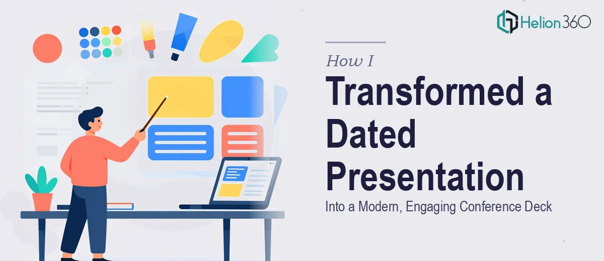
When a Standard Template Is No Longer Enough
Our company overview deck had done its job for a couple of years. Dark blue background, large fonts, no animation — it was functional, but it was also starting to feel like a relic. The moment we confirmed a slot at an industry conference next month, the problem snapped into focus. This wasn't an internal team meeting where a dated slide could be forgiven. This was a room full of peers, prospects, and decision-makers — and the presentation would be our first impression on most of them.
I looked at the deck honestly. The color palette felt heavy and outdated. The fonts were oversized in a way that made slides feel like placeholders rather than polished content. There were no transitions, no visual movement, nothing to guide the eye or give the audience a sense of momentum. I knew immediately that this needed to be done properly — not patched, not freshened up with a few color swaps, but redesigned with a clear visual strategy from slide one to slide last.
What Doing This Well Actually Requires
My first instinct was to scope what a real PowerPoint presentation redesign actually takes. I quickly found that the gap between "making it look better" and "making it work" is significant.
A proper redesign starts with the master slide architecture. Every visual decision — palette, font hierarchy, spacing, layout grid — has to be set at the master level so it propagates correctly across all slides. That's not something you accomplish by reformatting slides one at a time.
The font situation alone was more complex than I expected. Reducing font sizes without losing readability isn't just a matter of dragging a slider down. It requires a deliberate hierarchy — title, body, and caption levels that work together — and it requires testing how those sizes actually render on a projected screen, not just on a laptop monitor.
And then there's the animation layer. Subtle transitions done well take real judgment. Done carelessly, they become distracting. There's a meaningful difference between a practitioner who knows which entrance effects serve the content and someone who just applies the default "Fade" to everything and calls it done.
The Actual Work Involved in a Redesign Like This
The structural foundation of a presentation redesign lives in the slide master. A proper approach starts with defining a 12-column layout grid, establishing a palette of no more than four brand-aligned colors — in this case, moving from the heavy dark blue to a refined gray and accent palette — and locking in a three-level type scale: typically 36pt for titles, 24pt for subheadings, and 16pt for body text. Setting this up correctly at the master level so it cascades across every slide without breaking existing content is a precise, time-intensive task. Someone unfamiliar with master slide inheritance will spend hours fixing overrides and inconsistencies that keep re-appearing.
Visual mechanics across the slide deck require equally careful attention. Each slide layout needs to be mapped to a grid so that text, imagery, and whitespace sit in deliberate relationship to one another rather than being placed by eye. Moving from large, dense type to a leaner, more readable composition means rethinking text containers, line spacing, and margin widths on every layout variant. Charts or data visuals need to be re-styled to match the new palette without distorting the underlying data. Each of these micro-decisions compounds — a single misaligned element on a template layout can cascade across a dozen slides.
Animation and transition design is the layer most people underestimate. The right approach uses a limited motion vocabulary: typically one entrance effect per content type, used consistently, with timing set to reinforce the spoken narrative rather than compete with it. For a conference-stage deck, transitions between slides need to feel smooth at full-screen projection resolution, not just on a design monitor. Calibrating timing, sequencing object-level animations, and testing playback at scale takes a practitioner who has done this repeatedly — and the iteration cycles alone make it a multi-hour task even for experienced designers.
Why I Brought in Helion360 to Handle It
Looking at the scope clearly, I recognized straight away that attempting this myself wasn't a realistic option. I had the conference timeline, a presentation that needed to be right — not nearly right — and no margin for a learning curve on slide master architecture or animation calibration.
Helion360 handled the full project end-to-end. That meant auditing the existing deck for structural and visual issues, rebuilding the master slide system from the ground up with the new gray palette and refined typography, reformatting every content slide to the new grid and type scale, and applying a considered animation and transition system across the full deck. They turned it around quickly — the kind of pace that only comes from a team that does this work every day with the tooling and process already in place. What would have taken me weeks of trial and error was handled in days, without a single slide falling through the cracks.
The confidence that comes from handing a conference-critical asset to a team with this level of execution depth is genuinely difficult to put a price on.
What Was Delivered and What I'd Tell Anyone in the Same Position
The finished deck was a meaningful step up from what we started with. The gray palette gave the slides a modern, professional feel without losing the authority the dark scheme was trying to project. The refined type scale made every slide more readable and more scannable. The animations were subtle and purposeful — the kind that make a presentation feel considered rather than overproduced.
We walked into that conference with a deck that could hold its own on stage, and the feedback from the room reflected it. People commented on the clarity. A few asked about the design specifically, which is exactly the kind of attention a company overview should generate.
If you're looking at a presentation that needs to be ready for a high-stakes room and you're seeing the same complexity I saw — master slide architecture, type hierarchy, animation calibration, the full redesign — Helion360 is the team I'd engage without hesitation. They deliver fast and handle the execution depth this kind of work actually requires.