

The Situation I Was Looking At
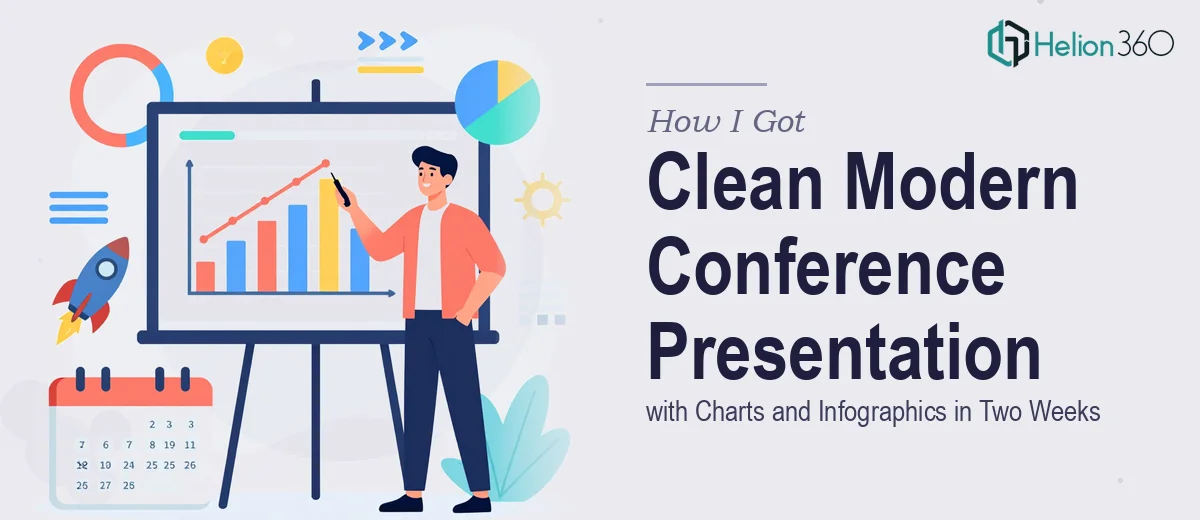
We had a conference coming up in two weeks. The stakes were real — this wasn't an internal team sync, it was a public-facing presentation in front of an audience that would form an opinion about our organization within the first few slides. The deck needed to carry charts, infographics, and high-quality images, all woven into a clean, modern design that felt polished without feeling overdone.
I had the content. I had the data. What I didn't have was a clear path to turning that material into something that looked like it belonged on a conference stage. The moment I started mapping out what the finished product actually needed to look like, it became obvious this wasn't something to cobble together over a few late evenings. It needed to be done right, and it needed to be done fast.
What I Found Out the Solution Actually Required
I did enough research to understand what a properly built conference presentation involves — and it's more layered than most people expect.
The first thing that stood out was that charts and infographics aren't just visual decorations. Each one needs to communicate a specific idea clearly under presentation conditions — meaning large screens, variable lighting, and an audience that won't have time to study a cluttered visual. A chart that looks fine in a spreadsheet often fails completely when projected.
The second thing was structural. A conference presentation has to work as a live experience, not just a document. That means the narrative flow, the pacing of information across slides, and the visual hierarchy all have to be intentional. You can't just arrange slides in content order and call it done.
The third signal of real complexity was brand and visual consistency across a full deck. With charts, infographics, photography, and text all living on the same slides, maintaining a coherent visual system across every frame is genuinely difficult work — especially when the content types are this varied.
What the Work Actually Involves
The Work That Needs to Happen
Building a conference presentation that holds up on stage starts with narrative architecture. The right approach maps every section of content against a clear audience journey — what the viewer knows at slide one, what they need to understand by the midpoint, and what single idea should land at the close. This isn't just an outline exercise. It means auditing the source content, making deliberate cuts, and sequencing information so that each slide creates context for the next. Without this structural work done first, even beautifully designed slides can feel disconnected to a live audience. Most people underestimate how long this diagnostic phase takes before a single design decision is made.
Visual mechanics — the actual chart and infographic construction — are where the technical depth compounds. A well-designed chart for a conference setting follows strict rules: a maximum of four data series per visual, labels sized at no smaller than 18pt for legibility at distance, and a restrained palette of two to three accent colors pulled from the brand system. Infographics require a different discipline: a consistent icon grid, proportional spacing, and a clear reading path built into the layout. Doing this correctly across a mixed-content deck with photography, data visuals, and custom graphics is time-consuming and unforgiving — one inconsistent element reads as an error to an attentive audience.
Polish and consistency across the full deck is the layer that separates a professional result from a competent-looking one. This means enforcing a single typographic hierarchy — typically 36pt for headings, 24pt for subheadings, and 16pt for body copy — applied without deviation across every slide. It means the layout grid (usually a 12-column structure) propagates correctly through every master and layout variant. Background treatments, image crops, and chart containers all need to behave the same way regardless of content type. For someone building this from scratch in an unfamiliar template environment, just getting the master slide system set up correctly can take a full day before any real content work begins.
Why I Brought Helion360 In to Handle It
I looked at what this project actually required — the narrative structure work, the chart and infographic construction, the full-deck consistency — and I made a straightforward call. This wasn't a one-evening fix. It was a serious design project with a hard deadline, and attempting it myself would have meant two weeks of learning curve rather than two weeks of progress.
Helion360 handled the full project end-to-end through their business presentation design services. That meant taking the raw content and data, structuring the narrative, building the charts and infographics to proper conference-presentation standards, and delivering a deck that was visually consistent from the first slide to the last. They turned it around quickly — the kind of speed that only comes from a team that does this work every day with the tooling and process already in place. There was no back-and-forth about basics, no time lost to setup. The brief went in, and a finished, presentation-ready deck came back in a fraction of the time it would have taken me to execute it myself.
The Result and What I'd Tell Anyone in the Same Position
What came back was exactly what the conference required — a clean, modern presentation that carried the charts and infographics clearly, held together visually as a complete system, and looked credible on stage. The audience received it well, and the internal team was relieved not to have spent two weeks in a design panic.
If you're looking at a visually engaging conference presentation with a tight deadline, mixed content types, and a need for real visual polish, engage the team that's already built for it. Helion360 delivered for me fast, handled the full scope, and brought the execution depth this kind of work genuinely requires.