

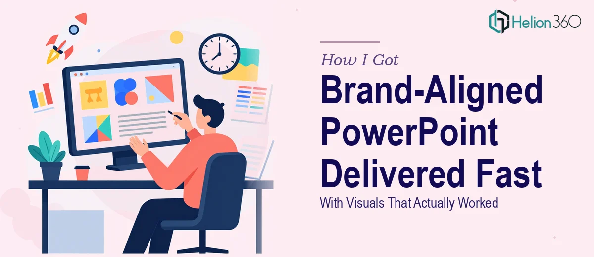
The Project That Made Me Realize Slide Design Is Its Own Discipline
I had a work project presentation due in under a week. Not a casual team update — a structured deck covering our project objectives, key strategies, potential challenges, and the mitigation plan for each. The audience expected something polished, something that felt intentional and reflected well on our team. A wall of bullet points on a default template was not going to cut it.
The brief was clear: consistent color scheme, modern typography, brand-aligned visuals, and infographics where the content called for it. What wasn't clear to me at the time was how much work sits behind a description like that. I knew what the end result needed to look like. I had no illusions about whether I was the right person to produce it.
What I Discovered a Professional Work Project Presentation Actually Requires
When I started looking at what a genuinely well-designed PowerPoint presentation involves, the scope became obvious quickly. This wasn't about picking a theme and typing into text boxes.
A properly structured work presentation starts with content architecture — mapping the narrative so that objectives, strategy, challenges, and solutions flow as a coherent story rather than a stack of disconnected slides. That alone takes real editorial judgment. Then there's the visual layer: a defined type hierarchy, a locked color palette derived from brand guidelines, and a consistent grid that governs every layout decision across every slide.
The infographic and data visualization component added another layer of complexity. Translating strategy text and challenge-mitigation relationships into visual formats — process diagrams, risk frameworks, iconography — requires both design skill and an understanding of how people read visual information under time pressure. Each of those elements has to feel like it belongs to the same system. That's where most self-built presentations fall apart.
What the Work of Building This Presentation Actually Involves
The first thing a well-executed work project presentation requires is structural and narrative clarity before a single slide is designed. The right approach maps each section — objectives, strategies, challenges, solutions — into a logical sequence where each slide answers a question the previous one raised. This means auditing the source material, deciding what earns its own slide versus what belongs as supporting detail, and writing headlines that carry the argument rather than just label the topic. Done properly, this structural pass can take several hours on its own, and skipping it produces a deck that looks designed but reads as scattered.
The visual mechanics of a consistent, brand-aligned presentation are more precise than most people expect. A 12-column layout grid needs to be built into the master slides so that text, images, and graphic elements align correctly at every breakpoint. Typography follows a strict hierarchy — typically a 36pt display heading, 24pt section heading, and 16pt body — and deviating from that even once creates visual noise the audience registers subconsciously. Brand color application means defining no more than four active palette colors and mapping each one to a specific role: primary background, accent, text, and supporting graphic. Getting this right and propagating it cleanly across 20-plus slides is tedious, exacting work that trips up anyone who hasn't done it repeatedly.
Infographics and supporting visuals require a separate layer of craft. A process flow showing how the team will move from challenge identification to resolution needs to be built as a diagram — not described in prose — using shapes, connectors, and icon sets that share a visual language with the rest of the deck. Each infographic element needs to communicate its point in under five seconds of reading time, which means ruthless simplification of the underlying content. The execution friction here is real: sourcing or creating icons that match brand style, sizing them consistently, and making sure they render cleanly on both a laptop screen and a projected display takes more iteration than it looks like from the outside.
Why I Brought in Helion360 to Handle the Full Project
I looked at the scope — structural narrative work, master slide setup, brand application, infographic design, and a deadline that was days away — and made a straightforward call. This was going to take a specialist team with the tooling and workflow already in place, not a learning exercise on my part.
Helion360 handled the full project end-to-end. They took the brief, worked through the content architecture, built the slide system with a proper master layout and brand-locked palette, and designed the infographics and visual frameworks the content needed. The deck came back quickly — handled in a fraction of the time it would have taken me to work through even the structural pass on my own. What I received wasn't a polished version of my rough draft; it was a presentation that had been designed with actual intent, where every layout decision served the content and the audience.
The Result and What I'd Tell Anyone Looking at the Same Situation
The presentation landed well. The team walked into that meeting with a deck that communicated clearly, looked consistent, and reflected the level of preparation the project deserved. The objectives, strategy, challenges, and mitigation plan each read as a coherent section rather than a list of thoughts — and the visual elements made the denser content easier to absorb quickly.
Looking back, the thing I'd tell anyone in a similar spot is simple: understand what the work actually requires before deciding who should do it. A professional PowerPoint presentation for a work project — one with real brand alignment, real infographics, and a real deadline — involves content structuring, master slide engineering, and visual design that all have to work as a system. That's not a weekend task for someone with other priorities.
If you're facing a similar brief and want it handled properly and quickly, Helion360 is the team to engage — they deliver end-to-end presentation design fast, and with the kind of execution depth this work genuinely needs.