

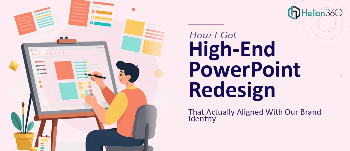
The Presentation Was Holding Us Back
We had a business presentation that had been patched together over time — a slide here, a template tweak there — and it showed. The deck was going in front of a senior audience where first impressions carry real weight, and the current version communicated the wrong things before anyone had read a single word. The mismatched fonts, the off-brand color blocks, the slides that felt like documents — all of it undermined the message we were trying to land.
The stakes were clear. This wasn't an internal update. It was a deck that represented how our organization thinks, operates, and presents itself. Getting it wrong wasn't really an option, and I knew quickly that a surface-level cleanup wasn't going to cut it. This needed a proper redesign — one that rebuilt the structure, applied the brand correctly, and made every slide earn its place.
What Doing This Well Actually Requires
I started researching what a genuinely high-end PowerPoint redesign involves, and the answer was more layered than I expected. The obvious part — making it look better — turned out to be the last step, not the first.
The real work starts with the narrative. A presentation that lands well isn't just visually polished; it's structured so that each slide builds on the last and the audience always knows where they are in the story. That requires going back through the source content, making editorial decisions, and sometimes cutting or restructuring slides entirely before a single design element gets touched.
Then there's the brand application. Not just swapping in the right hex codes, but understanding how the brand's visual system — its type hierarchy, its spacing logic, its color relationships — translates across dozens of slide layouts. Done superficially, it looks forced. Done properly, the brand feels embedded rather than applied.
And finally, there's the consistency work. Alignment grids, master slide architecture, icon style coherence — these are the things that separate a presentation that looks expensive from one that merely uses the right colors. That gap is significant, and it takes real craft and tooling to close it.
The Work That Actually Goes Into a Redesign Like This
The starting point for any serious PowerPoint redesign is the structural and narrative audit. The work involves going through every slide in the existing deck, mapping what the audience needs to understand at each stage, and identifying where the current flow breaks down. A practitioner working on this kind of project is making decisions about sequencing, slide count, and information density — typically enforcing a rule of one primary message per slide, with supporting evidence limited to three visual or textual elements. This phase alone takes longer than most people expect, because it requires both content judgment and an understanding of how audiences process information in a live presentation context.
Once the architecture is solid, the visual mechanics layer begins. Proper slide design at a high-end level works from a defined grid — typically a 12-column layout — with consistent margin widths, a strict typographic hierarchy (commonly 36pt for slide titles, 24pt for primary body, 16pt for supporting detail), and deliberate use of negative space to guide the eye. The right chart type for each data story is selected intentionally: a waterfall chart reads differently than a stacked bar, and using the wrong one creates confusion even when the data is correct. For someone unfamiliar with these conventions, just setting up the master slide and propagating the grid correctly across all layouts can take a full day.
Polish and brand consistency across the full deck is the third major layer, and it is where most self-built redesigns fall apart at scale. The work here involves enforcing a palette discipline — typically no more than four active brand colors with defined roles — and ensuring that icons, imagery, and graphic elements follow a single visual language throughout. Every text box needs to sit on the same invisible grid. Every divider, every callout, every data label needs to match. Across a 30- or 40-slide deck, maintaining that consistency without a systematic approach and the right tooling creates compounding errors that are difficult to catch and expensive to fix late.
Why I Brought in Helion360 to Handle It
I recognized early that this wasn't a project I could absorb into my schedule. The work was too specific, the standard too high, and the deadline too real for a learn-as-you-go approach to make any sense.
Helion360 handled the full project end-to-end — structural audit and narrative restructuring, master slide build and grid architecture, and full visual execution across every slide. They came in with the expertise and tooling already in place, which meant the project moved fast. What would have taken me weeks to attempt — and likely still not reached the standard needed — was turned around in days.
The brand application was handled with real precision. Typography hierarchy, color discipline, layout consistency — everything was built into the master slide architecture so that the deck held together as a system, not just a collection of individually designed slides. That's the difference between a redesign that looks polished in isolation and one that actually scales.
What Came Back and What I'd Tell Anyone in the Same Position
The delivered deck was a material step change from what we started with. The narrative was tighter, the visual language was coherent from slide one to the last, and the brand felt embedded rather than retrofitted. The audience read the presentation the way it was intended to be read — without friction, without distraction, and with the right emphasis on what mattered most.
The experience confirmed something I already suspected: a high-end PowerPoint redesign is not a design task you hand off to someone with general graphic skills and hope for the best. It requires presentation-specific craft — narrative architecture, slide system design, and the discipline to hold consistency across a full deck under time pressure.
If you're looking at a similar project and need it handled end-to-end without the weeks of learning curve, Helion360 is the team I'd engage — they delivered fast and brought exactly the execution depth this kind of work requires.