

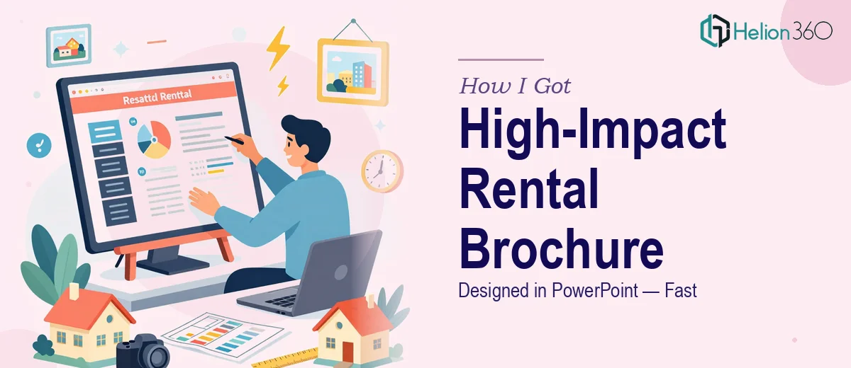
The Situation: A Brochure That Needed to Do Real Work
I had a rental property portfolio that needed a proper marketing document — something that could be handed to prospective tenants, shared digitally, and updated easily when listings changed. The audience was professionals and families: people with options, who respond to quality and clarity.
A rough flyer was never going to cut it. This needed to feel like a premium product — clean layout, strong photography placement, clear property details, and a brand presence that said "this landlord is serious." It also needed to be editable in PowerPoint, because details change and I couldn't go back to a designer every time a price or availability date shifted.
I looked at what a well-executed real estate rental brochure in PowerPoint actually requires, and it became clear very quickly that this was not a weekend DIY project.
What I Found the Solution Actually Required
The first thing I discovered is that a brochure that feels polished isn't just a matter of dropping photos into a slide. The layout has to guide the reader's eye deliberately — from the hero image, to the property headline, to the key details, to the call to action — without any single element competing for attention in a way that creates visual noise.
The second complexity: editable doesn't mean cobbled together. For the brochure to remain usable after handoff, the PowerPoint file needs to be built on a clean master slide structure with properly named layouts, locked background elements, and unlocked content zones. If that architecture isn't set up correctly from the start, every edit breaks something.
The third signal that this was serious work was the brand consistency requirement. Typography, color palette, and spacing rules had to hold across every property page — even as content varied. That kind of discipline across a multi-page editable document takes real experience to execute without the file becoming fragile.
What Proper Real Estate Brochure Design in PowerPoint Actually Involves
The work starts with structure and narrative flow. A real estate rental brochure needs a clear content hierarchy across every page: property name at a prominent display size (typically 36–40pt), key specs at a supporting level (20–24pt), and descriptive body copy no smaller than 14pt for readability on screen and in print. The layout must allocate specific zones for photography, copy, and contact information — and those zones need to be consistent across all property pages. Getting that architecture right before a single visual decision is made is what separates a usable document from one that looks fine on page one and falls apart on page four. Most people underestimate how long it takes to define and lock this structure correctly in PowerPoint's slide master environment.
Visual mechanics are where the real craft lives. A well-designed property brochure uses a grid — typically an 8 or 12-column base — to align every element with precision. Photography placement follows specific aspect ratios (16:9 for hero images, 4:3 for secondary shots) so that swapping in new property photos doesn't break the layout. Color palette is typically kept to 3–4 tones: a neutral base, one brand accent, and one supporting tone for highlights or call-to-action elements. These rules sound simple to state but are genuinely difficult to apply consistently across a document with variable content. A single misaligned element on a page that will be printed or projected reads as unprofessional immediately.
Polish and consistency across a multi-page editable file is the step that catches most people off guard. Every text box needs consistent internal padding, every image frame needs to crop predictably when content is swapped, and every slide layout needs to be built so a non-designer can make updates without inadvertently shifting alignment or breaking the visual hierarchy. This means building custom slide layouts in the master — not just formatting individual slides — and testing the editable zones under realistic edit scenarios. That QA step alone, done properly, takes several hours and requires knowing exactly what to test for.
Why I Brought in Helion360 to Handle It
I recognized early that the combination of design quality, PowerPoint architecture, and editable-file discipline was a specific skill set — not something I was going to assemble from scratch on a tight timeline.
Helion360 handled the full project end-to-end: the layout structure and content hierarchy, the visual design system including grid, typography scale, and color palette, and the PowerPoint master slide build that made the file genuinely editable without falling apart. They turned it around quickly — done in days, not the weeks it would have taken me to learn the tooling, iterate through layout options, and QA the file properly.
The result was a file that looked like a professionally produced marketing document and behaved like one too. That combination — design quality plus functional architecture — is exactly what this type of project requires, and it's what a team that does this work every day is built to deliver.
What the Project Delivered and What I'd Tell Anyone in the Same Spot
The finished brochure held up across every use case: printed for in-person viewings, shared as a PDF via email, and opened directly in PowerPoint for quick edits when listing details changed. The design communicated the right level of quality to the target audience — professionals and families who respond to presentation — and the file structure meant I wasn't locked into a designer for every minor update.
The business outcome was straightforward: a marketing asset that worked the way a marketing asset is supposed to, delivered on a timeline that matched the actual need.
If you're looking at a similar project — a real estate brochure or any editable presentation document that needs to look professional and function reliably — and you want it handled end-to-end without the learning curve, Helion360 is the team I'd engage. They delivered fast and brought the kind of execution depth this work genuinely requires.
For more guidance on creating effective marketing materials like this, explore lead magnets that convert. You may also find it helpful to review how others have successfully tackled professional brochure and email flyer projects, or learn from case studies on investor-focused presentations.