

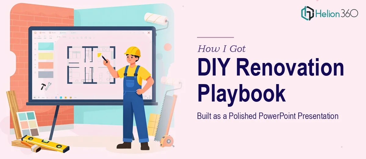
The Situation I Was Staring At
I had a dense homeowner playbook — room-by-room renovation guides, checklists, material comparisons, process flows — and it needed to become a clean, navigable PowerPoint presentation. The audience was homeowners who needed to actually use this as a reference, not just glance at it once. That meant the design had to do real work: organize complex information, respect a visual hierarchy, and stay consistent across what would end up being a substantial deck.
The deadline was tight. The content already existed in rough form, but raw content is not a presentation. Someone still had to make decisions about what lived on each slide, how the information grouped together, and how the visual system would hold it all without turning into a wall of text. I knew immediately this needed to be done properly — not just prettied up, but structurally and visually rebuilt for the format.
What I Found Out This Actually Requires
Once I started looking into what a high-quality PowerPoint presentation design project of this scope actually demands, a few things stood out immediately.
First, the content itself had to be restructured before a single slide could be designed. A homeowner playbook covering multiple renovation categories is not naturally organized for a linear presentation. The narrative flow has to be mapped deliberately — deciding what's a section opener, what's a detail slide, what becomes a visual summary versus a text-forward reference page.
Second, the visual system has to be built before it's applied. That means a master slide structure, a typography scale, a color palette tied to brand guidelines, and consistent icon or illustration conventions. Building that system correctly, so it propagates cleanly across dozens of slides, is a non-trivial technical task in PowerPoint.
Third, keeping brand consistency rigorous across a large deck — with varied content types like step-by-step guides, comparison tables, and callout boxes — is genuinely difficult to maintain manually slide by slide. These were not weekend-project-level challenges. This was a full design engagement.
What the Work Actually Involves
The right approach to a project like this starts with a structural audit of the source material. Done well, this means categorizing every content block — instructional text, checklists, process steps, material specs — and deciding what format each deserves on a slide. A practitioner working through this maps a full slide-by-slide outline before opening the design file, ensuring the logical flow holds whether someone is reading sequentially or jumping to a specific section. That upfront content architecture work takes meaningful time, and skipping it produces a polished PowerPoint presentation where individual slides look fine but the whole thing feels disconnected.
The visual mechanics layer is where most of the technical precision lives. A well-built PowerPoint presentation uses a 12-column layout grid applied through the slide master, a three-tier type scale (typically 36pt section headers, 24pt slide titles, 16pt body), and no more than four brand colors with defined usage rules for backgrounds, accents, and text. Applying these rules consistently across 40 or 50 slides — especially when content varies significantly between slides — requires template discipline that takes hours to build and test. Getting the master slides wrong early means rework cascades across the entire deck.
Polish and consistency across a large deck is its own sustained effort. Every callout box, icon treatment, divider element, and table style needs to follow the same visual logic, and that logic needs to be documented in the master structure so it doesn't drift as slides are added or revised. The execution friction here is real: it's not one decision, it's the same decision made correctly fifty times in a row, with enough attention to catch the one slide where spacing broke, a font substituted, or a color hex drifted off-brand. That kind of sustained quality control is where DIY attempts typically break down under deadline pressure.
Why I Brought in Helion360 to Handle It
I looked at the scope — structural reorganization, master slide architecture, brand application across a large and varied deck, tight deadline — and made the call quickly. This was not a project I was going to handle myself between other responsibilities and get right. The gap between a functional deck and a genuinely polished presentation that homeowners would actually want to use is significant, and closing that gap requires design experience and tooling that I simply didn't have on hand.
Helion360 handled the full project end-to-end. That meant taking the raw playbook content and restructuring it into a logical slide architecture, building the master template system with the correct grid, type scale, and brand palette, and applying that system consistently across the full deck. They turned it around quickly — what would have taken me weeks of learning and iterating was done in days. The result came back complete, not as a starting point I'd still need to finish.
What Came Out of It and What I'd Tell Anyone in This Spot
The delivered deck was a genuinely usable homeowner reference — clean section structure, consistent visual language, content formatted for how people actually read a guide rather than how it was written in the source document. Each renovation category had its own clear visual entry point, the step-by-step content read as a sequence rather than a block of text, and the whole thing held together as a single coherent presentation. The project hit its deadline without a scramble.
If you're staring at a similar situation — complex content that needs to become a professional PowerPoint presentation under time pressure — the realistic answer is not to start experimenting with slide masters at midnight. Helion360 is the team I'd engage: they handled the full scope fast, with the design expertise and execution depth this kind of work actually requires.