

The Situation and What Was at Stake
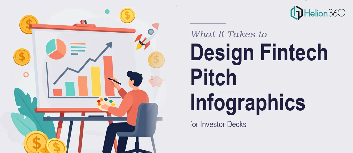
We were a fintech startup heading into investor conversations, and our investor pitch deck was the first real impression we'd make. The data we had was strong — growth metrics, market size, revenue projections — but it was sitting in spreadsheets and rough slide drafts that communicated nothing quickly. Investors don't sit with dense tables. They scan, they assess, and they form opinions in seconds.
The deck needed infographics that could carry the story visually: where we were, where we were going, and why the opportunity was real. The deadline was fixed, the audience was sophisticated, and a poorly visualized deck wasn't just an aesthetic problem — it was a credibility problem. I knew immediately this wasn't something to patch together internally. It needed to be done right, from the ground up.
What I Found Investor Pitch Deck Infographic Design Actually Required
I spent time understanding what separates a presentation-ready infographic from a chart someone dropped into a slide. The gap is significant.
First, investor pitch deck design isn't just about making things look clean. It's about selecting the right chart type for each claim, encoding data in a way that's immediately legible, and ensuring the visual hierarchy guides the reader to the right conclusion without confusion. A misused chart type — a pie chart where a bar chart belongs, a 3D effect that distorts perceived values — actively undermines credibility with an informed audience.
Second, infographics in a pitch deck have to carry a narrative thread. Each visual needs to connect to the slide before and after it. That's a structural editorial decision, not just a design one. Choosing what to show, what to suppress, and how to sequence the argument requires both data literacy and storytelling judgment.
Third, the fintech context adds a layer of specificity. The visualizations need to reflect the conventions investors in this space expect — unit economics framing, cohort-style growth representations, clear market sizing logic. That's domain knowledge most generalists don't carry.
The Work That Needs to Happen in a Deck Like This
The foundation of good infographic design in a pitch deck is structural clarity before any visual work begins. The right approach starts with auditing every data point — what it actually says, what it's meant to prove, and which visual form communicates that proof fastest. A well-structured deck typically sequences problem, solution, traction, and opportunity in that order, with each infographic serving a specific argumentative function. Getting that architecture right before opening a design tool is the decision that determines whether the visuals feel coherent or random. For someone without experience doing this kind of story-mapping, the audit phase alone can take days of iteration.
Visual mechanics are where the execution complexity multiplies. Proper infographic design for investor presentations operates on disciplined layout rules — a 12-column grid, no more than four brand colors applied consistently, and a type hierarchy running approximately 36pt for headlines, 24pt for data callouts, and 14–16pt for supporting labels. Chart selection follows strict logic: grouped bar charts for comparative metrics, line charts with annotated inflection points for growth stories, icon-based unit charts for market sizing. Deviating from these conventions without a reason introduces visual noise. Setting up master slides and style sheets that enforce these rules across every infographic — and hold when content changes — is genuinely technical work that takes hours to configure correctly.
Polish and brand consistency across a full deck is the part that quietly eats the most time. Every infographic needs to carry the same palette, the same corner radius on callout boxes, the same stroke weight on chart axes, and the same spatial breathing room around data labels. In a 15 to 20-slide deck with multiple infographic types, maintaining that consistency manually means checking dozens of individual elements. One mismatched element on a slide shown to a sharp-eyed investor reads as carelessness — and in a pitch context, carelessness is expensive.
Why I Brought in Helion360 to Handle It
Looking at the scope — the story architecture, the chart selection logic, the grid-based layout system, the brand consistency across every slide — I recognized quickly that attempting this myself wasn't a realistic path. The deck was too important and the deadline too tight to treat it as a learning exercise.
I engaged Helion360 to handle the full project end-to-end. They took the raw data, the brand guidelines, and the narrative brief and turned the entire deck around quickly — done in days, not the weeks it would have taken me to work through the structural decisions, build the master slide system, and iterate through the visual mechanics. The team handled the infographic design for every section: growth metrics, market sizing, competitive positioning, and financial projections. Each visual was built to investor-presentation standards from the first draft. That's the value of a team that does this work every day — the tooling, the conventions, and the judgment are already in place.
The Result and What I'd Tell Anyone Facing the Same Call
What came back was a deck that looked like it belonged in the room. The infographics were clean and immediately legible — investors could read the growth story, the market opportunity, and the unit economics at a glance without having to decode the visuals. The narrative thread held from the first slide to the last. The brand application was consistent across every infographic, every callout, every chart axis.
More practically, the deck held up under scrutiny. When investors asked questions, the visuals supported the answers rather than creating new ones. That's the real test of whether pitch deck design was done well — not whether it looks impressive in a thumbnail, but whether it performs in a room.
If you're looking at the same situation — data that needs to become a credible, visually sharp investor pitch deck on a tight timeline — Helion360 is the team to engage. They handled the full execution fast, and the depth of work they brought to the infographic design made a visible difference.