

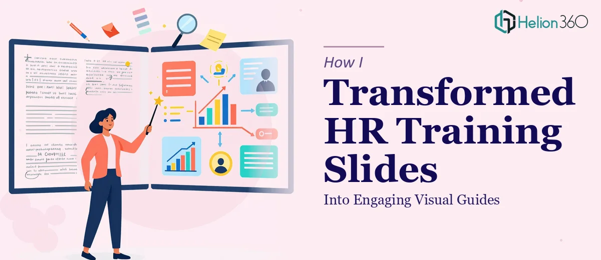
When the Training Deck Stopped Working
Our HR team had built up a library of training presentations over several years. The content was solid — policies, onboarding workflows, compliance procedures — but the slides were walls of text. Bullet point after bullet point, with no visual logic to guide a learner through the material. Completion rates from self-paced modules were poor, and facilitators kept telling us that participants zoned out halfway through.
The stakes were real. These weren't optional sessions — they covered compliance topics that every new employee had to understand before their first week on the floor. If the material wasn't landing, we had a genuine operational risk, not just a design problem.
I knew the presentations needed to be rebuilt as proper visual guides: structured, scannable, and built around infographic design principles rather than text-dump slides. I also knew immediately that this wasn't something our internal team could execute at the level the material deserved.
What I Found This Kind of Work Actually Requires
Before engaging anyone, I spent time understanding what genuinely good PowerPoint infographic design involves — not just making things look prettier, but restructuring how information is communicated visually.
The first signal of real complexity was the content audit itself. Each slide deck had to be broken down by information type — process flows, policy hierarchies, compliance checklists, role-based decision trees — and each type demands a different visual treatment. You can't apply one infographic template to everything and call it done.
The second signal was the visual mechanics. Proper infographic design in PowerPoint involves deliberate icon systems, consistent visual metaphors, and a typographic hierarchy that makes scanning effortless. Getting that to work coherently across forty or fifty slides — while keeping the brand locked in — is a discipline unto itself.
The third thing I noticed was the time requirement. A proper redesign of a single complex slide, done well, isn't a fifteen-minute task. Multiply that across multiple decks with different content types and you're looking at a project that needs dedicated expertise, not a side effort.
What the Work Actually Involves
The right approach to infographic PowerPoint design starts with a structural audit of the source content. Every slide needs to be categorized by the type of information it carries — sequential process, comparison, hierarchy, reference data — because the visual format follows the content logic, not the other way around. A five-step onboarding workflow needs a horizontal process flow diagram with numbered nodes and connective arrows. A compliance checklist needs a structured grid with status indicators. Getting this mapping right before touching any design tool is what separates a coherent visual guide from a prettified slide deck. The decision-making here is methodical and takes real time — rushing the audit phase is where most DIY attempts fall apart before a single design element is placed.
Visual mechanics are where the execution complexity becomes undeniable. A well-built infographic slide operates on a strict layout grid — typically a 12-column base — with a typographic hierarchy of no more than three levels (roughly 28pt for headers, 18pt for sub-labels, 12pt for body callouts). The icon system must be sourced from a single family and used consistently: one icon per concept, never two icons for the same idea across the deck. Color usage follows a capped palette — a primary brand color, one accent, and two neutrals — with contrast ratios that pass accessibility standards. Setting all of this up inside PowerPoint's slide master so it propagates correctly across every layout takes hours for someone who hasn't done it dozens of times before.
Polish and brand consistency across the full deck is the final layer, and it's where volume creates real friction. When you're working across forty-plus slides, small inconsistencies compound fast — a misaligned icon here, a slightly off-brand color hex there, a margin that drifts two pixels between layouts. Each one is minor in isolation but collectively they signal amateurism to any trained eye. Proper execution means a final consistency pass against a brand spec checklist: every element checked against the approved palette, every font instance confirmed, every icon scaled to the same base size. That level of finish isn't achievable in a single pass — it requires a dedicated review cycle built into the project timeline.
Why I Brought in Helion360 to Handle It
After mapping out what this work genuinely required, it was clear that attempting it internally would mean weeks of learning curve and inconsistent output. The right call was to engage a team that already had the process, the tooling, and the repetition behind them.
Helion360 handled the full project end-to-end: the content audit and information architecture mapping, the full infographic redesign of every slide, and the brand consistency pass across the entire deck library. There was no hand-holding required from my side — I shared the source files and the brand guidelines, and the work came back fast. We're talking days, not weeks, for a volume of material that would have taken our internal team months to attempt at the same standard.
The turnaround alone justified the decision. But more than speed, the quality of thinking behind the visual structure — how each slide type was matched to the right infographic format — was exactly what the material needed.
The Result and What I'd Tell Anyone in the Same Position
What came back was a completely rebuilt training library. Each deck had a clear visual logic — process flows for sequential content, icon-driven checklists for compliance material, comparison layouts for policy options. Facilitators immediately noticed the difference in how participants engaged with the material. The slides became reference tools that learners could actually scan and retain, not documents they sat through.
The business outcome was straightforward: better comprehension, less time spent re-explaining material in live sessions, and a training library that now reflects the professionalism the content always deserved.
If you're looking at a similar situation — dense training content that needs to become a proper visual guide — and you want it handled end-to-end without the weeks of ramp-up, Helion360 is the team I'd engage. They delivered fast and brought exactly the kind of execution depth this type of work demands.