

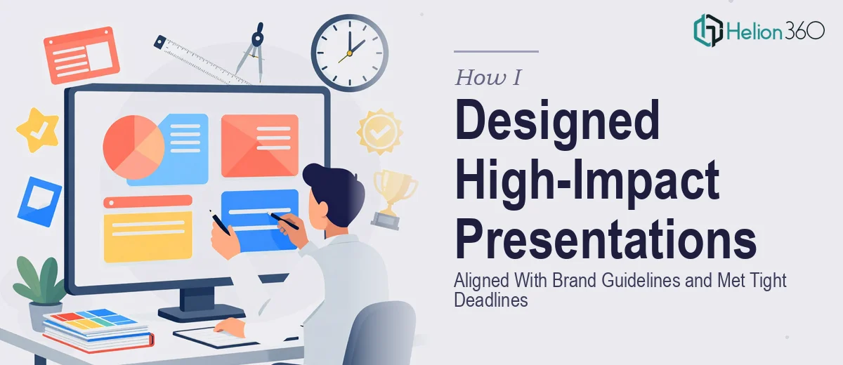
When the Brief Says "Brand-Aligned" and the Clock Is Already Running
I had a stack of presentation projects lined up — a mix of PowerPoint decks and Google Slides builds, ranging from compact five-page summaries to fuller ten-page business presentations. Each one needed to look consistent, feel professional, and land with the right visual weight. Nothing experimental. Just clean, structured, on-brand work delivered on time.
The challenge was not the software. I know my way around PowerPoint and Google Slides reasonably well. The challenge was the brand alignment piece combined with the turnaround pressure. Every deck had to match an existing format — specific typography, color systems, layout logic — while also communicating clearly across a range of business contexts, from internal reviews to investor-facing materials.
I started working through the first project myself. I pulled up the brand guidelines, matched the color palette, and started laying out slides. It moved slowly. The moment I hit the more nuanced layout decisions — hierarchy between visual elements, how to balance dense content without overcrowding a slide, how to make data feel readable without stripping out the detail — I realized the gap between "good enough" and "genuinely polished" was wider than I had accounted for.
Where the Process Started Breaking Down
The issue was not one thing. It was the accumulation of small decisions that compound into a final result. Typography spacing that looks slightly off. A chart that is technically correct but visually confusing. A slide that has all the right information but no clear reading path for the eye.
I had a working version of the first deck done. It was functional. But holding it up against the example presentations I had been given as reference, I could see the gap. The reference decks had a rhythm to them — each slide felt intentional, not just filled in. That kind of consistency across a full presentation takes more than knowing the brand colors. It takes a practiced eye for layout and a feel for visual storytelling that I did not have at the level these projects required.
I also had more decks queued behind this one, each with its own requirements. The math was not working in my favor.
Bringing in the Right Support
After sitting with the problem for a day, I reached out to Helion360. I explained the situation — the brand guidelines, the project scope, the deadlines, and the quality bar I was trying to hit. Their team asked the right questions upfront: file formats, font availability, layout references, and how much creative latitude existed within the brand system.
From there, they took over the design execution. I stayed involved for content review and feedback rounds, but the actual slide construction — the layout decisions, the typography refinement, the visual hierarchy — was handled by their business presentation design team.
What the Final Presentations Actually Looked Like
The difference was noticeable in the first round of files. The decks came back with proper breathing room on each slide, consistent spacing, and a visual logic that made each section easy to follow. The brand guidelines were respected without the slides feeling rigid or templated. There was a genuine design sensibility applied to how information was arranged — not just boxes placed on a grid.
The Google Slides versions were built natively in the platform, not just ported over, which meant animations and master slide structures actually worked as intended. The PowerPoint versions had clean, editable layouts — nothing baked in as images where it did not need to be.
Over the course of working through the project queue, the consistency held. Each deck felt like it belonged to the same family without being identical. That is harder to achieve than it sounds, especially when the content across projects varies significantly.
What I Took Away From This
Presentation design for business use — particularly when brand guidelines are non-negotiable and deadlines are fixed — is a specific discipline. It sits at the intersection of graphic design, communication strategy, and platform-specific technical knowledge. Doing it well under pressure requires both the right skill set and enough bandwidth to actually apply it carefully.
If you are managing a similar workload — brand-aligned PowerPoint or Google Slides presentations that need to look genuinely professional, not just complete — Helion360 is worth a conversation. They handled what I could not execute at the level required, and the work came back ready to use.