

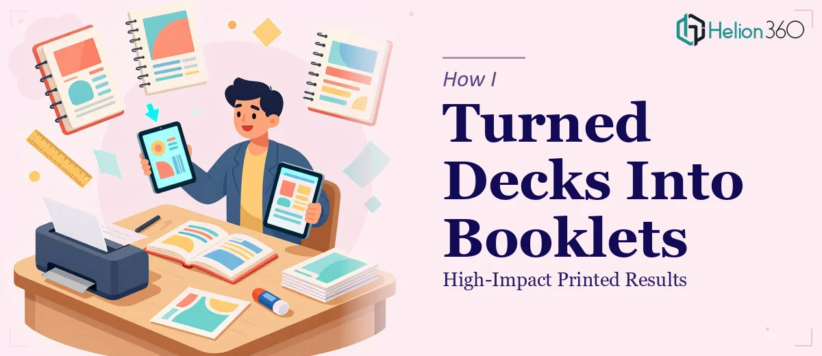
When a Slide Deck Is Not Enough for the Room
We had two presentation decks that had been doing solid work in virtual meetings. Clear messaging, decent layout, enough to get the point across on a screen. But when our startup started planning for in-person events and conferences, those same slides suddenly felt insufficient. Handing someone a printout of a 16:9 slide with oversized text and thin margins is not a great first impression.
The goal shifted from screen-ready to print-ready — specifically, we needed two fully designed printed presentation booklets that people could hold, flip through, and take home. That is a different design challenge entirely.
What I Tried to Handle on My Own
I started by exporting the decks to PDF and adjusting the layout manually in PowerPoint, thinking I could retrofit the slides into a booklet format. The problem was that slides are built for horizontal, full-screen display. When you try to reformat that content for a printed page — especially one that needs bleed areas, consistent margins, readable body text, and full-color print specs — the whole structure starts to break.
I also realized the content itself needed reworking. Bullet points that worked fine on a projected slide do not translate well to a printed page that a reader is engaging with at their own pace. The visual hierarchy needed to change. Typography needed to scale appropriately. Images needed higher resolution. And both booklets had to feel like part of the same brand system while still being distinct documents.
I spent a few evenings trying to make it work in PowerPoint and later in Canva, but the output never looked like something I would be comfortable distributing at a professional event. The layouts felt inconsistent, the spacing was off, and the branding was not cohesive enough across both pieces.
Bringing In the Right Help
After hitting that wall, I came across Helion360. I explained the situation — two existing decks, a tight deadline, a conference coming up, and a need for print-ready booklet design that matched our brand. Their team asked the right questions from the start: print dimensions, color mode, whether we needed bleed and crop marks, how the two booklets should relate to each other visually, and what the final use case was.
That conversation alone told me they understood the difference between presentation design for screens and design for print. I handed over both decks along with our brand guidelines and let them take it from there.
What the Final Booklets Actually Looked Like
The turnaround was faster than I expected. Helion360 restructured the content layout for each booklet so it read naturally as a printed document rather than a repurposed slideshow. They adjusted typography for print legibility, rebuilt charts and graphics at the right resolution, and created a consistent visual system across both pieces — same brand, same tone, but with enough variation to make each booklet feel purposeful on its own.
The full-color output was sharp. The layouts breathed properly. And perhaps most importantly, the booklets felt like something our startup had genuinely invested in — not something that was cobbled together from old slide files.
What This Process Taught Me About Print vs. Screen Design
Converting a slide deck into a printed presentation booklet is not a straightforward export. It requires rethinking how content is structured, how much text belongs on a page, how visuals need to be prepared for CMYK color output, and how a reader interacts with a physical document versus a projected slide. These are genuinely different disciplines, and trying to bridge them without the right skill set costs more time than it saves.
If you are working on something similar — decks that need to live as printed materials for events, proposals, or brand collateral — Helion360 is worth reaching out to. They stepped in where my own tools and time ran out, and delivered the kind of polished, print-ready work the project needed.