

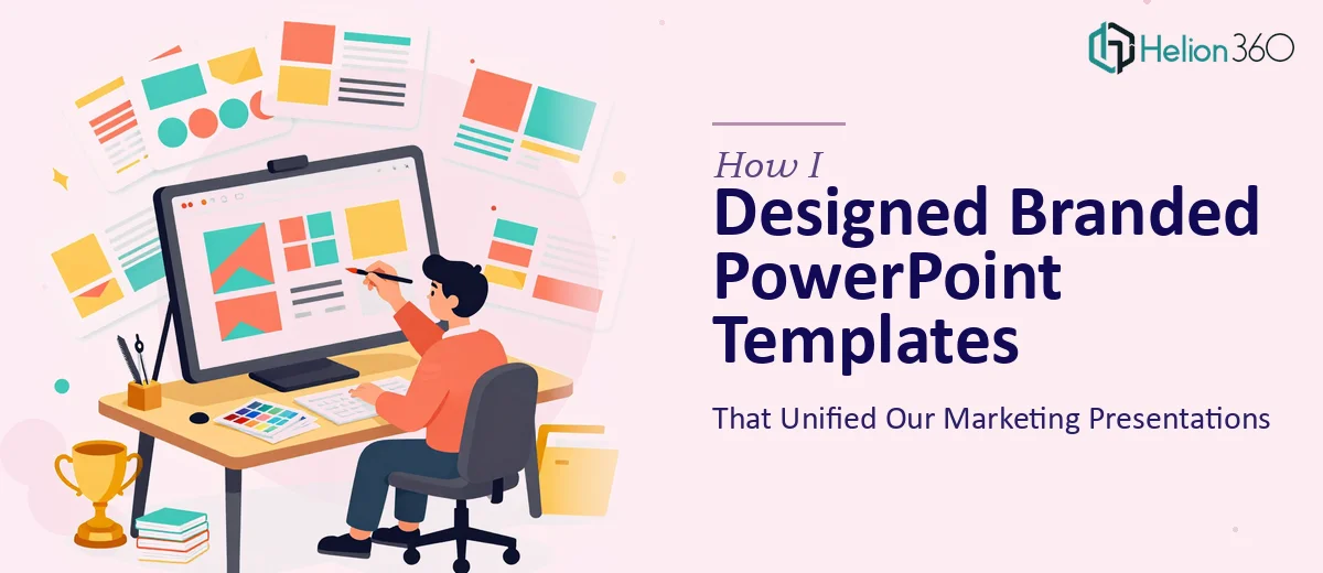
The Problem With Our Presentations Was Embarrassingly Simple
Every time our team put together a marketing presentation or client deck, it looked like it came from a different company. One slide used the wrong font. Another had an outdated logo. The color palette shifted depending on who built the file last. It was not a crisis, but it was the kind of inconsistency that quietly erodes how professional a brand feels — especially when those slides are going in front of clients.
I was tasked with fixing it. The goal was straightforward: create a set of branded PowerPoint templates that anyone on the team could use, built around our brand fonts, colors, and logo. Every marketing presentation going forward would start from the same foundation.
What I Tried to Build on My Own
I started by pulling together our brand guidelines and opening PowerPoint with a plan. I knew the basics — setting slide masters, defining color themes, placing the logo on the layout. I built a rough version of the template within a couple of days.
But the problems surfaced quickly. The slide master structure was getting complicated as soon as I tried to account for different layout types: title slides, section dividers, content slides, diagram slides. Keeping the branding consistent across all of them while also making the layouts flexible enough for real use was harder than expected. The templates I was producing looked fine at first glance but fell apart in practice — text boxes shifted when content was added, diagrams looked inconsistent, and some layout slides simply did not behave.
Then came the process diagrams. The company needed visual representations of several workflows and service models. I am comfortable with design fundamentals, but building clean, scalable process diagrams inside PowerPoint — ones that are both visually clear and on-brand — is a different kind of work. My attempts were functional but not polished enough for client-facing materials.
Bringing in Outside Help
After spending more time than I had budgeted and still not landing at the quality level we needed, I reached out to Helion360. I explained the situation: we needed a complete branded PowerPoint template system and a set of process diagrams, all aligned to our brand identity. Their team asked the right questions upfront — layout requirements, the number of diagram types, how the files would be used and by whom.
From there, I handed over the brand assets and stepped back.
What the Final Templates Looked Like
Helion360 delivered a structured slide master with multiple layout types — title, section, full content, split content, and diagram-specific layouts. Each layout was built to hold content without breaking the visual structure. The brand fonts were embedded correctly, the color palette was locked into the theme, and the logo placement was handled through the master so it never had to be manually placed again.
The process diagrams were a separate deliverable. They came in as editable PowerPoint shapes — not images — which meant anyone on the team could update the text or adjust a step without needing to go back to a designer. Each diagram followed the same visual language as the templates: same colors, same icon style, same spacing logic.
What I noticed immediately was how much easier it was to build a new presentation using these files. Everything just stayed in place. The visual consistency that had been missing for months was suddenly built into the starting point.
What This Kind of Work Actually Requires
Building a branded PowerPoint template system is not just about making slides look good. It requires a solid understanding of how PowerPoint's master and layout structure works, how to handle font embedding and color themes properly, and how to design layouts that are genuinely usable — not just visually appealing in a screenshot. The process diagram side adds another layer: translating complex workflows into something clean, readable, and still on-brand.
The time I spent trying to do this myself was not wasted — I understood the problem better going in. But the gap between a workable draft and a production-ready template system was real, and it was not something I could close quickly on my own.
If your team is dealing with the same kind of inconsistency across presentations, Helion360 is worth reaching out to. They handled both the template system and the diagrams cleanly, and the files have been in daily use without issues since delivery.