

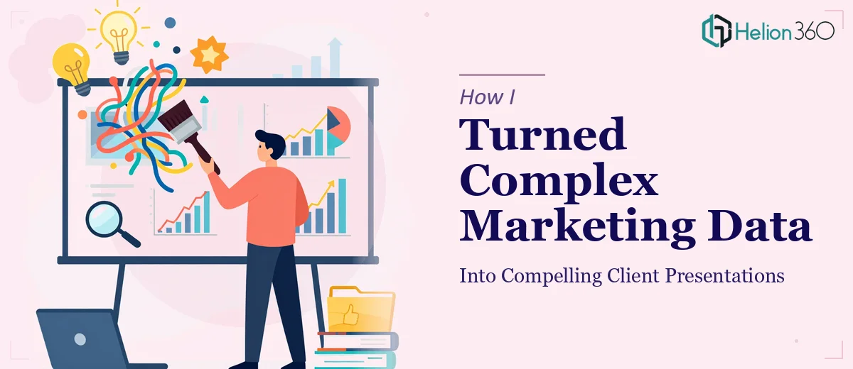
When the Data Is There But the Story Isn't
I've worked in account management long enough to know that clients don't really want to see raw numbers. They want to understand what those numbers mean for their business. That sounds simple in theory. In practice, building a presentation that bridges complex marketing data and a clear, confident narrative is a different challenge entirely.
Our agency was preparing quarterly performance decks for several clients at the same time. Each one had its own campaign data — channel performance, conversion funnels, audience insights, cost-per-acquisition breakdowns — and each client expected something that felt tailored, not templated. I started pulling together the slides myself, the way I always had.
Where It Started to Break Down
The data wasn't the problem. I had plenty of it. The problem was translating it into something that looked as good as it read. I could write the narrative, identify the key insights, and sequence the story logically. But when it came to the actual slide design — making charts readable, keeping layouts consistent, ensuring the visual hierarchy guided the audience's eye — I kept running into walls.
I'd spend an hour adjusting a bar chart only to realize the color palette clashed with the client's branding. I'd get the layout right on one slide, then lose consistency three slides later. With multiple decks running in parallel and a presentation deadline closing in, it became clear that the design execution was going to eat up far more time than I had.
I also noticed something I hadn't expected: even when I got the slides looking decent, they didn't feel authoritative. The data was right. The messaging was right. But something about the visual design was working against the story instead of reinforcing it.
Handing It Off to People Who Could Actually Build It
After hitting that wall, I came across Helion360. I explained the situation — multiple client decks, campaign performance data that needed to be visualized clearly, branding that had to stay consistent across every slide, and a tight turnaround. Their team asked the right questions from the start: What's the audience for each deck? What action do we want clients to take after seeing this? Where is the data currently living?
That last question alone told me they understood the workflow, not just the design side of it.
Helion360 took the raw inputs — spreadsheets, campaign reports, brand guidelines, and my rough slide outlines — and built the decks from there. They structured the data visualizations so that the most important metrics landed first and supporting context followed naturally. Charts were clean and readable without being oversimplified. Each slide had a clear visual focus so that clients could absorb the information without having to decode the layout.
What the Final Decks Actually Looked Like
The difference between what I had built and what came back was significant — not because my version was wrong, but because the design execution elevated the content in a way I hadn't managed on my own.
The marketing report presentations felt cohesive from the first slide to the last. The data visualizations were precise but also visually engaging. Branding was consistent throughout. And most importantly, the story arc I had planned actually came through in the finished product. The slides didn't just display data — they made an argument, walked clients through it, and landed on clear takeaways.
Client feedback after those presentations was noticeably better. A few clients specifically commented on how easy the decks were to follow. That's exactly what good presentation design is supposed to do — make the content feel effortless for the audience, even when the underlying work was anything but.
What I Took Away From This
Account management means being responsible for how information is communicated, not just what information gets shared. When the communication depends on strong visual design and data visualization, the standard for the final product goes up. Trying to do that entirely on your own — while also managing the content, the client relationship, and the deadline — is a recipe for something falling short.
Knowing when the work has outgrown a solo effort is a skill in itself. For presentations that carry real weight with clients, the design and the story have to work together without compromise.
If you're managing client presentations and finding that the design side is costing you more time than the content side, Helion360 is worth a conversation — they handled the part I couldn't and delivered something I was genuinely proud to put in front of clients.