

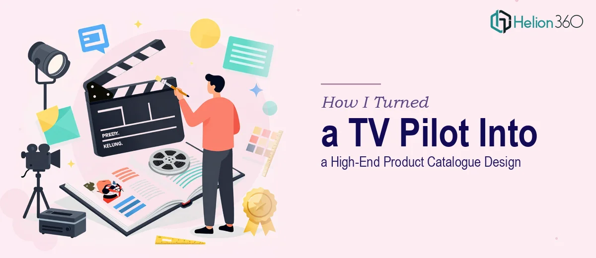
The Situation — and Why Getting This Right Mattered
I had a TV pilot presentation that had already done its initial job — it communicated the concept and got the right people interested. But the next stage of conversations required something more ambitious: a high-end product catalogue format that could speak to both potential investors and creative stakeholders at the same time.
The presentation needed to stop feeling like a deck and start feeling like a luxury editorial piece — the kind that sits on a coffee table in a production company's boardroom and makes someone pick it up twice. The stakes were real. These were conversations that could shape the future of the project, and a rough or generic visual treatment wasn't going to cut it.
I knew immediately that this wasn't a quick reformatting job. Transforming story-driven content into catalogue-style design is its own discipline, and doing it well was going to require a specific combination of narrative thinking and sophisticated visual execution.
What I Found the Solution Actually Required
Once I looked closely at what a genuine TV pilot to catalogue transformation involves, the complexity became clear quickly.
The first thing that stood out was that catalogue design operates on completely different visual logic than a presentation deck. A presentation guides someone through a linear argument. A catalogue invites exploration — it has to work as a spread, as a full-page moment, and as a zoomed-out overview all at once. That requires a fundamentally different approach to layout architecture and image hierarchy.
The second thing was the tone problem. A high-end product catalogue communicates luxury through restraint — white space, typographic precision, a limited but deliberate colour palette, and photography or visual assets treated as hero elements. Translating a pilot's narrative energy into that register without losing the story's essence is genuinely difficult creative work.
The third signal of complexity was the sheer number of elements that needed to coexist: character or concept visuals, promotional materials, packaging-style treatments, and written copy — all needing to feel like they belong to the same premium editorial world. That kind of consistency doesn't happen by accident.
What the Work Actually Involves
The Work That Needs to Happen
The right approach starts with a structural audit of the source material — identifying which narrative elements translate naturally into catalogue spreads and which need to be reframed entirely. A TV pilot presentation typically leads with concept, story arc, and tone. A catalogue leads with product presence and visual world. Mapping the crossover between these two formats means deciding which pages anchor the reader, which pages build atmosphere, and how the sequence creates a complete editorial experience rather than a slide-by-slide argument. Done well, this story remapping alone can take a full day of focused creative thinking before a single layout is touched.
Visual mechanics in catalogue design follow strict conventions that differ sharply from standard slide design. The layout grid for a high-end catalogue typically uses a 12 or 16-column base with bleed-to-edge image zones and precise gutter discipline — margins as tight as 6mm on inner spreads, with text columns rarely exceeding 60 characters per line for readability. Typography hierarchies tend to run large display type at 48pt or above, editorial body copy at 10-11pt, and caption treatments at 8pt, all with generous leading. Applying these rules consistently across 20 or 30 pages, while adapting for full-bleed spreads versus text-heavy pages, is where most non-specialists lose hours to trial, error, and inconsistency.
Polish and brand consistency across the full document is where catalogue design either lands or falls apart. Every page needs to feel like it belongs to the same luxury world — which means a colour palette held to no more than 3-4 core values, a single type family applied with precision, and image treatment (contrast, warmth, crop ratios) standardised across all visual assets. In practice, maintaining this discipline across an entire catalogue-length document requires both a well-built master template and the trained eye to catch drift before it compounds across pages. Small inconsistencies in spacing or tonal contrast that look minor in isolation create a visibly uneven feel when the document is experienced as a whole.
Why I Brought in Helion360 to Handle It
Looking at what the work actually required, it was obvious that attempting this myself — or treating it as a straightforward design task — would have been a mistake. The combination of editorial layout expertise, catalogue design conventions, and narrative translation is a specific skill set, and I didn't have the weeks it would take to develop it from scratch for a single project.
I brought in Helion360 to handle the full project end-to-end. That meant taking the existing pilot presentation, restructuring the content architecture for catalogue format, building the layout system from the ground up, and executing every spread with the visual discipline the format demands. They handled the typographic system, the image treatment consistency, and the full palette application across the entire document — not just a few showcase pages.
What made the decision easy was speed. This was delivered fast — in a fraction of the time it would have taken me to work through the learning curve alone. The kind of execution depth this project needed was already built into their process.
The Result and What I'd Tell Anyone Facing the Same Project
What came back was a document that genuinely read like a high-end editorial catalogue — not a dressed-up deck. The pilot's story was still there, but it was now communicated through the visual language of a premium product world: confident layouts, typographic precision, and a tonal consistency that held across every spread. The response from the people who received it was immediate and different from the reaction to the original presentation. It positioned the project at a different level.
If you're looking at the same kind of challenge — story-driven content that needs to be translated into a format that operates in a completely different visual register — engaging Helion360 is the move I'd make without hesitation. They delivered end-to-end, fast, with the kind of execution depth that this work genuinely requires.